
A crucial role in defining its message and impact. Specific color palettes can captivate attention, evoke emotions, and create a memorable impression.
With a staggering 16.8 million colors available, the possibilities for selecting color combinations for your upcoming logo, ad campaign, website, or brand identity design are virtually limitless. Fortunately, we’ve got you covered. In this guide, we’ll explore a variety of compelling color schemes that can significantly enhance your brand’s presence and impact.
Color Theory and Color Wheel: A Quick Overview
First, to grasp why certain color combinations are so effective, it’s essential to delve into color theory and the color wheel. Color theory lays the groundwork for understanding the psychological effects of color on human perception and emotion. Meanwhile, the color wheel is a visual tool that demonstrates the relationships among colors, applying color theory in a practical manner.
Let’s break it down below:
Color Theory
Color theory represents the combined knowledge and methodology behind the application of color. Research has proven that colors can significantly influence human emotions, perceptions, and actions. For artists and designers, mastering color theory is key to mastering the art of mixing colors and creating harmonious color schemes. It provides a set of principles and guidelines that enable designers to effectively communicate with and engage their target audience.
Color Wheel
The color wheel, conceptualized by Sir Isaac Newton in 1666, reflects a deep understanding of how humans perceive colors and how they can be combined to create visually appealing palettes.
This tool effectively demonstrates the interplay between colors, grounding color theory in practical application. Newton’s experimentation with prisms uncovered the foundational categories of color:
- Primary colors: red, yellow, blue
- Secondary colors (formed by mixing primary colors): orange, green, violet
- Tertiary colors (resulting from a mix of primary and secondary colors): red-orange, yellow-orange, yellow-green, blue-green, blue-violet, red-violet
Our perception ultimately defines color, influencing our psychological and collective response to different hues. This relationship imbues color with significance and is pivotal in crafting iconic and successful branding (for example, the McDonald’s Red-Yellow scheme).
What are the types of color combinations?
When colors work together, they create a color scheme or color combination. By drawing a line down the center of the wheel, you can distinguish between warm colors (reds, oranges, yellows) and cool colors (blues, greens, purples).
Warm colors are often linked to energy, brightness, and dynamism, whereas cool colors are typically associated with tranquility, peace, and serenity. Understanding that colors convey a specific temperature allows you to appreciate their effect on the message you wish to convey. Therefore, a thorough grasp of the color wheel and its classifications allows for creating harmonious and visually appealing color combinations. They are classified as:
Complementary Color Combination
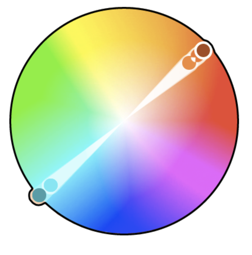
Complementary colors are those situated directly across from each other on the color wheel. This arrangement offers a stark contrast and enhances vibrancy.
Triadic Color Combination
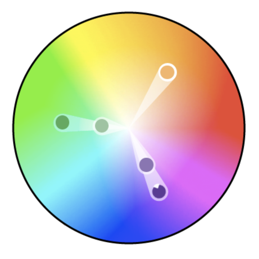
A triadic color scheme involves three colors evenly spaced around the color wheel. This selection achieves a harmonious and balanced aesthetic in designs.
Tetradic Color Combination
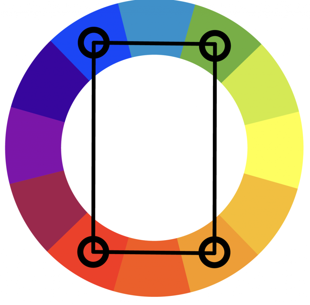
Tetradic color combinations are rectangle colors due to their formation of two pairs of complementary colors, outlining a rectangle on the color wheel. These combinations result in dynamic and bold designs.
Harmonious/Analogous Color Combination
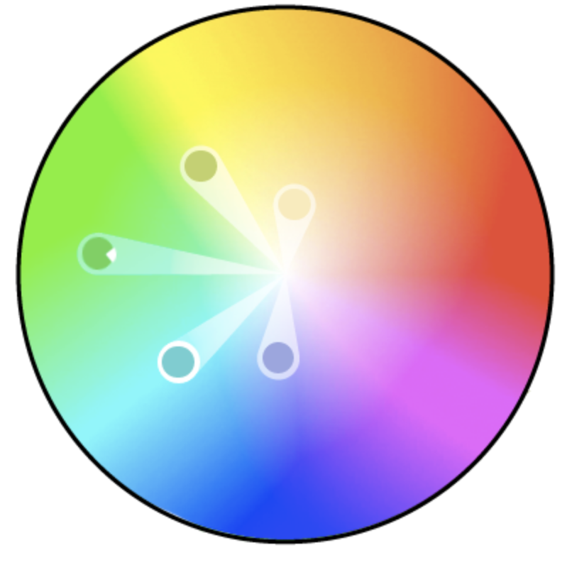
Harmonious or analogous color schemes consist of colors positioned next to one another on the color wheel. This proximity produces a calming and pleasant visual effect.
Understanding the universal perceptions and the interconnectedness between colors and human experience is crucial for mastering art or design. The ability to communicate through colors, with its subtle and almost instinctual nuances, forms a distinct and complex language that is both vivid and elusive.
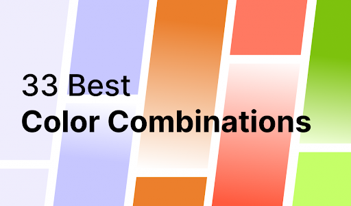
30 beautiful color combinations that’ll inspire your next design
From contrasting hues to matching shades, here are 33 top color pairings to spark inspiration for your upcoming ad campaign or design, featuring both timeless and on-trend color collaborations.
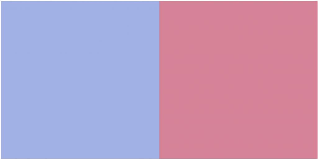
1. Blue & Pastel Pink

Merging blue with pastel pink results in a harmonious blend. The gentle, spring-inspired hue of pastel pink, combined with the sophisticated undertones of blue, fosters a peaceful equilibrium. This juxtaposition of colors elicits an elegant and feminine sense of calm, making it perfectly suited for beauty, health, and wellness brands.
Hex codes: #2F3C7E (Blue), #FBEAEB (Pastel Pink)
2. Dark Charcoal & Bright Yellow

Dark charcoal and vibrant yellow create a highly contrasting and visually compelling color combination. This combination exudes an energetic and modern vibe, perfect for innovative design firms, dynamic sports apparel companies, and urban lifestyle companies.
Hex codes: #101820 (Dark Charcoal), #FEE715 (Bright Yellow)
3. Baby Blue & White

The timeless pairing of baby blue and white conveys tranquility and reliability, reminiscent of gazing into the sky on a clear, sunny morning. This color combination embodies calm and confidence and is ideal for branding in the healthcare, childcare, and non-profit sectors.
Hex codes: #8AAAE5 (Baby Blue), #FFFFFF (White)
4. Cherry Red & Off-White

The classic duo of cherry red and off-white is marked by its versatility and timeless appeal. Striking a balance between elegance and warmth, this color pairing perfectly suits luxury fashion labels, the high-end dining and hospitality sector, and romantic or bridal-focused branding.
Hex codes: #990011 (Cherry Red), #FCF6F5 (Off-White)
5. Forest Green & Moss Green

The combination of forest and moss green creates a harmonious monochromatic palette, evoking feelings of nature and the great outdoors. This color scheme is perfectly suited for eco-conscious and sustainable products or brands, outdoor clothing and equipment companies, as well as nonprofits and cooperatives focusing on environmental causes.
Hex codes: #2C5F2D (Forest Green), #97BC62 (Moss Green)
6. Royal Blue and Deep Peach

The royal blue and peach duo establishes a triadic color scheme, where the playful essence of peach harmoniously complements the striking presence of royal blue. This vibrant contrast makes it an ideal choice for logos and websites, offering a visually appealing balance.
Hex codes: Royal Blue (#00539CFF), Peach (#EEA47FFF)
7. Light Red & Yellow

The lively and striking pairing of light red with yellow captures the essence of cheerfulness. By updating the classic ketchup and mustard palette to a softer, more contemporary version—shifting from red to coral—this color combination perfectly suits children’s branding, logos, and packaging for youth-oriented food and beverage products.
Hex codes: #F96167 (Light Red), #F9E795 (Soft Yellow)
8. Dark Blue & Light Blue

The variation between shades, particularly in light and dark blue, shouldn’t be underestimated. This monochromatic pairing exudes authority and sophistication and fosters a sense of professionalism and trustworthiness. It’s an ideal color scheme for businesses like insurance agencies or financial services firms looking to convey reliability.
Hex codes: #00246B (Dark Blue), #CADCFC (Light Blue)
9. Sky blue & Candy pink
The timeless and beloved pairing of sky blue and bubblegum pink offers a vibrant and fun contrast that evokes youthful exuberance. This lively duo is perfect for brands focused on parenting and logos for childcare, children’s clothing, products, and toys.
Hex codes: #89ABE3 (Sky Blue), #EA738D (Candy Pink)
10. Cherry Red and Bubblegum Pink

The pairing of cherry red and bubblegum pink creates an engaging analogous color scheme. They produce a striking visual contrast, perfect for dynamic and expressive beauty and lifestyle brands and their products.
Hex codes: #CC313D (Cherry Red), #F7C5CC (Candy Pink)
11. Sailor Blue and Mint

An old saying suggests that blue and green should not be paired unless separated by another color. However, exceptions exist to every guideline, and the combination of navy and mint proves that these hues can complement each other beautifully despite their contrasting nature.
This pairing is especially effective in typography, where the colors provide a harmonious contrast without overwhelming one another.
Hex codes: Mint (#ADEFD1FF), Sailor Blue (#00203FFF)
12. Island Green and White

The pairing of Island Green and white is viewed as a grounded and natural color scheme, often linked to environmental themes. This makes it an excellent choice for packaging eco-conscious products.
Hex codes: Island Green (#2BAE66FF), White (#FCF6F5FF)
13. Lilac and Lime Green

This color scheme has a retro feel and exudes a sense of freshness, making it a fantastic choice for beauty product branding.
Hex codes: Pale Lilac (#E3C9CEFF), Lime Green (#9FC131FF)
14. Alabaster white and Silver

The pairing of white and silver epitomizes minimalistic design. Opt for this combination for a sleek, understated look that embodies sophistication.
Hex codes: Alabaster White (#F1F4FFFF), Silver (#A2A2A1FF)
15. Brown and Beige

This monochromatic color scheme radiates warm, natural tones, making it ideal for designing packaging for chocolate and coffee-related products.
Hex codes: Brown (#A07855FF), Beige (#D4B996FF)
16. Pastel Olive Green & Salmon Pink
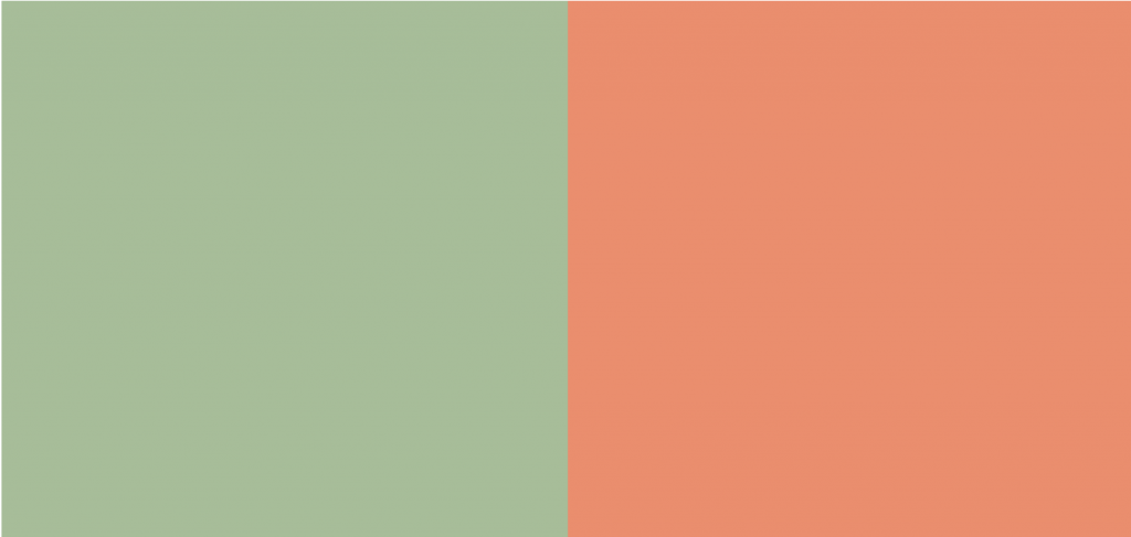
The pairing of salmon pink and pastel olive green brings forth an earthy yet lively harmony, conjuring feelings of warmth and a nostalgic connection with nature, tranquility, joy, and equilibrium. This refreshing and spirited color duo is perfectly suited for brands that emphasize eco-friendliness and sustainability and products focused on wellness, mindfulness, children’s items, and toys.
Hex codes: Pastel Olive Green (#A1BE95), Salmon Pink (#F98866)
17. Deep Periwinkle & Soft Lilac

The enchanting blend of deep periwinkle and soft lilac forms a color palette that straddles the line between the ethereal and the tangible, radiating a sophisticated calm, a touch of enchantment, or a subtle peacefulness. This variation of purple hues perfectly matches brands and products in the beauty, wellness, spirituality, or mindfulness sectors.
Hex codes: Deep Periwinkle (#735DA5), Soft Lilac (#D3C5E5)
18. Teal & light green

The combination of teal and light green forms a cool, calming color palette, bringing to mind the tranquil beauty of lagoon waters or the verdant allure of natural springs. This cohesive and soothing color scheme is an excellent choice for health and wellness brands, as well as those drawing inspiration from outdoor scenes and the natural world.
Hex codes: Teal (#20948B), Light Green (#6AB187)
19. Dark Green & Light Gray

While color trends may fluctuate, the timeless elegance of this classic color palette ensures its lasting appeal. The blend of dark green with light gray conjures a sense of serenity and enduring style. The earthy, natural shades of green paired with the tranquil and neutral hues of gray forge an ideal palette for mindfulness and wellness brands, organic offerings, and brands that pride themselves on superior craftsmanship, natural materials, and subtle luxury.
Hex codes: Dark Green (#31473A), Light Gray (#EDF4F2)
20. Midnight blue, Royal Blue, & Burgundy Red

The blend of midnight blue, royal blue and burgundy red creates a striking color scheme that commands attention. It exudes an air of mystery, allure, strength, and luxury. It is perfectly suited for premium fashion and jewelry brands, luxury vehicles and beverages, upscale dining, boutique accommodations, and high-end perfumes and cosmetics.
Hex codes: Midnight Blue (#1E2761), Royal Blue (#408EC6), Burgundy Red (#7A2048)
21. Terracotta Red, Light Beige, & Muted Teal
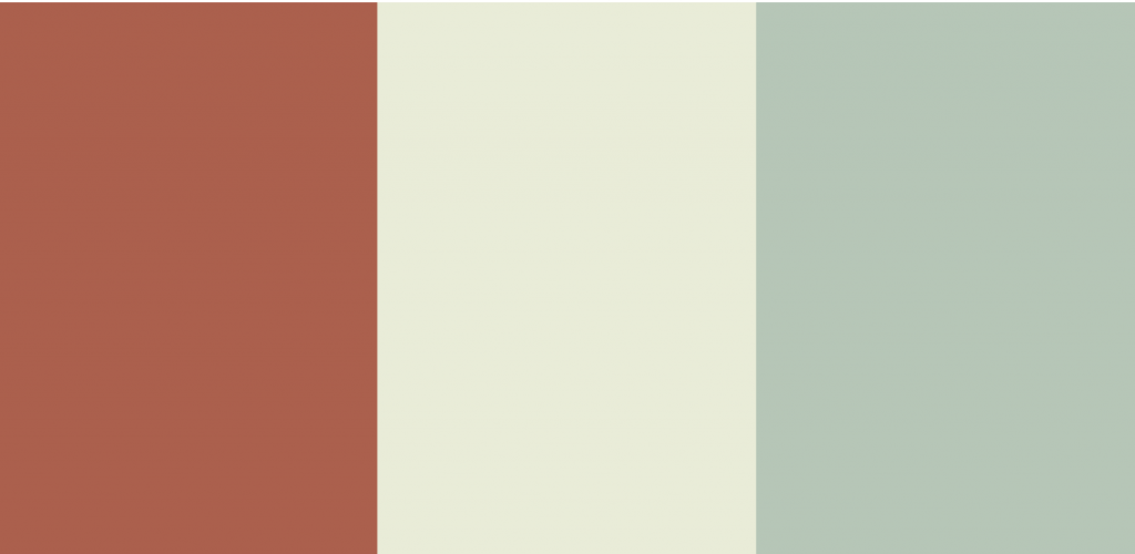
The captivating trio of terracotta red, light beige, and muted teal forms an alluring and enigmatic color scheme. With its earthy and subdued tones, this palette is visually appealing and timeless. It’s an excellent choice for brands focused on farm-to-market products and eateries, as well as those in home decor and interior design, outdoor clothing and equipment, and botanical wellness products.
Hex codes: Terracotta Red (#B85042), Light Beige (#E7E8D1), Muted Teal (#A7BEAE)
22. Deep Blue, Orange-Red, & Yellow-Orange
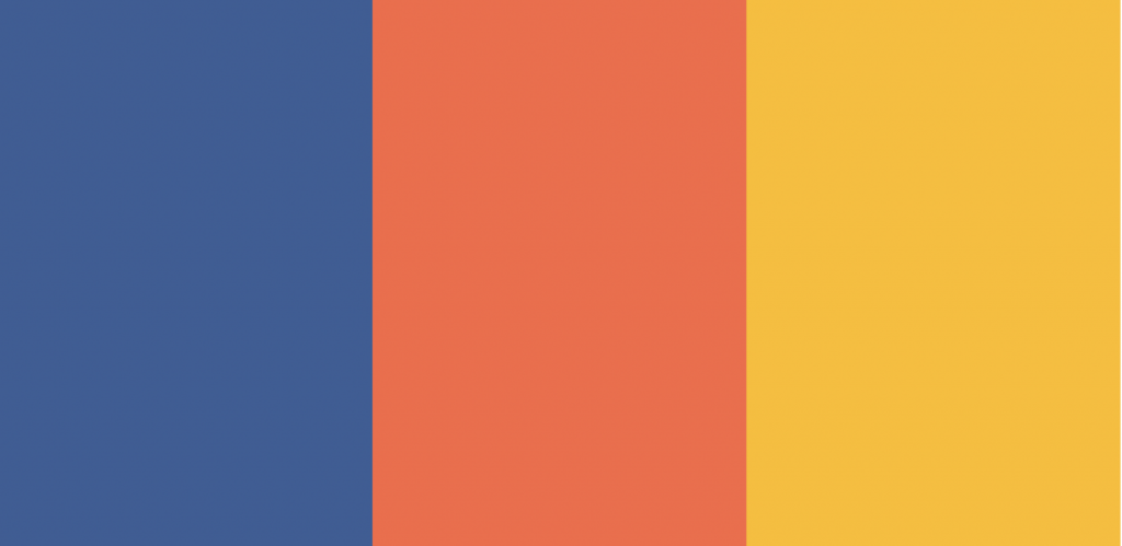
This dynamic and playful combination of deep blue, orange-red, and yellow-orange tones creates a bold, vibrant, and energetic aesthetic. Juxtaposing the deep blue with warm oranges evokes a lively sense of movement and enthusiasm, making it well-suited for accent colors or logo choices. This palette is particularly well-suited for adventure and outdoor brands, adventure travel, amusement parks, and food and beverage packaging.
Hex codes: Deep Blue (#375E97), Orange-Red (#FB6542), Yellow-Orange (#FFBB00)
23. Mauve, Dusty Rose, & Soft Blue-Gray
Mauve, dusty rose, and soft blue-gray harmonize beautifully. The fusion of soft blue and dusty pink creates an elegant and feminine palette, exuding subtle charm and sophistication. This combination suits wedding and event planning, beauty fashion, home decor, and the wellness industries.
Hex codes: Mauve (#8C6499), Dusty rose (#D69ABD), Soft blue-gray (#B0C4DE)
24. Dark Reddish Brown, Taupe, & Light Peachy Brown
Rustic, warm, and irresistibly cozy, a blend of dark reddish brown, taupe, and light peachy brown forms an earthy and welcoming color combination. This timeless and refined palette exudes sophistication, making it perfect for heritage and craftsmanship brands, interior design and real estate agencies, outdoor apparel and gear brands, artisanal brands, coffee shops, and bakeries.
Hex codes: Dark reddish brown (#330000), Taupe (#73605B), Light peachy brown (#D09683)
25. Dark Navy Blue, Bright Scarlet Red, & Light Lemon Yellow
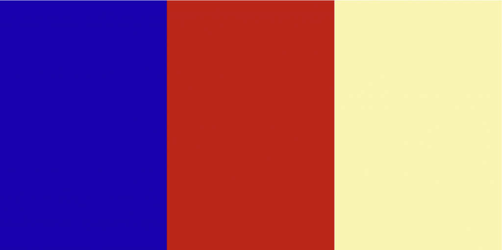
Dark blue, bright scarlet red, and light lemon yellow form a visually arresting combination that exudes excitement and boldness. This contrasting blend of colors is versatile, spanning styles from retro to modern, making it perfect for sports and fitness brands, fast food and casual dining establishments, amusement parks, children’s products, toys, and retro-inspired ‘Americana’ designs.
Hex codes: Dark blue (#5031F) , Bright scarlet red (#CB0000), Light lemon yellow (#E4EA8C)
26. Teal Blue, Light Blue, & Light Gray
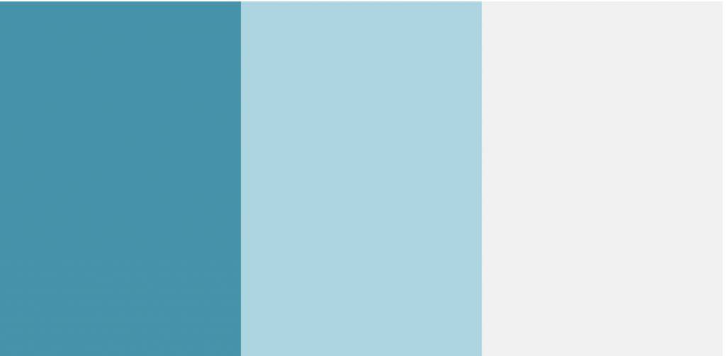
The combination of teal blue, light blue, and light gray offers a refreshing and contemporary feel, conjuring images of pristine skies and icy waters. This cool, crisp color palette elicits feelings of trust, reliability, and steadiness, perfectly fitting for settings such as hospitals, clinics, financial institutions, insurance companies, legal practices, and cloud security enterprises.
Hex codes: Teal Blue (#1995AD), Light Blue (#A1D6E2), Light Gray (#F1F1F2)
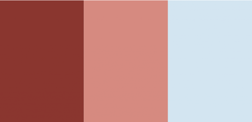
27. Deep Navy Blue, Bright Red, & Pale Pink

The bold and contrasting mix of deep navy blue, vivid red, and soft pale pink offers a playful yet refined aesthetic, striking and adaptable. The combination of navy and red delivers a powerful visual statement, suggesting dynamism and liveliness, whereas the inclusion of pale pink introduces an element of youthful and whimsical charm. This color scheme is particularly appealing for high-end brands in the automotive, fashion, or jewelry sectors and for sportswear and design firms.
Hex codes: Deep Navy Blue (#002C54), Bright Red (#C5001A), Pale Pink (#FDF6F6)
28. Dark Charcoal, Deep Rust, & Sky Blue
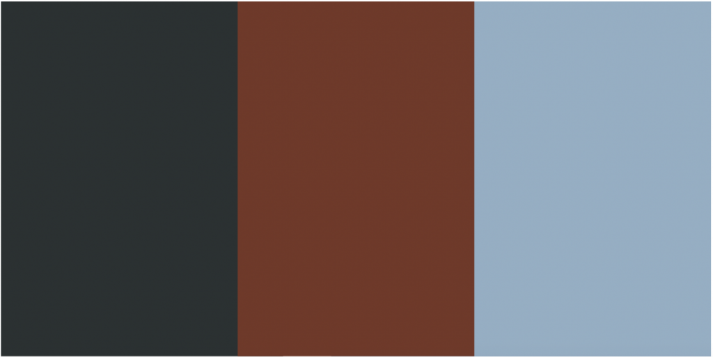
This dynamic and contrasting palette, featuring dark charcoal, deep rust, and sky blue, offers a sophisticated and contemporary vibe. It conveys strength, coziness, and luxury, making it perfectly suited for premium brands within the fashion and automobile sectors and design studios or architectural practices.
Hex codes: Dark Charcoal (#2A3132), Deep Rust (#763626), Sky Blue (#90AFC5)0
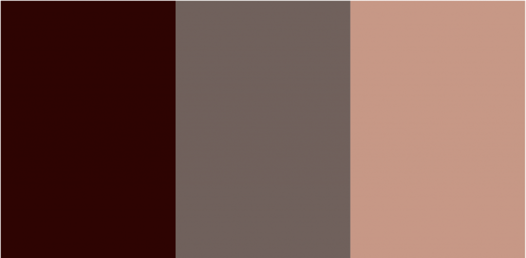
29. Dark Chestnut Brown, Burnt Sienna, & Soft Cream
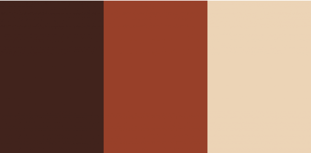
The warm, earth-toned mix of dark chestnut brown, burnt sienna, and soft cream captures the essence of the natural world, reminiscent of a lush autumnal setting. This color palette exudes a sense of coziness, tradition, and authenticity, making it a perfect match for brands that emphasize organic and farm-to-table products, celebrate heritage and craftsmanship, or specialize in outdoor home goods, as well as for coffee shops and bakeries.
Hex codes: Dark Chestnut Brown (#46211A), Burnt Sienna (#A43820), Soft Cream (#F1D3B2)
30. Pastel Orange, Peach, and Custard Yellow

This monochromatic palette, featuring a trio of harmonious colors, radiates comforting summer sensations. It’s an excellent choice for crafting packaging designs for products embody summer’s warmth and leisure.
Hex codes: Pastel Orange (#FFA351FF), Peach (#FFBE7BFF), Custard (#EED971FF)
31. Sapphire, Light Gray, Cadet Gray, and Silver

Although this four-color combination doesn’t seem like the best idea because it looks gloomy, they’re best suited for minimalistic brands that don’t want to stand out.
Hex codes: Sapphire (#2E5266FF), Light Slate Gray (#6E8898FF), Cadet Gray (#9FB1BCFF), and American Silver (#D3D0CBFF)
32. Purple, Lilac, Petunia, and Aubergine Gleam

Given its nocturnal ambiance, this color scheme is ideal for creating packaging for products intended for use during the night.
Hex codes: Purple (#93385FFF), Lilac (#9F6B99FF), Petunia (#4F3466FF), and Aubergine Gleam (#301728FF)
33. Dark Green, Light Green, White, and Red

Given its nocturnal ambiance, this color scheme is ideal for creating packaging for products intended for use during the night.
Hex codes: Purple (#93385FFF), Lilac (#9F6B99FF), Petunia (#4F3466FF), and Aubergine Gleam (#301728FF)
Wrapping Up
Selecting the perfect color combinations is crucial as they significantly influence consumer psychology and determine whether a product catches a customer’s eye or goes unnoticed.
Choosing the ideal palette is merely the initial step. Subsequently, you’ll collaborate closely with your design team to refine and finalize the design, ensuring that your labels, ad designs, and logos meet all regulatory standards and maintain the integrity of your design vision. Talking of Ad Creation and Design, our team at Wyde.ai is a pioneer in the catalog ads segment with DPA creatives that perform better, getting up to 3x performance lifts at scale. You can book a demo with us here and boost your ad creation and design process.