The best cart recovery email examples for food and beverage brands online.
Ecommerce stores lose $18 billion in sales revenue each year because of cart abandonment. In March 2021, almost 80 percent of online shopping orders were abandoned and these numbers are increasing every year.
Not only is it important for eCommerce stores to understand the reasons for cart abandonment but also look for ways to recoup the lost sales. With the open rate of 45% email cart recovery emails are the best way to win back lost sales.
But simply writing an email and hitting send won’t guarantee the success of cart recovery. Businesses must be strategic with how they persuade customers to continue with the purchase. There are different elements of cart recovery email which can be used to convince customers.
In this blog we’ll look at some best cart recovery emails by the food and beverages industry and what makes them unique. This might help you apply those strategies to your email campaign and recover lost sales.
Taco Bell cart recovery email

The design of this email template is simple, with a clear message. The color red for the CTA button is designed to stand out and entice users to take action. Taco Bell has listed the benefits like free rewards and points to encourage users to download the app, in case they still decide to not complete the purchase.
What we like?
- Simple and unique design template
- Clearly highlighted CTA
- Offering additional benefits if ordered through an app
- Micro-conversion (install app; instead of purchase)
Pulp & Press abandoned cart email

The opening line is intriguing to remind customers that they have forgotten something. This template has all the elements of a typical cart recovery email and more. Offering 30% to users with a minimum cart value is a great strategy by pulp & press to increase sales, and at the same time get them to convert. Adding customer reviews as social proof is another winning tactic they make use of.
What we like?
- Using images relevant to the brand
- Simple and persuasive sales copy
- Offering 30% on minimum cart value to increase sales
- 8/10 customers will make the purchase after reading reviews
Winc cart recovery email
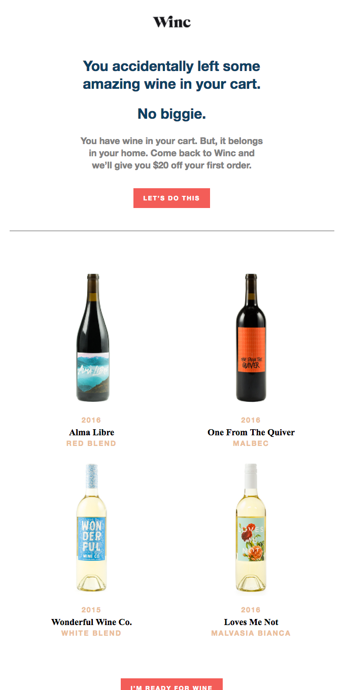
Winc is offering $20 off for first-time customers to recover abandoned carts and who doesn’t love discounts?! The CTA “Let’s do this” looks unique and more of a collective act together. Mentioning the product’s name and the price helps the consumer recall the items in the cart too.
What we like?
- The opening line is attention-grabbing
- Customized call to action copy
- Adding visuals makes the message more appealing
ChefSteps abandoned cart reminder email

ChefSteps has tried to build a friendly relationship with the customer by personally addressing this email to the person. Guiding customers on how to complete the purchase makes way for faster checkout. Adding a link to the FAQ and contact us section can ease the customer buying journey by addressing their pre-purchase anxiety.
What we like?
- Addressing customers by their name can help build a strong connection with the brand
- Clear CTA to help customers understand what they need to do next
- Simple and direct message
- Clear product picture to remind the buyer of what they left behind
Nutriseed abandoned cart email
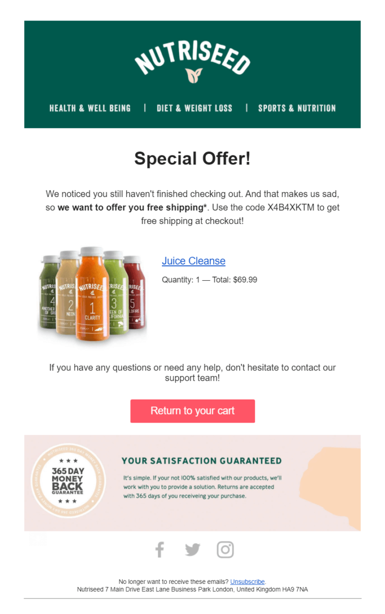
Nutriseed has used an emotional angle in the copy to win back customers. They have highlighted “free shipping” so as to grab eyeballs right to it and motivate them to complete the purchase. The brand also includes a 365 day money-back guarantee to address the consumer’s pre-purchase anxiety.
What we like?
- Adding product name and price as a reminder
- Clear CTA directing customers to the cart
- Highlighting 365-day money-back guarantee and free shipping to improve motivate the purchase
Pipcorn cart recovery email
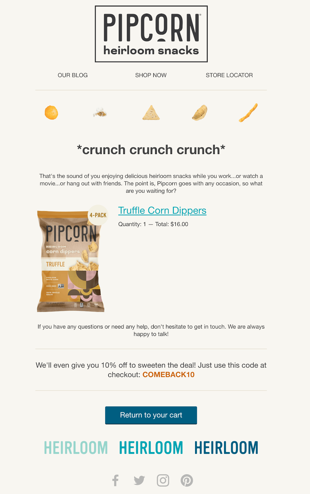
Pipicorn has used exceptional copywriting to convey the message. Storytelling is the future, and the brand has used it wisely to keep customers engaged. Offering a discount code attracts customers to complete the purchase.
What we like?
- Great copywriting blended with storytelling makes it unique
- Discount code to convince customers to complete the purchase
- Providing assistance to those who left the cart because of some issue.
Golde cart recovery email
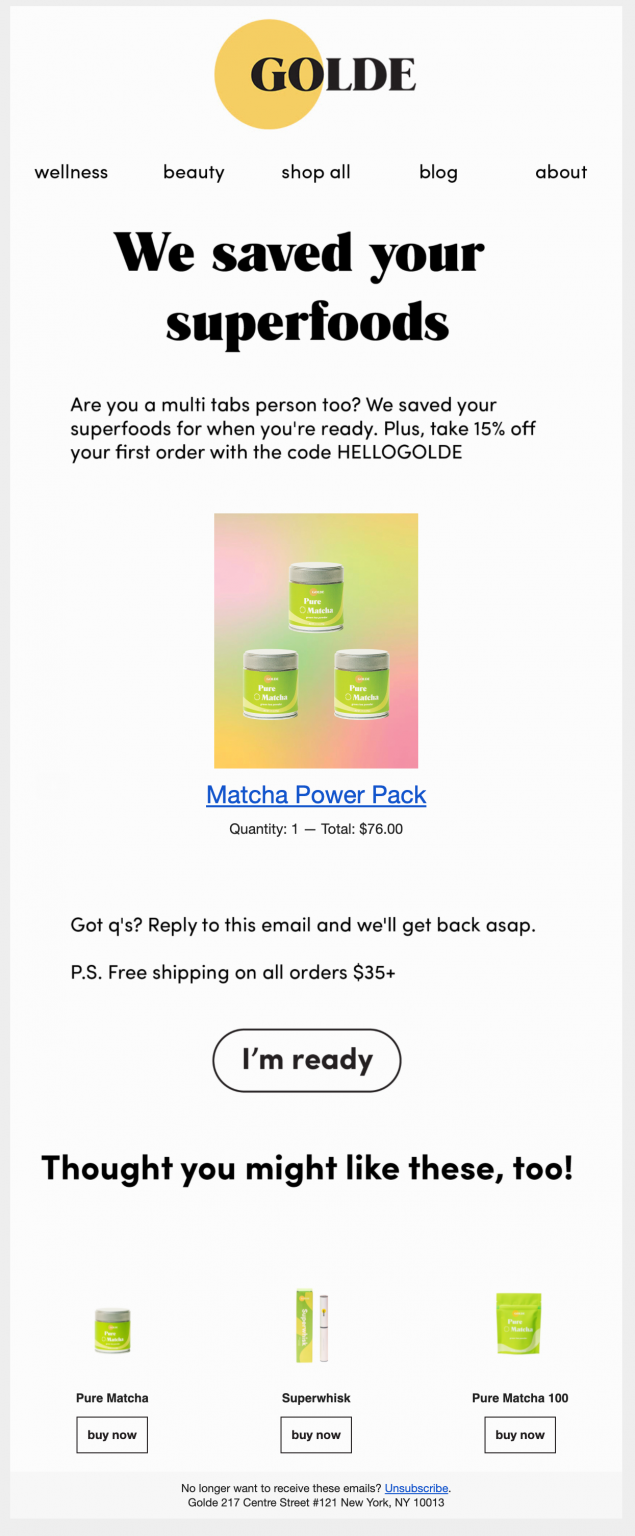
GOLDE has tried to build customer trust and brand loyalty by saying, “We saved your superfoods.” Listing the product name and price works as a reminder of what the customer has left behind. Adding some product recommendations in the email also increases the chances of them converting on the email.
What we like?
- The opening line is intriguing
- The creative CTA button copy
- Product recommendations to nudge another visit
- Offering free shipping on minimum cart value to motivate a purchase
Whisky Me cart recovery email
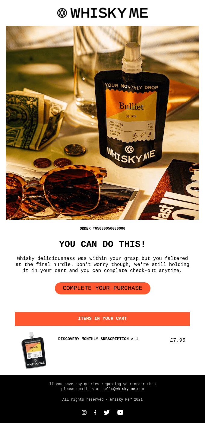
The tone of conversation in this email is very friendly. A different color is used to highlight the CTA button. Listing down the product name and price assures customers about the product they left in the cart. The product image used in the beginning is a product in use, making the consumer immediately recall what they added to the cart in the first place. It’s hard for wine connoisseurs to ignore it!
What we like?
- Using the image of a wine bottle in use
- The friendly tone is clearly reflected in this email
- Clear CTA button and copy
- Providing email to resolve customer queries
HungryRoot abandoned cart recovery
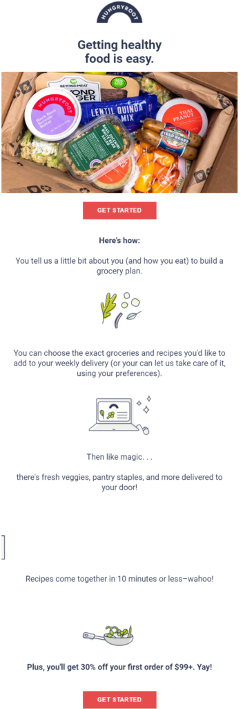
The tagline used here is intriguing, yet touches upon why the consumer may have abandoned the purchase in the first place. HungerRoot builds up to the call to action strategically by laying out the steps it will take for the brand to understand their purchase preferences and help them make the right purchase.
What we like?
- The brand clearly understands its target audience, and the tone of the email makes it clear
- Description of the product and why it is best
- Offering discounts on minimum cart value and first-time purchases is a great way to encourage customers to take action
Ross Street Roasting Co. cart recovery email
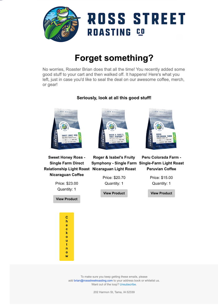
The tone of the message is conversational and semi-casual, keeping up with the brand’s overall image. Adding product images with the price is the best way to replicate the in-store experience and at the same time, remind customers about the items in the cart.
What we like?
- The tone of the message is direct and persuasive
- The opening line, “Forgot something,” is catchy and offers an instant connect
- The ability to visit the product page of the items left behind
Cater2me abandoned cart recovery email
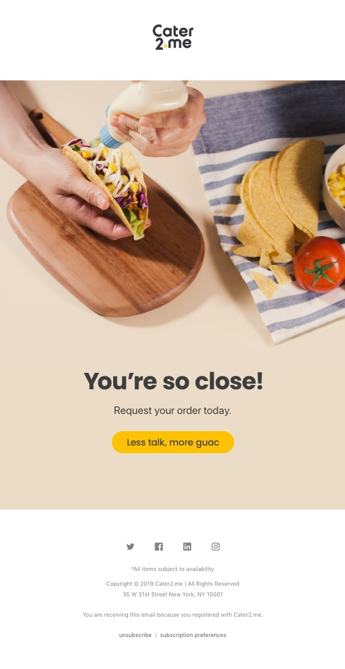
Cater2Me knows the key to the perfect cart recovery email — keep it simple. The brand has used an image that is tempting and fits right with the message. Food delivery is a time-sensitive industry, and brands need to recover sales quickly; might as well lure the consumer by helping them visualise how good the food tastes!
What we like?
- The image used is appealing to evoke buyer’s interest (and taste)
- Minimal email copy that shows the consumer how close they are to owning the product
- Clear and creative call to action copy
Naturebox cart recovery email
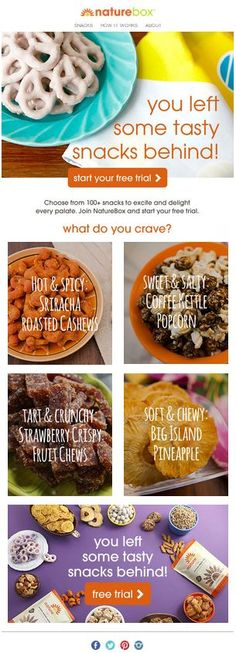
This feels the same as the brand’s website. Visuals work as the best reminder and encourage customers to take action. NatureBox has offered multiple snack options to improve the chances of sales. The opening line “you left some snacks behind” is click-worthy. The brand has placed the CTA button twice, so no chance of missing it.
What we like?
- This email template looks like a company page offering a more personalized experience to customers
- Offering options according to taste make it easy to choose
- Free trial as a motivation to nudge an interaction
Blue Apron cart recovery email
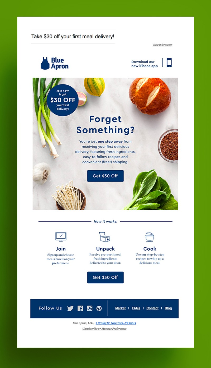
The brand knows that most emails are read on mobile since the design is mobile-friendly. Placing the benefit “Get $30 off” right at the top makes it difficult for buyers to miss it. Mentioning social media handles will help customers keep a tab of brand activities. Offering monetary benefits improves the chances of sales other than any benefit.
What we like?
- The design of this email template is intuitive and straightforward
- The major benefit is rightly placed at the top
- Redirecting customers to other pages makes it easy to find more about the brand
- The step-by-step buying process removes confusion, if any
GrazeShop abandoned cart recovery email
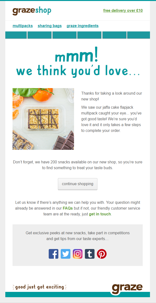
This email looks similar to the shopping cart. The brand has tried to connect with customers using a friendly tone. The primary benefit, “free shipping,” is highlighted at the top. Re-directing customers to complete the order reduces conversion time. Mentioning the FAQ section helps customers to find a solution to their queries.
What we like?
- The tone of the message is very friendly and persuasive
- CTA is clear and straightforward
- A different color is used for FAQ and Get in touch sections to highlight them
- Mentioning social media connections helps customers stay connected and know behind-the-scenes
Hawaii Coffee Company cart recovery email

It’s difficult to say what made customers not complete their sales but sending a well-written note might increase the chances of recovery. Hawaii Coffee Company knows the real pain of cart abandonment and are readily available to help customers complete it. Sending cart abandonment emails are not only for cart recovery but also to promote other products, and the brand does this right to nudge another visit.
What we like?
- Well-written personalized email
- A clear CTA button in the end
- Promoting other products offered by the brand
- Mentioning social media handles to help customers stay updated with company activities
Recess abandoned cart recovery email
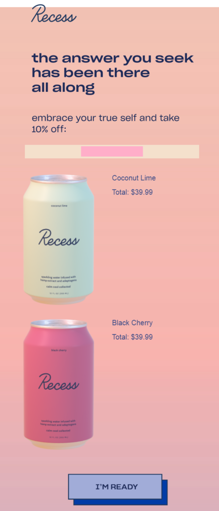
Recess has tried keeping the message simple and direct. This email template is a perfect example of strong copywriting. Using product images works as a reminder and keeps customers engaged. Offering discount work as the best strategy to win back the lost sales. We also love how colourful and lively the email looks!
What we like?
- The design of this email template is mobile-friendly and straightforward
- Using product images is a strong brand recall
- Offering discounts to motivate the buyer
- Clear, crisp and creative call to action
Dope Coffee cart recovery email
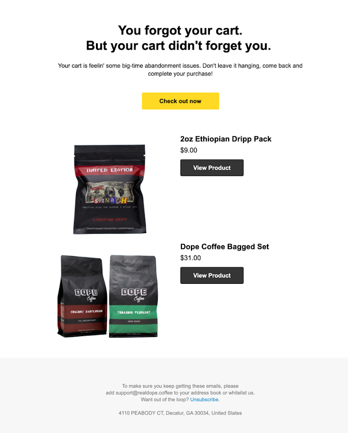
This email template clearly indicates how your copy doesn’t have to be verbose to stand out. A simple message with compelling images is all that you need. The brand has tried building authority by saying, “don’t leave it hanging,” which shows how the brand believes in the value it offers.
What we like?
- The brand has tried making the opening sentence catchy with a touch of humor
- The CTA button is placed at the top, which improves the chances of getting noticed
- Option to view the products again to encourage
Smiley Cookie cart recovery email
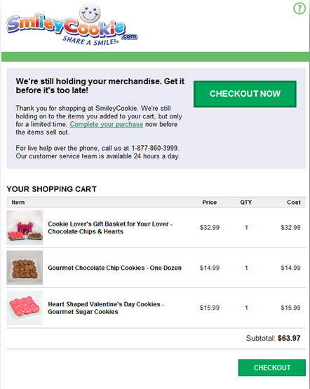
Smileycookie.com makes it difficult to ignore the CTA even if the customer doesn’t read the entire email by placing the checkout button right at the top and making it so vibrant! Adding the checkout page to the email makes the check out process faster which is a smart way to recover abandoned carts.
What we like?
- The brand has tried to connect with customers right in the beginning
- Mentioning a contact number helps to reduce efforts to reach customer support
- The checkout option reduces conversion time as customers can complete the purchase without visiting the store again
- Replicating the cart page in the design and adding the cart total
Thrive Market cart recovery email
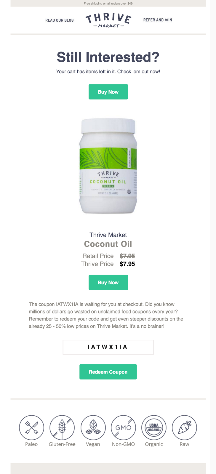
Thrive knows what perfect email copywriting is, and it’s visible in this email. A CTA button is placed twice, so customers don’t miss it. The brand has clearly created FOMO by mentioning a fun fact about coupon codes. Listing reasons to buy the product boosts confidence in the product and improves chances of cart recovery.
What we like?
- Clear and crisp call to action
- A secondary call to action on the purchase motivation (coupon code)
- Slashed pricing to show how the consumer ‘saves’ on the purchase
- Product image kept at the center of the email for recall
- Visual product labels to state the benefits at the bottom
Ippodo Tea USA & Canada cart recovery email
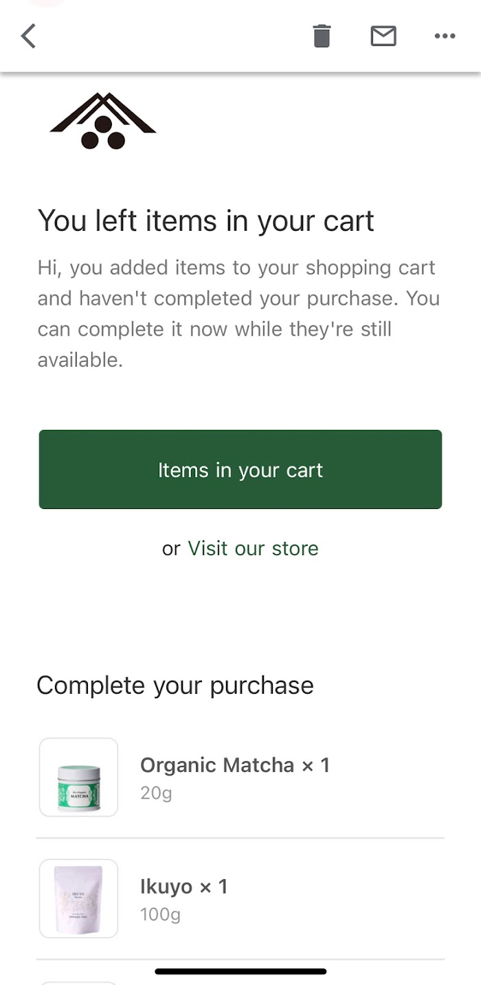
The email template is simple, effective, and mobile-friendly. The opening line is direct, stating the reason for the email. Adding cart items reminds customers of the products they left in the cart.
What we like?
- The friendly tone of the abandoned cart reminder
- Direct call to action to return to cart
- A secondary call to action to visit the store to nudge another interaction
Conclusion
The open rate of cart abandonment emails in 2021 was 41.09% which means sending emails for cart recovery is still effective because it helps you engage with your customers on a one-on-one basis.
However, for your emails to get opened and action to be taken, you need to get a few basic elements right and tap into the right consumer psychology, at the right time.
The above cart recovery email examples are listed to show you how different strategies work for different businesses.
Now, it’s time to find your strategy!

