Best cart recovery email examples for health and wellness brands
You’re spending a lot of time and effort to bring quality traffic to your website. Your product pages look perfect, and the customers adore your products. The entire shopping experience from first viewing the product to adding them to the shopping cart is frictionless.
And then you notice that more than 70% of those shoppers end up abandoning their carts and quit your website, without completing their purchase.
eCommerce store owners have been battling abandoned carts ever since online stores came into existence. With a rising number of brands going online, shoppers get more choices than ever. Leading them to increasingly abandon their carts in search of better deals on their purchases.
One of the best and most effective ways to nudge people to recover their abandoned shopping carts is with a well-crafted cart recovery email campaign. However, there is a problem: most online store owners are using the same tried-and-tested cart recovery tools to try and bring down their cart abandonment rates.
In this blog, we bring you the best cart recovery examples from health and wellness brands to inspire your next email campaign.
Cart recovery examples from health and wellness brands
1. Nutriseed
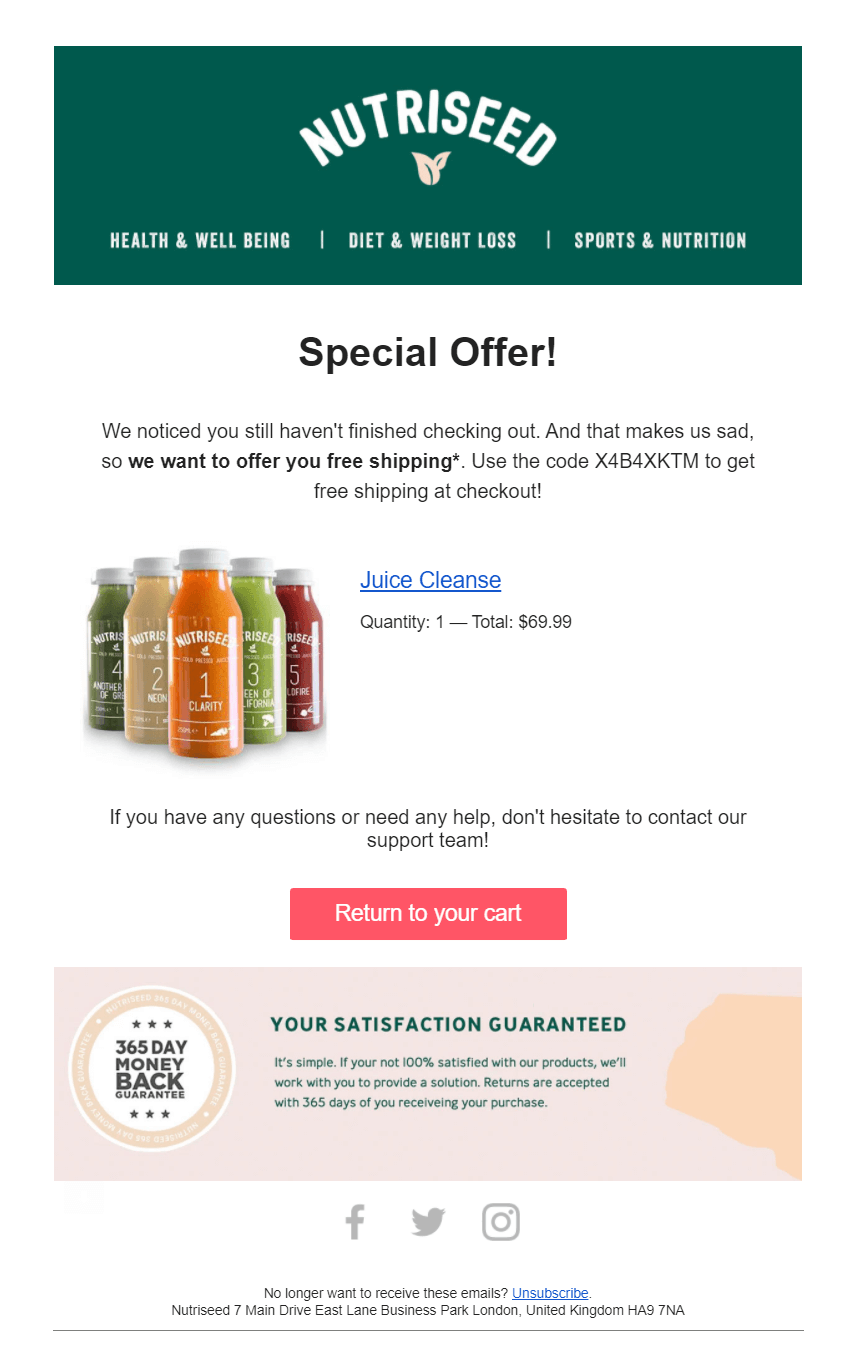
Nutriseed’s cart abandonment email campaign does everything right to get their customers back to their shopping carts. While the subject line could use some optimization for an improved open rate, the email uses a playful copy that tries to build an emotional connection with the customer.
To make the abandoned item more appealing, the brand promises free shipping and a 365-day money-back guarantee to encourage shoppers to finish their purchase. A brightly colored CTA button stands out to navigate the reader towards the desired action.
2. Ritual
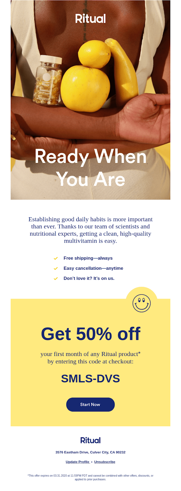
Ritual’s cart recovery email has everything a good email should have: a copy that builds trust, eye-catching imagery, and an offer you can’t ignore. Apart from the vivid imagery, what makes Ritual’s abandoned cart email so appealing is its crisp copy. By mentioning the role of scientists and nutritional experts, they build credibility to their products and make the customer think they are missing out on something wonderful.
A lot of brands give incentives like a discount code or free shipping but Ritual outright claims that the product amount will be fully refunded if it’s not of the customer’s liking. Such claims attempt to build a strong trust in the brand. Moreover, the offer of a 50% discount is aptly highlighted.
3. Peloton
Peloton’s abandoned cart email has all the right elements: a non-cliche catchy headline “Time to bring it home”, a highlighted discounted price (compared next to the original price), a section that talks about how the customer can save money using Peloton (thereby showing the customer the value they’ll get by becoming a subscriber), and an option to book a test class at the showroom.
This neat email design coupled with just the right amount of no-nonsense copy makes this a notable example of all cart recovery emails.

4. Thrive market
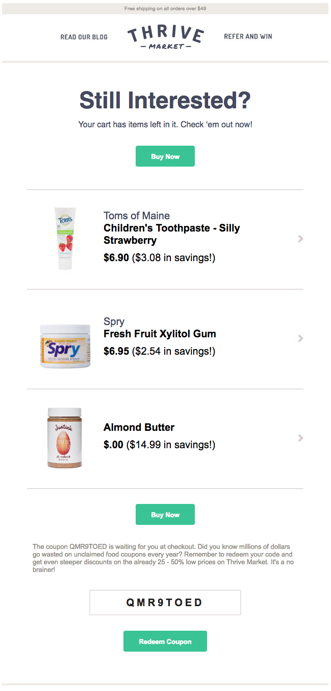
Thrive market’s abandoned cart email tells the customer how much they’d save by purchasing from the store versus from other retailers. By keeping their copy crisp and straightforward and the design minimalistic, the brand ensures they don’t overwhelm the reader with too much information.
The offer of a coupon code at the end, alongwith the copy below it, convinces the customer why it is worth buying from them and encourages shoppers to finally seal the deal.
5. 23 And Me
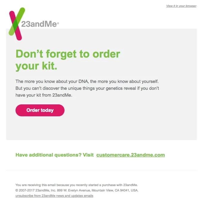
23 And Me sends an abandoned cart email that’s to-the-point and contains only a few basic elements: An intro text “Don’t forget to order your kit”, a CTA button saying “Order today”, and some closing text offering to answer any questions “Have additional questions?”.
Why? So that the email doesn’t distract the customer with excess information and gets them to take the one action 23 And Me wants: complete their purchase. This is also attributed to the light color palette that the email follows.
Moreover, including words like Don’t forget to order your kit and Order today induces urgency in the copy.
6. Holy Crap
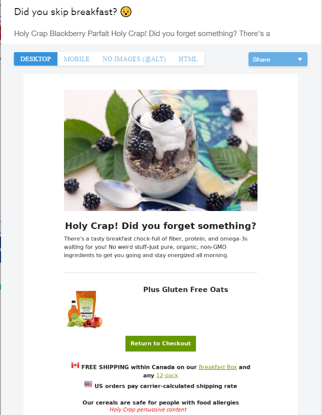
Holy Crap’s cart recovery email is a good example of sticky content. The use of a colorful emoji in their subject line makes their email stand out from the rest. The email keeps things casual and leads with a warm question “did you skip breakfast?” to capture the reader’s attention.
The email copy is on-brand and has a consistent tone which represents their brand identity. The brand engages in delightful witty wordplay on their brand name with the copy “Holy crap! Did you forget something?”
7. Pulp & Press
Pulp & Press’s abandoned cart email uses a minimalist design that uses a single striking image to paint a bigger picture. The use of clever wordplay “Waiting for a sign? This is it!” is a brilliant copy tactic. By combining the cart with the ongoing cyber sale, they induce a sense of urgency by giving a discount on the order, but only while the supplies last.
The styling in the email is very on-brand and redirecting from the website to the email feels familiar, making it a good customer experience. The CTA copy “Let’s do this” encourages the shopper to complete their purchase. Moreover, including the top rated customer testimonials also contributes to cultivating trust and credibility in the brand.

8. SugarBearHair
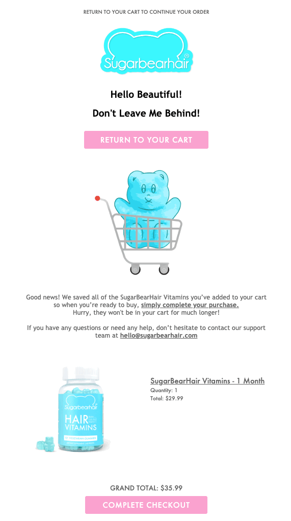
SugarBearHair’s abandoned cart email stands out from the crowd. With their use of playful graphics like an illustrated gif, the graphics hook people into their emails. The use of the color blue works well with the color of the gummies,making the contrasting pink CTA pop up even more.
The email copy feels like a friendly and delightful read. Moreover, customers have the option of reaching out to customer support up front, since the product claims health benefits.
9. Quip
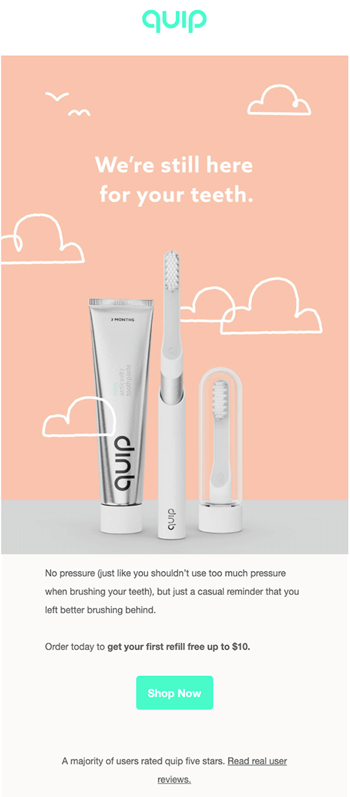
Quip’s abandoned cart email exudes simplicity and doesn’t seem overcrowded with marketing tactics that don’t align with the brand message. This shows their confidence in their product.
The email features a soothing and warm design, with the hand-drawn cloud elements adding a human touch. The copy doesn’t pressurize the customers to buy from them. By pointing out that the majority of their users rate them five stars is a clever way to reinforce the shopper’s trust in the brand. The CTA is eye-catching and calls out the customers to check out the brand.
Moreover, Quip adds a unique incentive with offering a free refill unlike a discount or coupon offered by other brands.
10. Casper
Casper, a wellness brand that specializes in sleep products, keeps their recovery email simple. They remind the shopper of the items that they have left behind in the first email, alongside multiple call to actions.
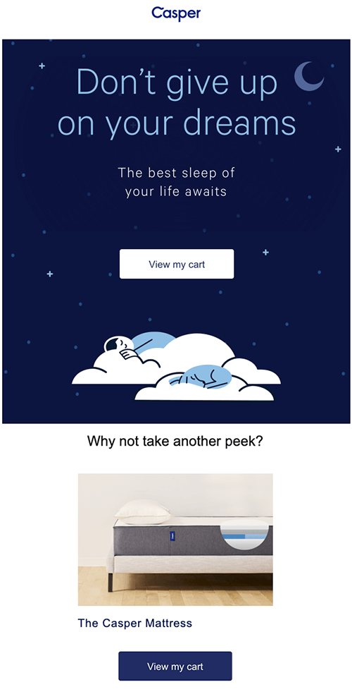
Twenty four hours later, Casper sends a follow-up email.
In their second email, Casper choses to rebuild the customer’s trust by showcasing its best reviews. Since shoppers trust reviews, this email attempts to address quality or customer satisfaction concerns that might be stopping the customer from completing their purchase.
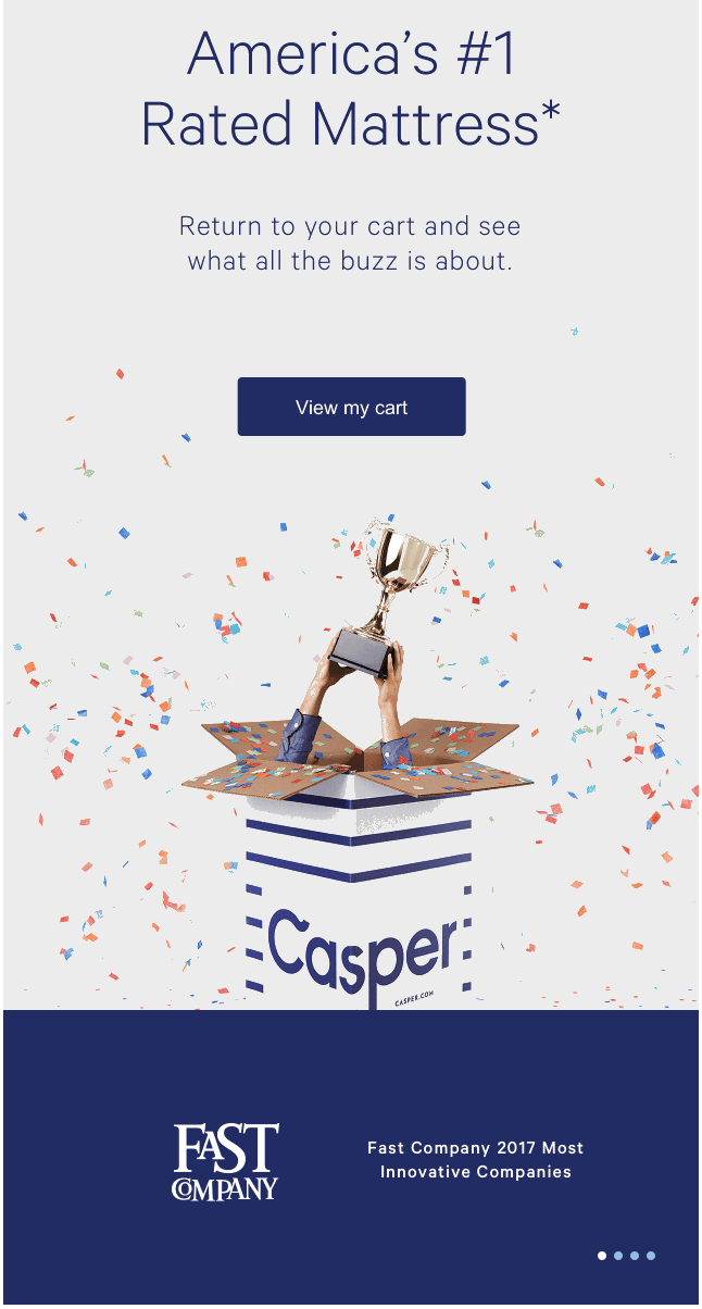
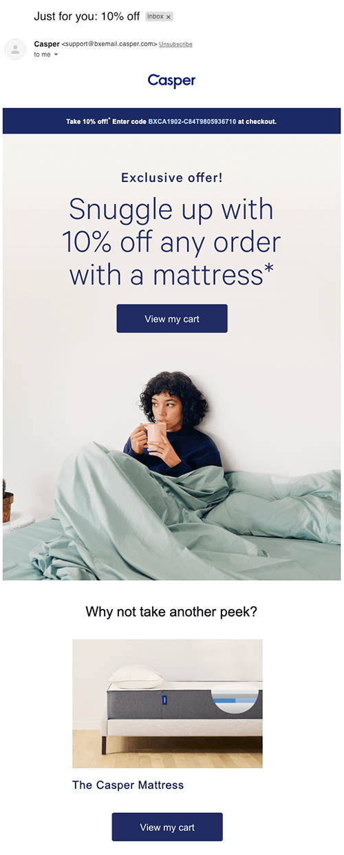
After another twenty-four hours, Casper sends their third and last email. Here they invite the customer to take one last look at what they left in their cart, choose a real person in their design to help the shopper visualize themselves as being cozy, and offer a discount incentive.
11. Grove Collaborative
Grove Collaborative’s cart recovery email conforms to a sleek and simple design and without being too pushy, gets straight to the point. They’ve created the email so that the abandoned cart products appear as their email’s main highlight and have provided multiple CTAs throughout the copy for easy engagement. Moreover, they’ve recommended some products at the end to nudge customers to get back to their site and potentially add more items to their cart. The promise of free shipping on the first order is the added incentive by the brand.

12. Boka
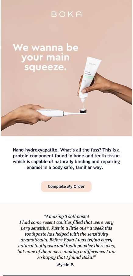
Boka, an oral care company, focuses on only 2 things in their cart recovery email: quality reassurance and social proof. The first part of the email deliberately mentions some scientific terminology to assure shoppers that their products contain elements which gives the brand extra credibility. This is a great way to remind the customer about the quality of the product, and not just the product itself.
In the second part of their email, they feature a real customer review within their cart abandonment email that focuses on what value the product brought in the customer’s life. Utilizing reviews from social media or onsite can help drive conversion, especially if your customers are shopping from competitors.
Wrapping up
Don’t let abandoned carts take away your revenue . Instead, take steps to win back your customer’s attention and help them make it through checkout.
Every eCommerce business is different. What works for one brand may not work for another. To recapture your lost carts and get people to open your abandoned cart email, experiment with different strategies, try a variety of subject lines and try various email formats with relevant messages to test what your prospective customers connect with.
We hope these examples serve as an inspiration to you and guide you in building an email campaign that will resonate well with your customers.

