The best cart recovery email examples for beauty and cosmetics brands.
Cart abandonment is one of the biggest issues faced by beauty and cosmetics ecommerce brands today. According to SaleCycle, 75.6% of shoppers add items to their online shopping cart but exit the store without completing their purchase.
That’s a HUGE potential revenue lost!
It’s not a surprise why so many companies are trying to bring back these customers and nudge them to complete their purchases. While brands can’t entirely eliminate cart abandonment, they can minimize the chances of it happening through cart abandonment recovery email campaigns.
Cart abandonment emails are one of the most effective channels to recapture a consumer’s interest in a product left behind. But only when strategized well.
To help you get a headstart on your cart recovery email strategy, we’re sharing some of the best cart recovery email examples from beauty and cosmetic brands in this article.
30 cart recovery email examples for beauty and cosmetics brands
1. Dollar Shave Club
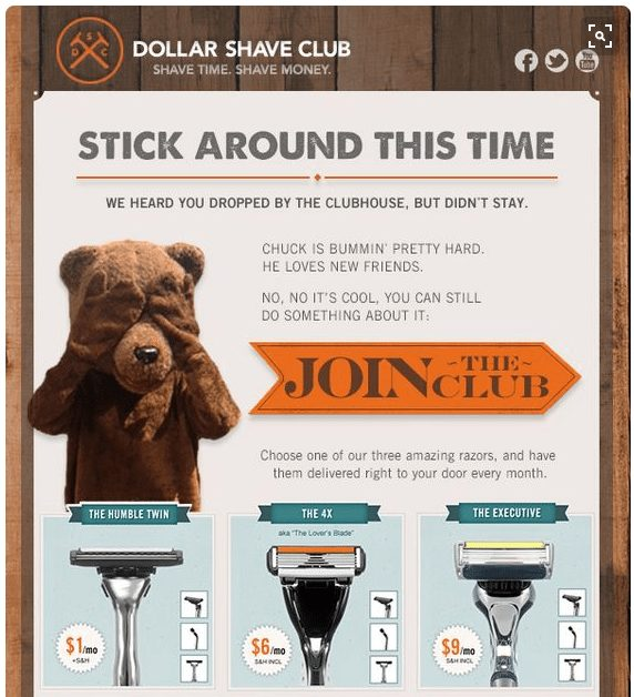
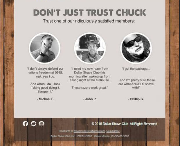
Known for its witty and personable marketing, Dollar Shave Club’s cart abandoned email series reflects its brand tone. The subject line “Stick around this time” is short and gives readers a reason to explore it further.
The image of the bear covering its eyes is intriguing and will encourage recipients to read the email. The email copy is written in an easy to read, laid-back language, which resonates with the company’s audience. Moreover, by introducing a “Don’t Just Trust Chuck” subhead, they are bringing in customer testimonials to gain back your trust.
2. Sephora
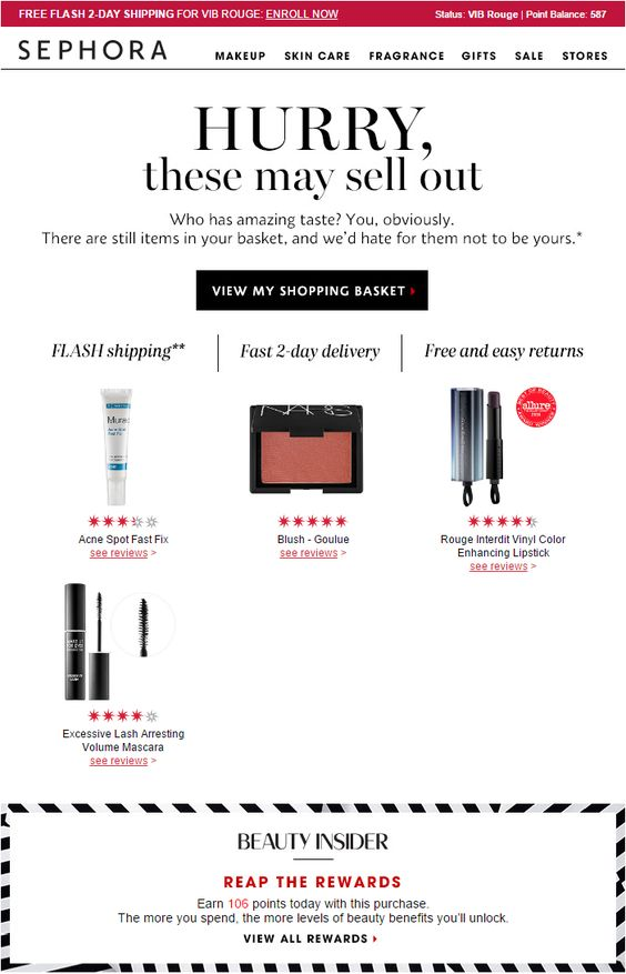
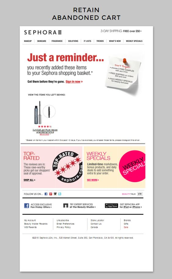
Sephora’s abandoned cart emails do everything right: call out with 3 reasons to shop, include star ratings, link to reviews, and include vibrant product images. In case the customer is still unable to decide, it has included links to top rated products and current deals in its two bottom banners.
3. Markwins Beauty Brands
Health and beauty retailer Markwins uses its abandonment emails as an opportunity for upselling. In this example, Markwins leverages dynamic delivery information to entice the shopper with free shipping when their total purchase value becomes greater than a certain amount. This tactic is used to increase the shopper’s cart value. 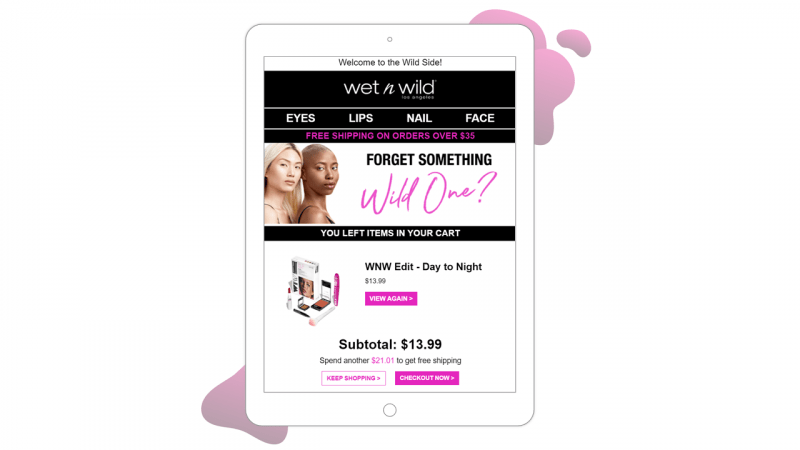
4. Glossier
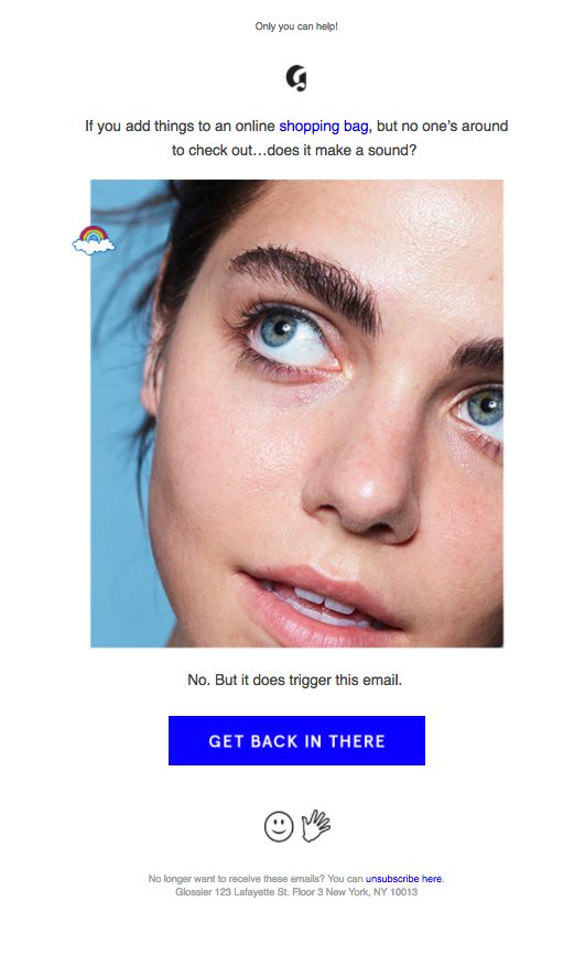
Glossier’s cart abandonment email is not your typical “Oops you forgot something” email that most brands send. Their email copy has a playful tone and they simply acknowledge that it’s a triggered email. They end with a clear call to action to “Get Back In There” and finish what you started.
5. Molton Brown
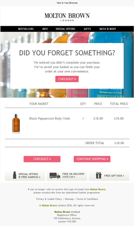
Molton Brown’s cart recovery email directly displays the shopper’s cart in the email itself and encourages the shopper to complete their purchase then and there. By highlighting the three benefits of shopping with the brand, Molten Brown manages to give an extra nudge to the email recipient.
6. Lime Crime
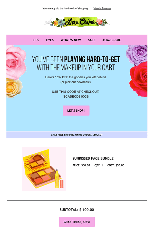
Lime Crime has worked out a great abandoned cart email. Its tagline “You’ve been playing hard to get” is unique and attention-grabbing. Coupled with the right colors, its copy and CTA aligns with the company’s branding whose tagline is “Makeup for Unicorns”. Lime Crime offers a discount in the third abandoned cart email. Another value incentive is the reminder that there’s free shipping over $50.
7. Lush
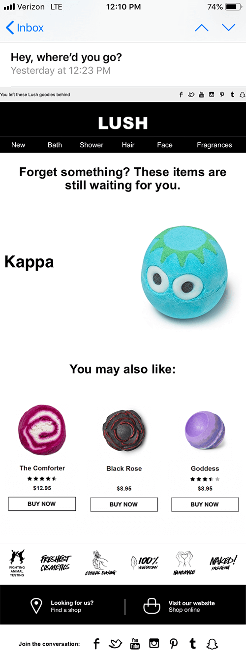
Lush’s abandoned cart email does a few things right: it’s easy to navigate and a great experience on mobile. It vividly showcases its cute bath bombs giving the customer something to think about what they are leaving behind.
8. Lorac Cosmetics
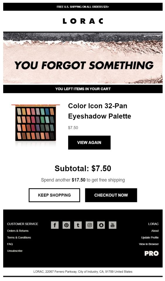
Lorac Cosmetics uses contrasting colors and highlighted CTAs to bring the viewer’s attention to the action it wants them to take: complete their purchase. Moreover, it attempts to increase the customer’s cart value by offering them free shipping when it reaches a certain amount.
9. Proactiv
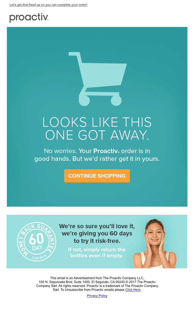
Proactiv’s cart recovery email features a clean and simple design (super on-brand!) coupled with great images and appropriate color scheme. The 60 day money back guarantee adds more incentive for the shopper to complete their purchase.
10. All Beauty
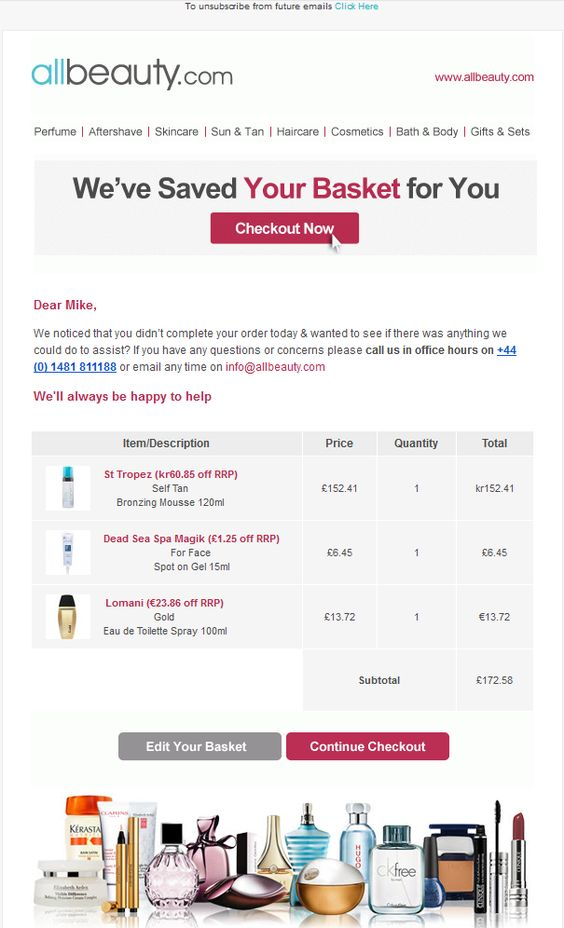
While All Beauty could use a more noteworthy headline, what makes its email good is the personalized touch they build by using the customer’s name and his exact cart info in their cart recovery email.
11. Birchbox

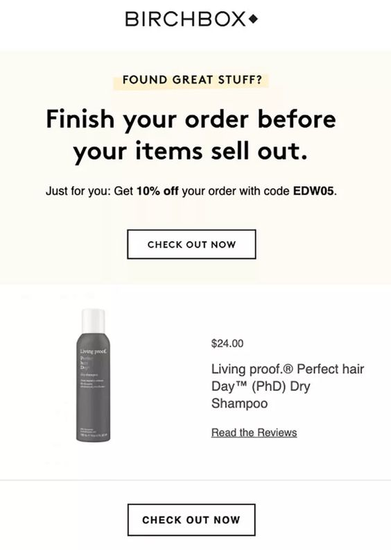
It’s no secret that people love freebies and offers. Birchbox uses discounts as an incentive for visitors who have abandoned their cart due to the cost of their order. Also, by reminding the viewer that their cart items are at risk of selling out if they don’t purchase now, the email includes scarcity and induces the fear of missing out (FOMO).
12. Beauty Bay
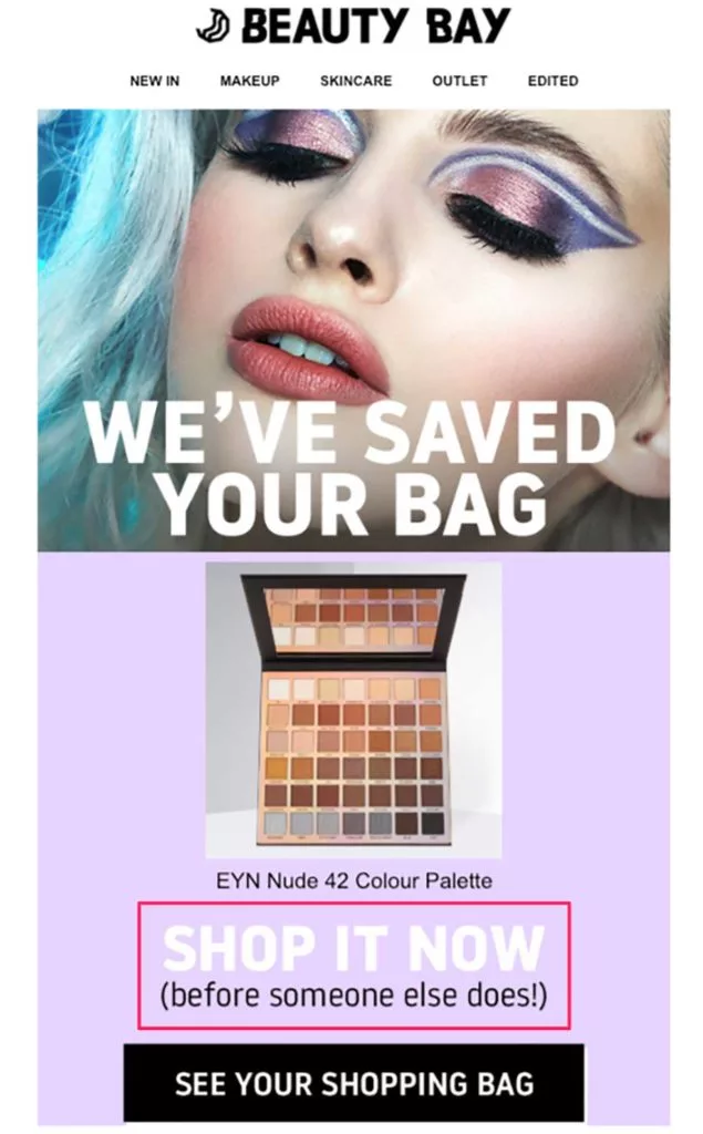
Creating scarcity is an effective psychological trigger for any marketing message and is often used in cart recovery emails. Letting your prospects know that they risk missing out on items in their cart invites them to complete their order.
For the same reason, Beauty Bay often uses scarcity in their cart recovery emails. Coupled with the right CTA, it’s cart recovery email is very effective and nudges the viewer to take action.
13. Beardbrand
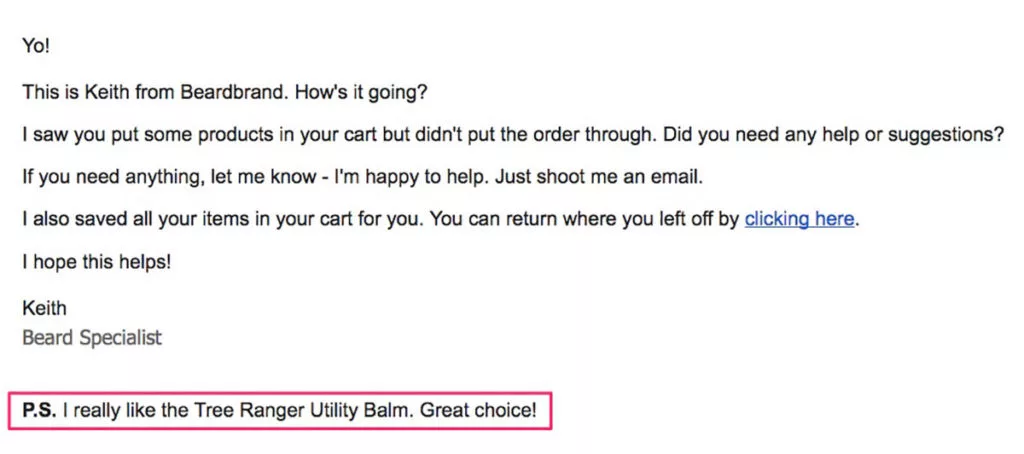
Beardbrand takes personalization at a whole other level. It’s abandoned cart email looks exactly like an email you would receive from a friend or colleague. Notice in the email how Keith reassures Sam that the product that’s left in his cart is a wonderful choice. Giving the visitor this ‘stamp of approval’ will get them excited to complete their purchase.
14. Tarte cosmetics
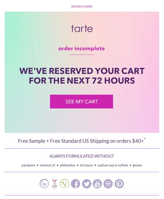
Tarte Cosmetics sends a cart abandonment email that makes clear that the shopper’s cart items are reserved for the next 72 hours. This sets the clock ticking and creates a sense of urgency by reminding the customer that they might lose on their cart items if they don’t return to the site.
15. Bluemercury
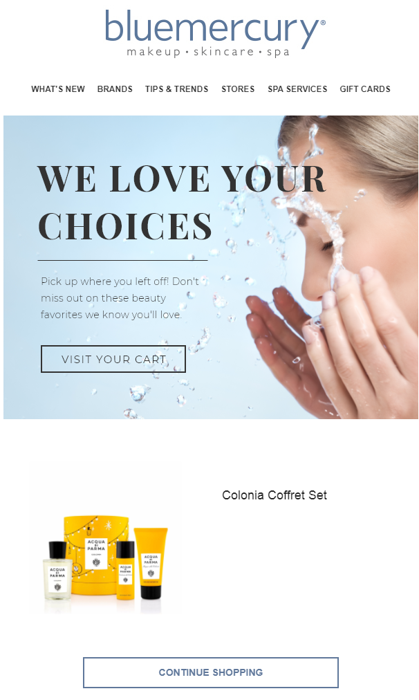
Bluemercury exemplifies that a little compliment goes a long way. And telling your visitors that their choice of products is good is a great marketing strategy to make them feel special. Its subject line: “You have great taste!” and the email copy “we love your choices” gets noticed straight away and brings a positive note to the email.
16. Camera Ready Cosmetics
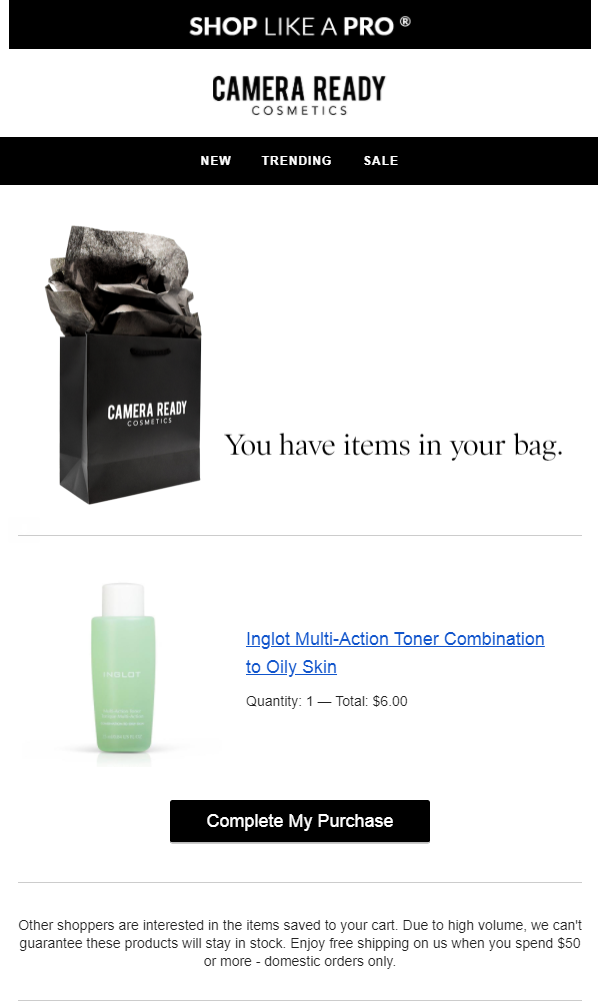
What’s great about this Camera Ready Cosmetics cart recovery email is how they add a sense of urgency not as part of the main body of the email but in the footnote, which makes it even more credible.
Building a sense of urgency in your abandoned cart email can do wonders for your conversion. If your customers believe that a product is available for a limited time only, or about to sell out, this can motivate them to take action.
17. Look Fabulous Forever
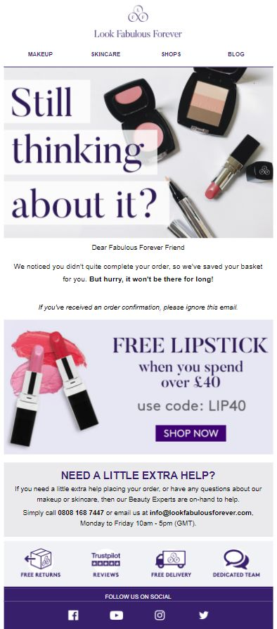
Look Fabulous Forever’s cart recovery email features product recommendations and an incentive of freebies when the shopper’s cart value reaches a particular value. It also plays around with building scarcity by reminding the viewer that the products may go out of stock quickly.
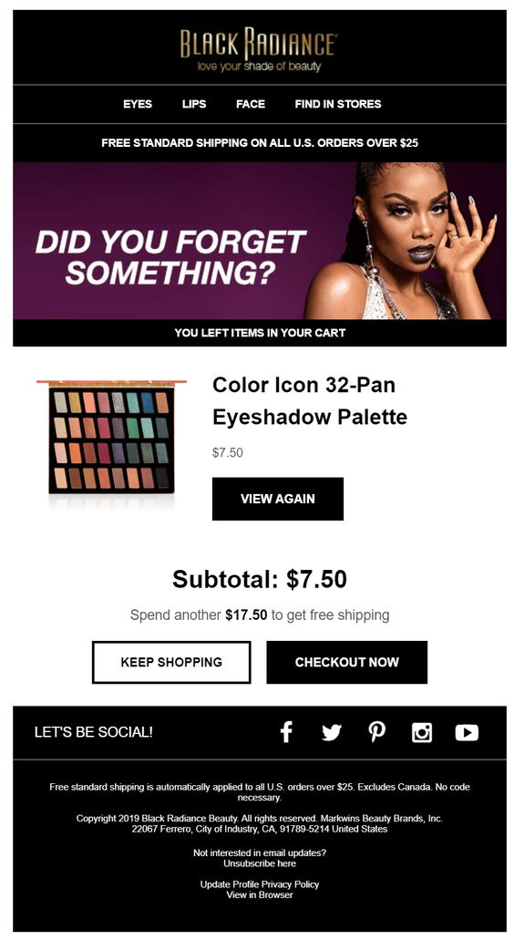
18. Black Radiance Makeup
Black radiance makeup’s cart recovery email uses a mix of eye-catching imagery, bright color schemes, and a free shipping incentive to get visitors to complete their purchase. We also like how the cart total is clearly mentioned within the email.
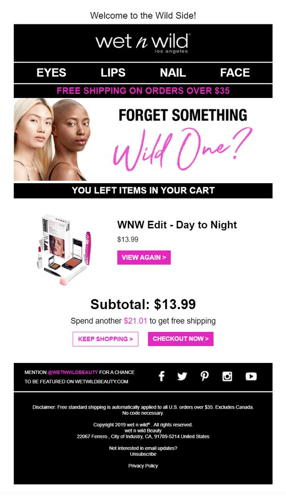
19. Wet n Wild
Wet n Wild sends a cart recovery email created with bright color schemes and concise copy letting you know the exact items left in your cart. The tagline “Forget something wild one?” evokes a sense of brand loyalty in the customer.
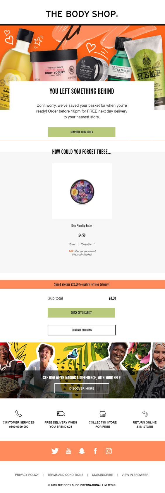
20. The Body Shop
The Body Shop’s cart recovery email is like a breath of fresh air: with the pastel color scheme, colorful imagery and minimal copy. The line “Order before 10pm…” creates urgency in the viewer’s mind as now they’ve got to respond within the time limit to avail said benefits.
But the aspect which most stands out in this email is the bottom section where the brand highlights the positive impact they are bringing in the lives of people. This makes the shopper believe in the brand as they feel associated with the philanthropic cause.
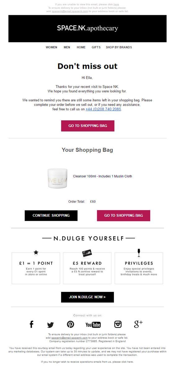
21. SpaceNK
SpaceNK works personalization into their cart recovery email by acknowledging the shopper’s site visit and gently reminds them that they left some items in their cart. The simple and minimalist design with the use of contrasting colors works great to get the cart items noticed immediately. SpaceNK also uses this opportunity to sway their shoppers into joining their membership by “Indulging themselves” and enjoy special privileges.
22. bareMinerals
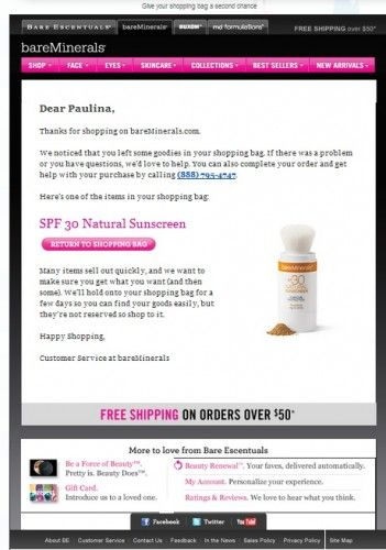
bareMinerals’ cart recovery email does a great job of reminding the customer that items may not stay in their cart forever and are quickly selling out. This creates an urgency to make the purchase lest they miss out on their favorite item.
23. Glossybox
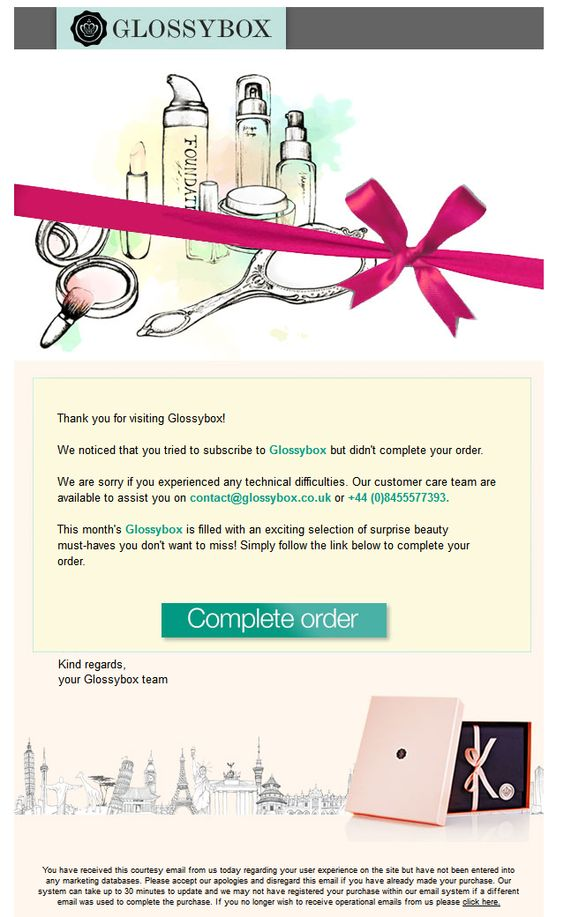
Glossybox’s cart recovery email uses a different approach. They focus solely on personalization making it seem like the brand is directly reaching out to you. Their copy has a warm and friendly tone, through which they apologize for any inconvenience faced and remind the customer of upcoming exciting offers to grab their interest.
24. Elf Cosmetics
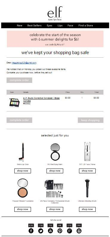
Short and sweet, Elf cosmetics’ abandoned cart email is to the point with the bare minimum elements: an introduction text “We’ve kept your shopping bag safe”, a call to action button text “Complete order”, and a section containing some selected recommendations. The subtle email ensures that the shopper doesn’t get distracted with unnecessary information and will focus on the action the brand wants: complete their purchase.
25. Bobbi Brown
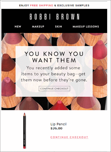
Bobbi Brown’s abandoned cart email is simple yet effective. But what’s notable is its multiple Call to Action (CTAs): they stand out visually, are offered at multiple places, and the clear messaging directs the viewer to take action. Bobbi Brown’s email has two CTAs: one at the top and next to each product with both CTAs styled as buttons (making it more clickable) having good active messages associated with them.
26. MAC Cosmetics
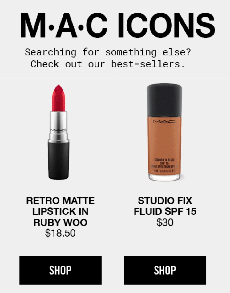
MAC cosmetics understands that there are multiple reasons why a customer might not go ahead with their purchase: a lack of time, the price doesn’t feel right, or the product itself isn’t right. And MAC incorporates this insight in their abandoned cart emails:
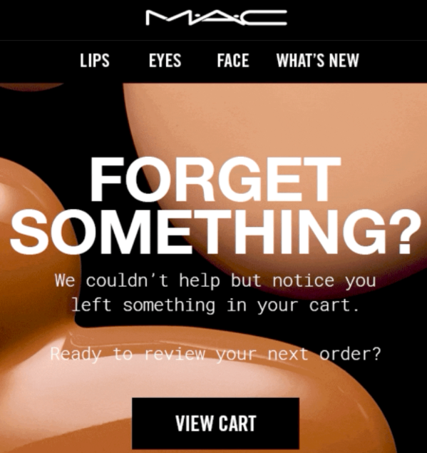
After asking if you forgot something behind, MAC invites the shopper to return to their site and view the cart items. Shortly after that , it shows its bestseller section just in case the shopper is unsure about the items in their cart and is“searching for something else,”.
![]()
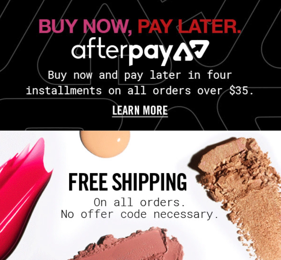
And finally, the company informs about free shipping and its payment option “Buy Now, Pay Later” to further encourage the shopper and remove any possible obstacles to purchase.
27. Esqido
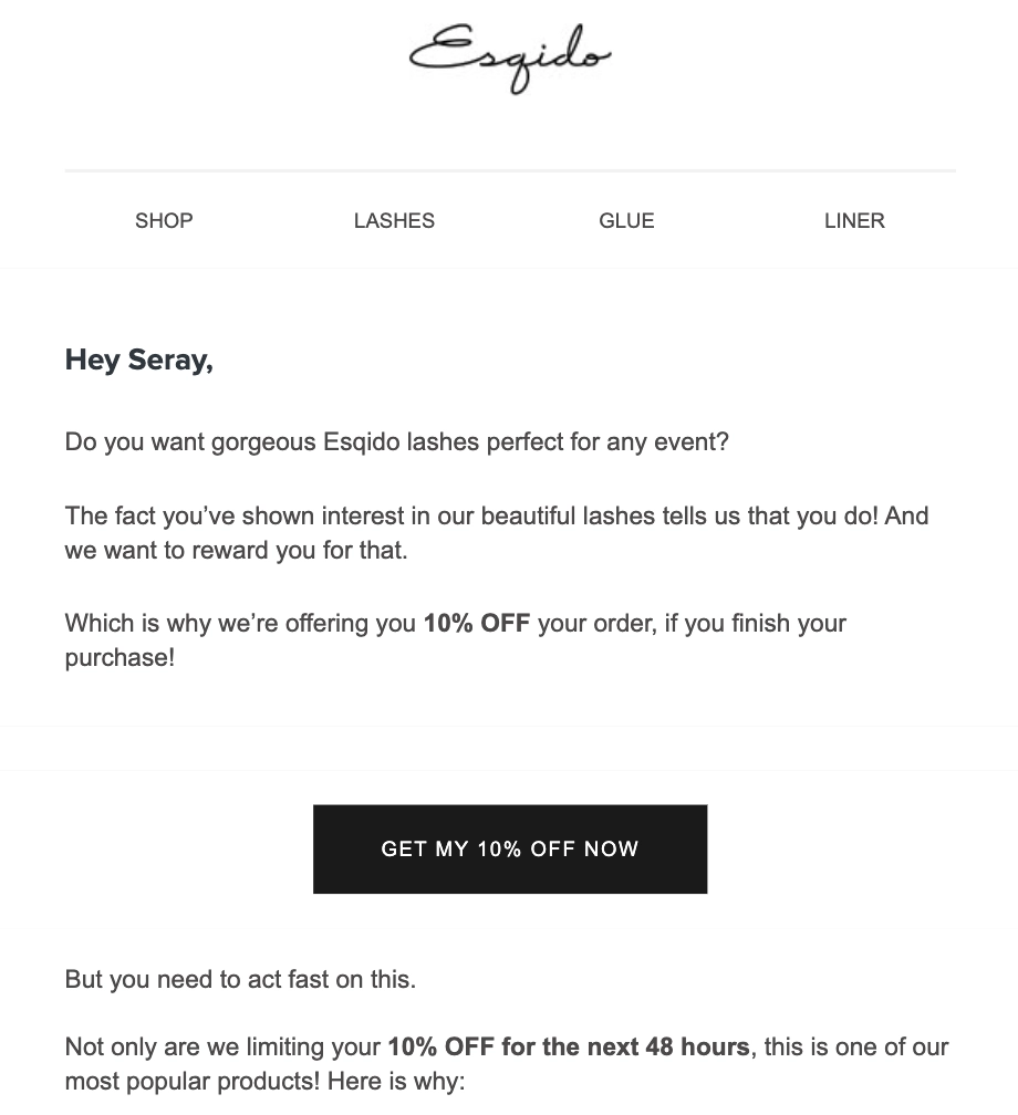
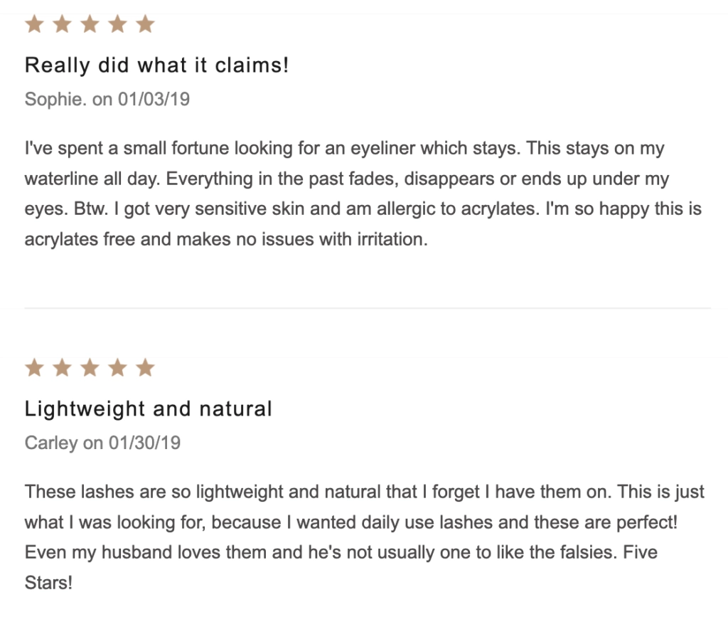
Esqido’s abandoned cart email feels like a personal letter by the brand to the shopper. The brand reignites the shopper’s lost interest by reminding the customer how much they want the product and why purchasing from Esqido can be a rewarding experience.
Moreover, the email then further incentivizes the viewer with a discount code and turns this incentive into a limited-time offer. Bounding any offer by time enhances its effectiveness and induces a FOMO in a shopper. To support their claims of popularity, Esquido infuses scarcity and inserts social proof by displaying some of its best customer reviews.
28. Kat Von D Beauty
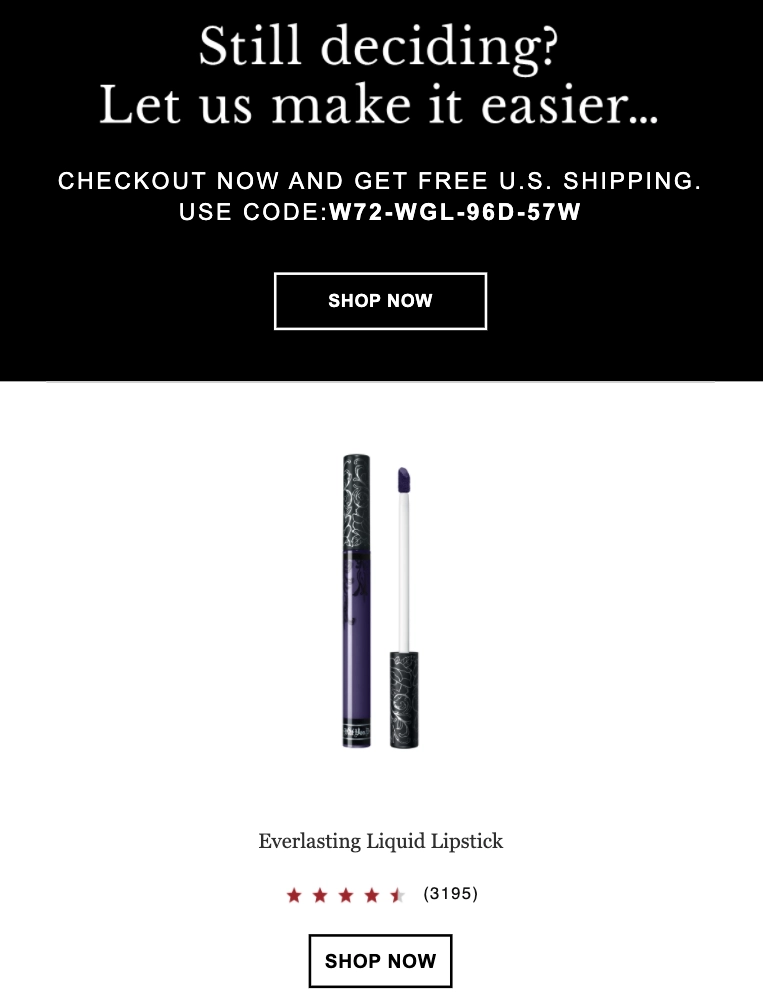
A lot of brands resort to discounts in their abandoned cart emails. However, discounts are a double-edged sword: while a discount code can help recover a few abandoned carts, it also decreases your product’s perceived value. Also, it gets customers habitual to a discount who may then start abandoning their cart on purpose.
Kat Von D’s cart abandonment emails work around this issue by offering an equally compelling alternative to discounts: Free Shipping.
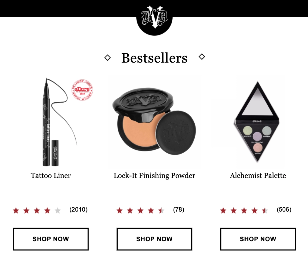
In the rest of the email, Kat Von D builds even more social proof by displaying its bestsellers (along with star rating and number of reviews):
29. Prose
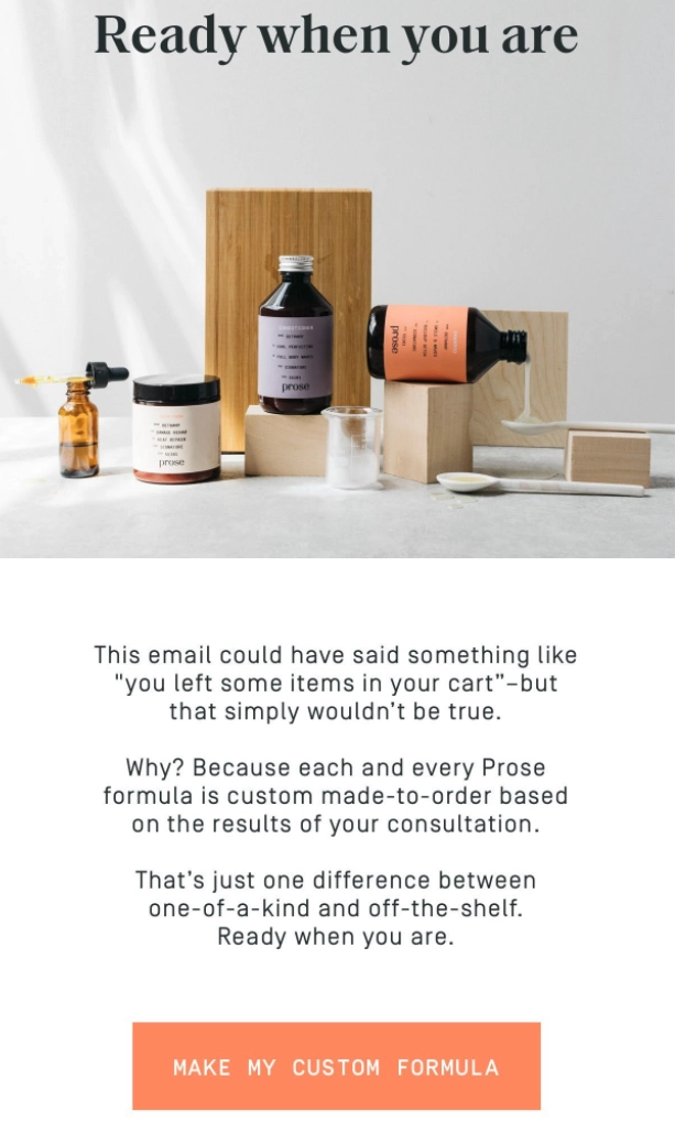
What if your brand sells products that can’t sit around in the shopping cart for days? Or can’t go out of stock? Items like fresh flowers, tailor-made dresses, software products or subscription boxes. While you can’t use the urgency trigger for these kinds of products, you can do something much better.
Check out this cart recovery email by the custom hair care brand, Prose. The brilliant copy emphasizes how every product is custom made after a consultation and the shopper shouldn’t miss out on it.
30. Rudy’s Barbershop
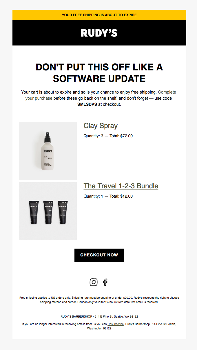
Rudy’s cart recovery email turns up the urgency factor a notch here, and it works. The email immediately catches your eye with its witty headline “Don’t put this off like a software update”. By letting the shopper know that their chance for free shipping is slipping away, they emphasize an urgent action.
Don’t let cart abandoners get away!
Now that we’ve shared a few of the best email examples from beauty and cosmetic brands who are successfully winning over their customers, it’s time for you to build strategic email campaigns to reclaim your lost revenue from abandoned carts.
There can be many different ways of writing and sending noteworthy cart recovery emails. While your angle and copy tone depends heavily on your brand and your audience, don’t be afraid to experiment with a little humor in your emails. And if you don’t want to sound too salesy, dial down on urgency and scarcity.
Finally, think of all the reasons why a customer might abandon their cart in your store and try giving solutions to as many as you can.
When it comes to email marketing, there’s no one size fits all formula that’ll work for every brand. Therefore, we advise you to experiment with your strategy and see what works best for your brand and audience using data as your guiding light.

