Get all the cart recovery email examples for fashion and apparel brands in this article.
More than 70% of your shoppers will abandon carts at checkout and, unfortunately, this is a number that has slowly been increasing in recent years owing to the number of businesses going online with similar products and services.
But there is still a way to bring back some of these lost customers – abandoned cart recovery emails.
Although an effective abandoned cart email strategy is no longer about sending a reminder about the product left behind, it’s about re-engaging the buyer’s interest and guiding them towards making the purchase.
To give you a head start, we’ve curated some of the best abandoned cart recovery email examples and templates for fashion and apparel brands to recover lost sales.
Abandoned cart recovery email examples for fashion and apparel (templates)
1. QC cart recovery email

By informing customers that the product is selling fast, the shoe brand here has created urgency around the item left behind. This nudges the buyer ever-so-subtly to come back and complete the purchase fast.
What works?
- Using a scarcity effect to compel customers to take action quickly
- Offering free shipping to provide an additional purchase motivation
- Listing recently viewed items to give them more options
2. Stetson abandoned cart email

Stetson does a great job with copy assuming the shopper still wants the product. The email is short and straightforward to ensure that cart abandoners are not overwhelmed with too much information or choices, keeping the visual of the item up, front and centre.
What works?
- The message is simple and direct
- Using the visual to remind customers about the product
- Setting a limit for free shipping so they spend more to avail it
3. Le Tote

Le Tote addresses a customer’s pain point or concern upfront in their cart recovery email. They keep their core message at the center of the visual to instantly grab the recipient’s attention, drawing them to take action on what they were ‘thinking’ about.
What works?
- Stressing on the customer pain point and addressing it
- Very intriguing and clear CTA wording to drive an action
- Including their tagline to reinforce the message
4. Homage cart recovery email

By using a time limit, Homage creates a sense of urgency in their cart recovery emails. Also, the red call to action button calls out the recipient almost instantly. But the good thing is that they also take into account the possibility that the consumer may have made the purchase already.
What works?
- Assuring customers that their cart is safe but only for a very limited time will definitely create urgency
- Keeping the CTA button clear and distinct in the design
- Recommending other products to nudge a visit to the store
5. 7 for all mankind recovery em

The clothing brand has kept the message short, sweet, and to the point. By offering 15% off as an incentive right at the opening of the cart recovery email, they instantly engage the lost customer’s interest to seal the deal.
What works?
- Offering an incentive up front to motivate a purchase
- Reminding the buyer of the other items viewed
- Keeping the CTA text actionable
- Using visuals to recall their interest
6. Uniqlo abandoned cart recovery email
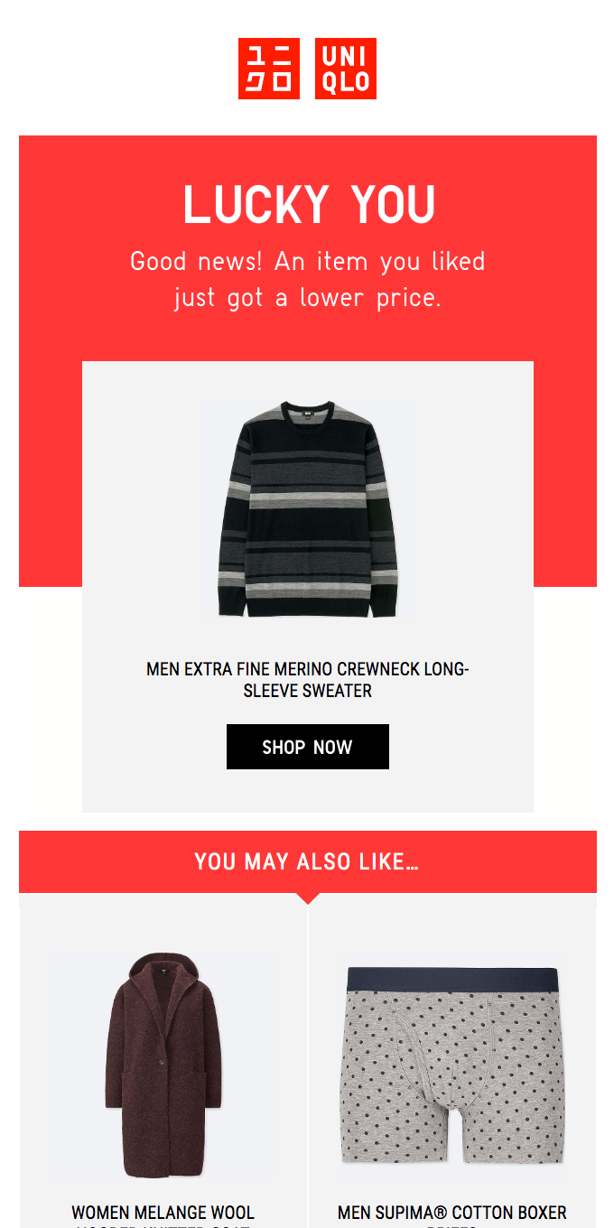
The friendly tone in this email would delight you to no bounds. UNIQLO has used the pricing strategy to entice cart abandoners. The brand also uses visuals along with exact product names to boost recall.
What works?
- Attracting customers by using a catchy headline such as “Lucky You”
- Using the pricing strategy to entice consumer interest
- Showing the image of the product and exact product name
- Listing other alternatives based on their preferences
7. GILT abandoned cart email

GILT uses scarcity to entice the cart abandoner back to the store. Their message right at the opening of the email is a psychological trigger, followed by visuals of the product left behind alongside personalized product recommendations.
What works?
- Using scarcity to create FOMO
- Using images so there’s no confusion about the items left behind
- Displaying other variants available as product recommendations
8. TOPO abandoned cart email

This email is a great example of creating a strong brand recall. The headline used by Topo designs is a kick starter. The message used for 10% off is also simple and sweet with zero marketing fluff.
What works?
- Sending a single use coupon is a great way to close the deal
- The reminder that there’s free shipping is another value incentive
- Using color contrast to make the offer and CTA stand out
9. Thousand Fell cart recovery email

The shoe store has started the message on the right note, which would be difficult to ignore – a discount on the cart total! No excessive information is used here to prevent cart abandoners from getting further overwhelmed by choices. They too use color contrast in sync with their branding to highlight the offer as well as the call to action.
What works?
- Using a push button for coupon code works like a psychological sales trigger
- The message here is clear, supported with visuals
- Color contrast draws attention to the core aspects of the reminder
10. Cotopaxi email to recover abandoned carts

This email by Cotopaxi has a lot of elements that a perfect cart abandonment email should have — clear CTA, perfect copy, the right tone with personalization. They also call the saved cart ‘yours’ to nudge the abandoner into feeling the product is already theirs.
What works?
- Creating urgency without losing the creative element by using text like “Going, gone”
- Using a contrasting colour with the help of visuals
- Including a second CTA that leads to the product page
11. J.Crew cart recovery email

The choice of copy to capture the attention of users is perfect. J.Crew starts off by instantly assuming that the buyer may have ‘forgotten’ to make the purchase instead of having lost interest.
What works?
- Using a product image to remind customers about the items in the cart
- Offering additional options to nudge another visit to the store
- Simple design that looks similar to their storefront design
12. Pacsun abandoned cart recovery email
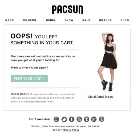
The tone of reminder used by Pacsum in this email is very optimistic. Instead of checking whether customers need the product or not, the brand simply connects with them using “you left something”, making them reconsider the purchase.
What works?
- Alerting consumers who may have forgotten to check out
- Customers are enticed to act by establishing a sense of urgency
- Dropping your phone number and email address removes communication barriers like pre-purchase anxiety
13. Big Brown Bag

If there has to be an email with a strong brand recall, Big Brown Bag does it well. The tone used in this email tries to build a connection with customers at a personal level. Their email design is also a replica of their storefront, giving a similar shopping experience in the inbox.
What works?
- Clearly stating the email’s purpose
- Using visuals to reinforce customer decisions and make a visual impact
- Customers are informed about “free shipping” on orders in order to make the cart look more attractive!
14. Bonobos cart recovery email
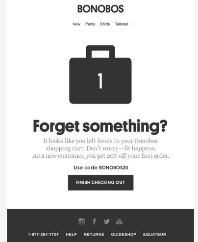
Bonobos has used the visual of a bag to show the number of items in the cart. The copy is crisp, clear and to the point. Everything about this email is minimalistic and simple yet so impactful to nudge a buyer to reconsider what they have left behind.
What works?
- The template is simple and minimalistic, with just the items in the cart mentioned
- The visual is also appropriate for the goods being sold on the site
- A promo code is added to boost the odds of sales with a purchase motivation
15. Madewell cart recovery email

The eCommerce brand, Madewell, has played well with words. We love the way the brand has used the opening sentence “These look good in your bag” as a great reminder and then added the subheading kicker as “but they would look even better on you.”
What works?
- Assuring customers that the product is a good choice that they should try
- A GREAT copy that would make anyone smile!
- Keeping the call to action/ objective of the email clear with the CTA “Shop Now”
16. Puma abandoned cart email

Each element in this email template is intriguing. Puma outperforms every other brand in terms of creativity and uniqueness and they haven’t forgotten to do the same with their cart abandonment emails.
What works?
- Establishing a friendly relationship with customers in the beginning
- Not being salesy but also using a scarcity effect to create urgency
- Adding a sleek design to the email with the right placement of each element to match their branding
- Using color contrast to highlight the CTA
17. Mango cart recovery email

Instead of directing customers to the store, MANGO has tried offering a checkout option directly in the email by replicating the interface of the cart page. The clothing brand has added an image of the product, price, and cart total to minimize customer efforts at recalling what they left behind.
What works?
- Excellent copywriting, a simple CTA, to provide cart information and keep customers updated
- By integrating a checkout page in your email, you may save your customers time and effort
- Keeping the email design color in sync with the brand
18. Nordstrom abandoned cart email

The brand knew that the copy might be a little overwhelming, so they tried balancing it with different fonts. Nordstrom has linked the FAQ section to address customer queries, and multiple CTA’s encourage customers to take action on what they’ve left behind.
What works?
- Checking with the customers if they need the product or not
- Redirecting them to the cart directly
- Linking FAQ section to help them find answers to their queries
- Using a contrast colour to highlight the benefits
- Keeping purchase motivations like free shipping and free returns highlighted
19. ASOS cartrecovery email

If you have to learn to add brand recognition to your emails, no one does better than ASOS. This cart recovery email looks similar to their homepage to offer a more frictionless shopping experience to their buyers. .
What works?
- The email template looks like a store page
- Simple and intuitive design
- Clear CTA to help customers where to click
- Highlighting benefits like ‘free delivery’ to encourage customers to take action
- Addressing purchase anxiety with the ‘easy returns’ message
20. Moschino cart recovery email

The clothing brand understands its buyer’s persona, which is reflected in this email. Moschino stands out with its on-brand, luxury-themed graphics in their cart recovery email keeping things as classy as on the storefront.
What works?
- A simple design to make the message clear
- Mentioning the cart details to help customers quickly make up their mind
- Offering checkout option in the email itself
- Addressing purchase anxiety by sharing secure payments and easy returns information
21. Dote abandoned cart email

Dote’s cart recovery email replicates the interface of the cart the consumer has left the product behind in. They also keep the email minimal, focusing on the product, the cart total and color contrast to highlight the desired call to action.
What works?
- Adding humour to re-engage the consumer
- List down the items in the cart for a quick recall
- Using color contrast to highlight the call to action
- Including contact information to offer help in making the purchase
22. Columbia abandoned cart email

The brand has used a price drop strategy to re-engage the cart abandoner’s interest in the product left behind. The clothing brand also includes personalized product recommendations to nudge another visit to the storefront.
What works?
- Increasing the chance of sales by mentioning price drop
- Nudging them to check other relevant items and deals
- Highlighting the benefit of “free shipping” for placing an order now
23. Adidas abandoned cart email

The sports fashion, apparel and footwear brand uses a touch of humor in its copy to re-engage the cart abandoner’s interest. Who doesn’t have wifi problems, for instance! They also include social proof in their abandoned cart email to address buyer doubts.
What works?
- Excellent template with great opening line and clear CTA
- Humor in the copy as per their target audience
- Opening both the options for customers either to shop or customize the product they like
- Adding customer reviews to increase the chances of conversion
24. Target abandoned cart email
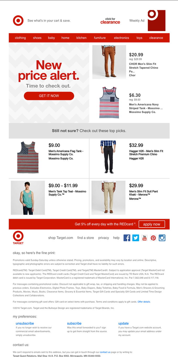
Target’s abandoned cart email has tried creating the impression that customers are getting the most out of their money. This encourages customers not only to purchase what’s in their cart but add other items as well that match their interests and purchase preferences.
What works?
- Mentioning price drop so that customers are encouraged to reconsider the purchase
- Listing additional products as recommendations to encourage another visit
- Including purchase related information as fine print to address queries and concerns upfront
25. Asics Tiger abandoned cart email
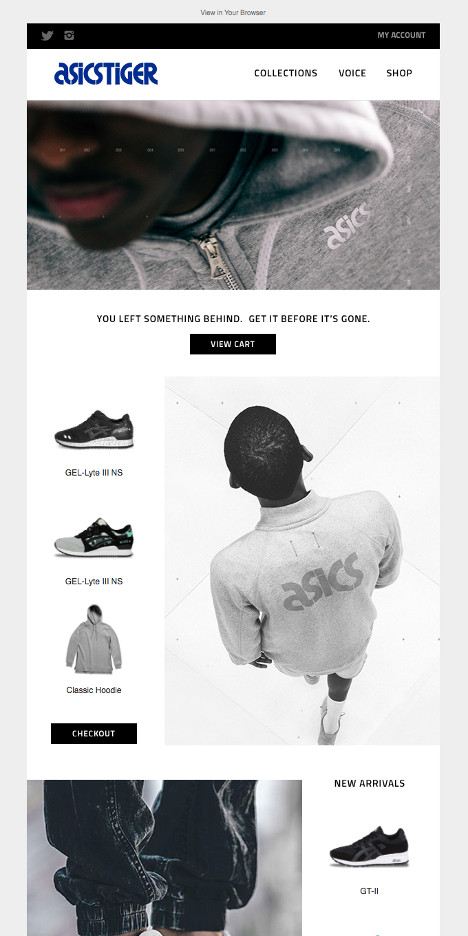
The fashion, apparel and shoe brand creates a sense of urgency using smart copy – “get it before it’s gone.” The brand uses a clutter-free layout to promote visuals of the items left behind, alongside other recommendations like ‘new arrivals’ in the email.
What works?
- Offering customers an experience similar to the online store
- Customers can directly checkout from here and keep an eye on new arrivals
- Including two similar call to actions – View Cart and Checkout (appealing to consumer psychology of wanting to make a purchase instantly or just reconsidering the items)
26. MCM cart recovery email
The first fold of the cart recovery email of MCM keeps the focus on the items left behind. They include visuals of the same product names as well as the pricing of each and the cart total, leading the buyer back to complete the purchase. They use the remaining part of the email to make product recommendations based on the items in the cart.
What works?
- Creating visual recall to remind customers what items they added to the cart
- Offering them the option to checkout directly from the email
- Including personalized product recommendations to nudge a micro-conversion (visit to the store)
27. Public Rec abandoned cart email

The email copy used by Public Rec looks like it’s trying to help customers with words like “Take another look.” The benefits or purchase motivations – free shipping and free returns are highlighted in the beginning to improve the chances of conversion.
What works?
- Distraction free template with focus on benefits—free shipping and return
- Offering comfort to directly checkout from the page
- Keeping the product visual at the center of the email
- One clear CTA button with actionable copy
28. Asics cart recovery email
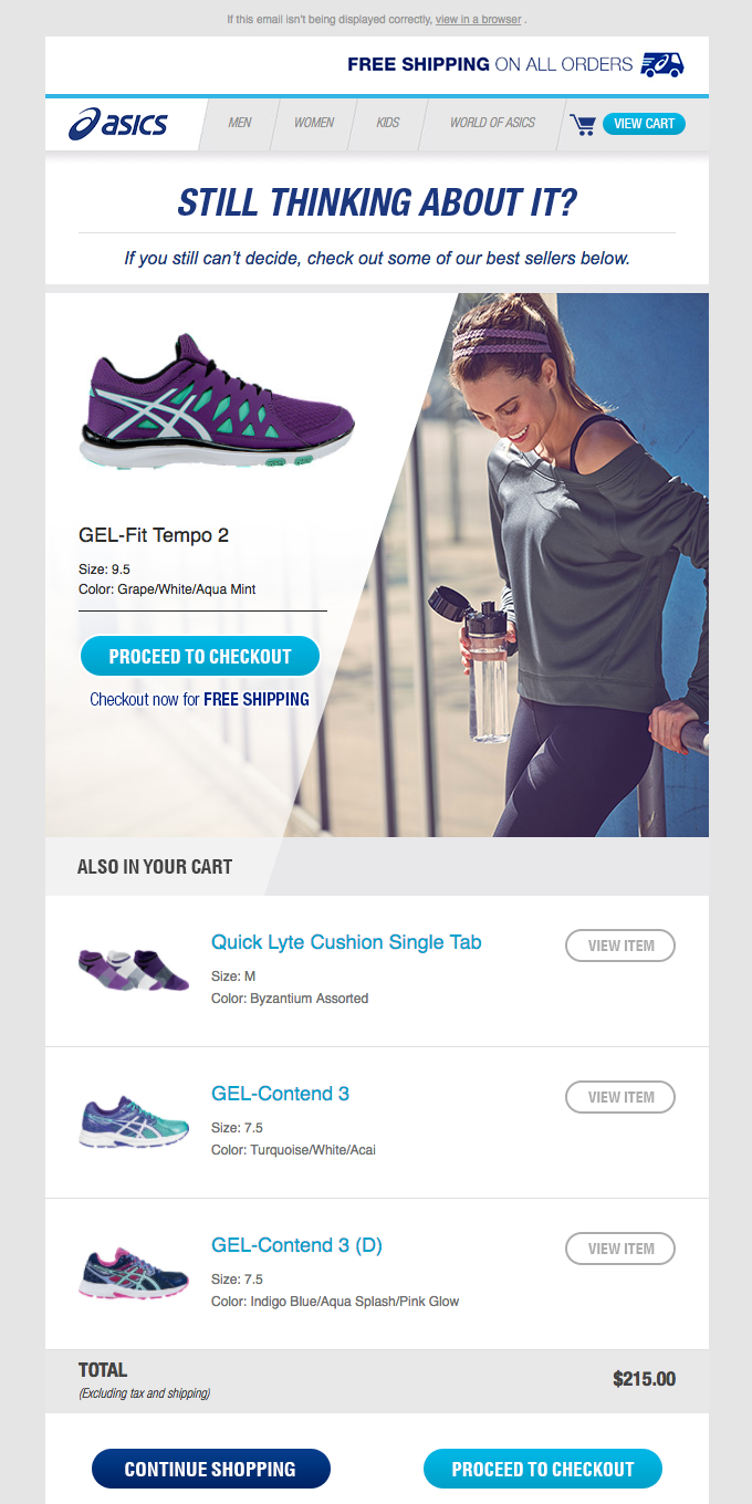
This cart abandonment email by Basics is a perfect illustration of asking customers if they are still looking for the product. They also use multiple call to actions across the email design template to nudge an action based on the browsing pattern of the recipient.
What works?
- Using friendly and conversational tone to build connection
- Including product visuals of the items left behind in the cart
- Offering purchase motivation like free shipping to increase chances of checkout
29. Everlane abandoned cart email

Everlane has used a witty copy to entice customers to complete their purchase by reassuring them of their taste! Who doesn’t like a little nod on their choices? It also includes a list of reasons to purchase the product left behind to make the cart abandoner reconsider the purchase.
What works?
- A clean email design
- A detailed brief about the product to quell any doubts about the item selected
- A witty, eye-grabbing copy that is appreciated by one and all
30. J.Crew Factory cart recovery email

J.crew Factory has added visuals of the product to remind customers about the items in the cart. The clothing brand has offered other buying options as CTA , i.e, new arrivals and what to wear to encourage another visit to the store.
What works?
- Creative copy to encourage the purchase
- Added image of the product to help the customer recall that the item left behind
- Offering alternate options so customers can check out more products from the store
- Color contrast to highlight different aspects of the email
Is your abandoned cart recovery email ready?
Now that you’ve armed yourself with the 30 finest cart abandonment email examples, use them as templates for yours and put them to use.
The open rate of abandoned cart emails is 45% when strategized in the right way. That’s where data comes into play. Use your consumer behavior and how they interact with your cart recovery emails to optimize your strategy further.
Ready to put these cart recovery examples to work? Book a demo with us to see how you can use real-time data to optimize the cart recovery emails of your fashion and apparel brand.

