Learn from the best of cart recovery emails examples to recover your lost sales.
Is your online electronics store constantly facing the dilemma of overcoming abandoned carts?
Cart abandonment is a major problem among eCommerce store owners. On an average, in 2021, 75.52 percent of customers added items to their cart but never completed their purchase. Making 3 out of every 4 shoppers cart abandoners.
However, there is a massive opportunity to recover revenue from these abandoned carts.
How? Sending out abandoned cart emails!

A cart abandonment email retargets customers who displayed an intent to make a purchase but did not complete their checkout process. It’s designed to remind the customer who is having second thoughts about their purchase that they are missing out on a great product and attempts to lure them back to their cart through discounts and offers.
Abandoned cart emails are one of the most effective sales recovery mechanisms to reclaim lost revenue and turn an almost prospect into a brand enthusiast. According to a 2021 study done on the performance of abandoned cart emails, it was found that the average conversion rate for shopping cart abandonment emails in 2021 is 18.64%.
What makes them so effective is that without sounding too salesy, these emails manage to induce FOMO in a customer’s mind, thereby increasing the brand’s chances of sale by 64% – but only when strategized right.
In this blog, we are sharing some of the best cart recovery email examples from online electronics stores, and what they got right to drive more conversions.
Cart recovery examples for online electronics stores
1. Google Store
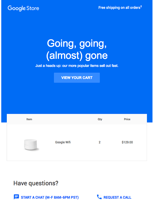
Google store’s cart recovery email does a great job at alerting potential customers that their products are in high demand and they might lose the items they’ve added to their cart. The message induces the scarcity effect as a marketing tactic.
They even clearly lay out the multiple ways to reach out to customer support along with the hours they’re available. A simple design portrays the Google store as a high-quality brand in people’s minds.
2. Jessops
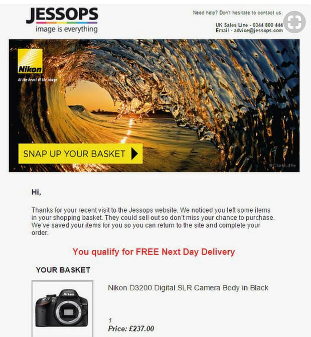
Jessops’ cart abandonment email plays around with email copywriting brilliantly. While the email includes a lot of product images and descriptions, its call to action button reads out an unusual wording: “Snap up your basket.”, as the store sells electronics items catering to photography and videography.
The email features an eye-catching photograph to grab the customer’s attention on first look. It offers an extra incentive for the customer to buy from them: free next-day delivery. And it provides clear communications channels with email and phone numbers for reaching out.
3. Dyson
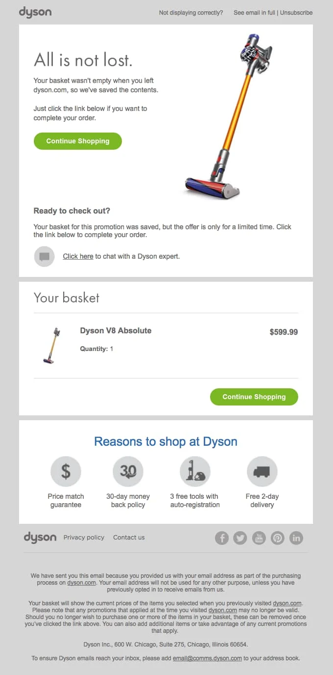
Dyson’s cart recovery email consists of the right elements and uses clear text coupled with a clean design, thereby making it easy and fun to read. By using positive phrases like “All is not lost” and “We saved the contents”, Dyson tries to sound helpful.
The email displays the image of the product and lists items still sitting in the customer’s cart. They induce a sense of urgency by adding “Your basket for this promotion is saved but the offer is valid for a limited time only”, making the offer time-sensitive. The two CTA buttons allow customers to view one even while scrolling on mobile and offer a way to complete their purchase at every touchpoint.
4. Drop
Drop‘s cart recovery email is a great example because of its interplay of images and good copywriting. The bolded text “ends in 19 days” builds an air of urgency. After including a CTA, Drop displays other items the customer might be interested in based on what’s in their cart. This is a good strategy to increase a customer’s order value by getting them back on the site browsing for more items they might require.

5. Moment
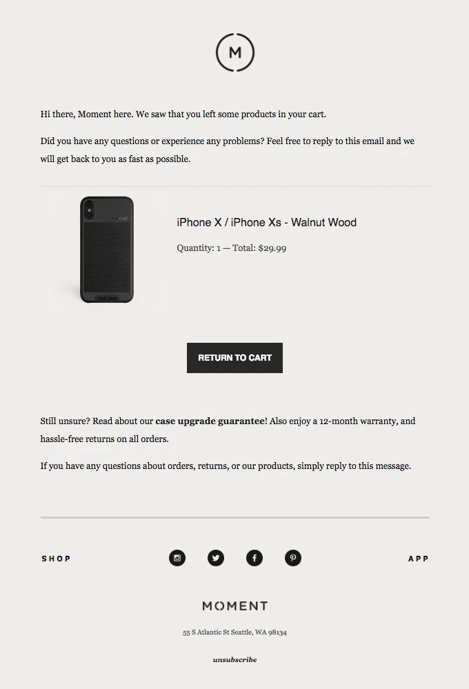
Moment packs a variety of assurances and incentives into its cart recovery email. It attempts to resolve any issues the shopper might have that impedes them to make the final purchase.
After displaying the cart items and a clear CTA to resume purchase, the copy saying “Still unsure? Read about our case upgrade guarantee. Also, enjoy a 12-month warranty and hassle-free returns on all orders.” tries to build trust in the customer’s mind by promising easy returns and quality assurance. The added incentive of an upgrade encourages them to shop with Moment.
6. Nomad
While your e-commerce site might be optimized to boost conversions, there will always be some customers who will not complete their purchase. Nomad plays on this in its cart recovery email to recapture its lost sales.
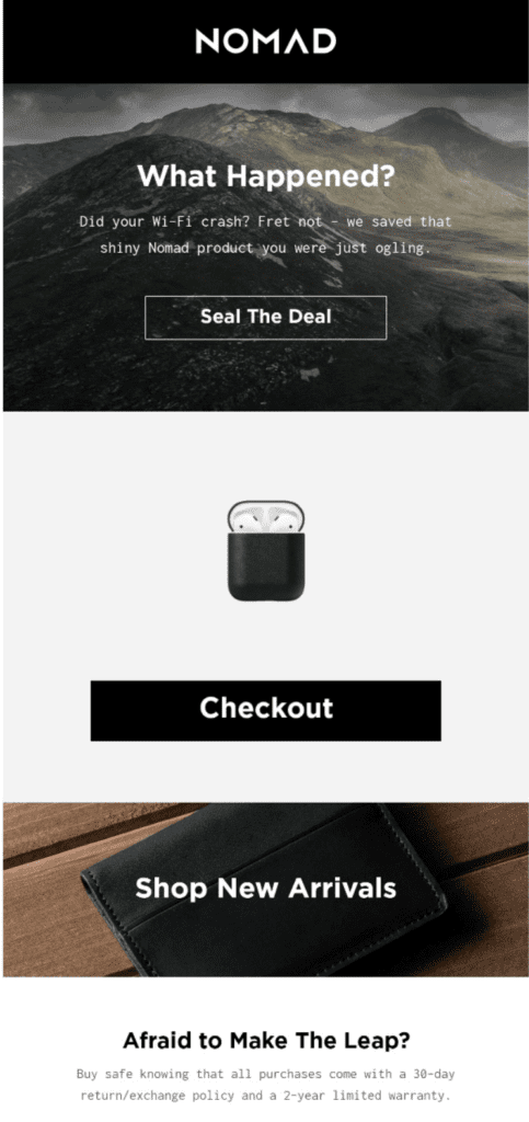
Nomad’s cart abandonment email uses playful copy to hook the readers onto its message. By asking “What happened? Did your Wifi Crash”, it playfully acknowledges the many reasons shoppers may have to abandon their cart. Later by telling the reader that they’ve “saved that shiny Nomad product they were just ogling”, they attempt to casually sway the shopper to complete the purchase.
The last leg of the email displays an assurance of a 30 days return/exchange and a 2-year warranty.
7. Amazon
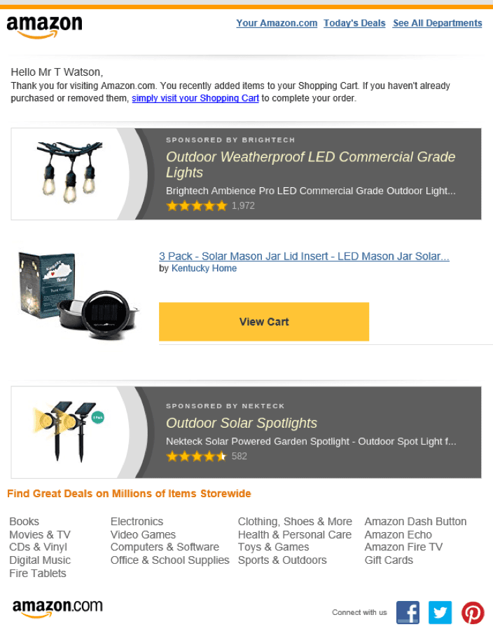
Amazon’s cart recovery email simply displays the shoppers items sitting in their cart and prompts them to complete their purchase. In addition, it also advertises related products from similar categories that are likely to entice the customer to increase his/her order value.
8. HHGreg
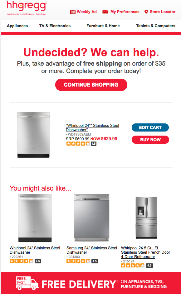
HHGreg’s cart recovery email uses simple and minimal copy to encourage the shopper to complete their order. The headline “Undecided? We can help” relies on the fact that shoppers often doublethink their electronic purchases and look for better alternatives. The promise of free shipping on the order coupled with some similar category alternatives displayed by the brand attempts to help the shopper come to a purchase decision quickly.
9. Target
Target works personalization into their abandoned cart email. By observing what items the shopper has been “looking at” but not buying, Target tries to incentivize with attractive deals and promises of savings. Moreover, the “Save now” CTA is cleverly created to make the shopper think they are getting a great deal on their purchase.

10. PEEL
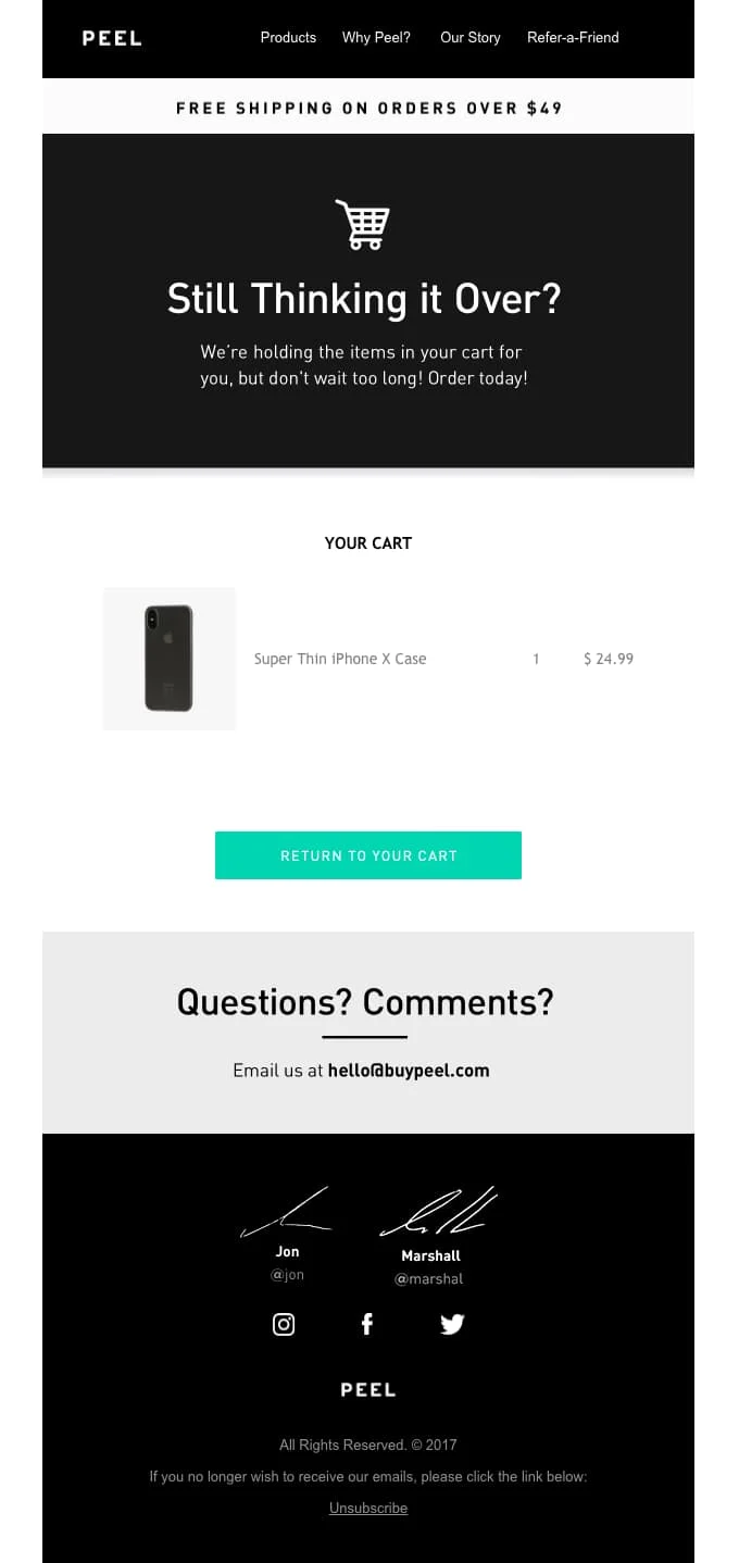
Peel’s email is a classic layout of a cart abandonment email: intro tagline, cart items, call to action, contact information and a footer. It is designed to not only encourage customers to complete the purchase of items already in their cart but also adds an incentive for buyers to add more items to their cart before checkout
with the free shipping offer.
11. eBay
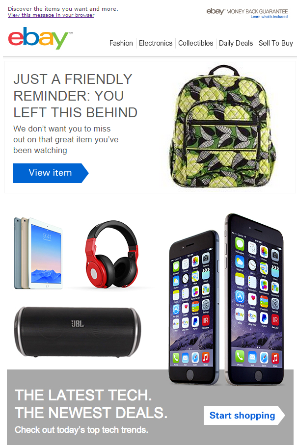
eBay understands that the whole reason shoppers go to eBay is to find a great deal on an item. They are incredibly calm when a shopper abandons their cart and that reflects in their email copy.
The email headline gives out a “Friendly reminder” that the shopper left some items in their cart. By saying “We don’t want you to miss out” eBay is letting the customer know that if they don’t purchase the item, someone else will. Thereby creating that extra push to complete the sale . Moreover, highlighting the product images of the items left in the cart is another tactic to make the email enticing to the viewer.
12. Right Channel Radios
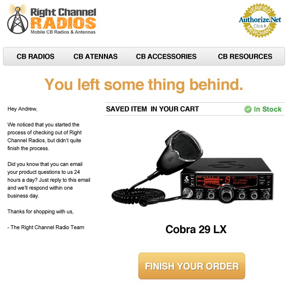
Right Channel Radios’ cart recovery email campaign contains three mailings:
- The first email reminds customers about the cart.
- The second email asks them to finish their purchase.
- The final email offers a discount to nudge them to complete their purchase.
Notice how their first cart recovery email reads like a personal letter to the customer. Starting with a noticeable headline “You left something behind” that invokes curiosity, the company assures the shopper that they have an excellent customer service team on standby 24/7 to answer any doubts they might have regarding their purchase.
13. Romee
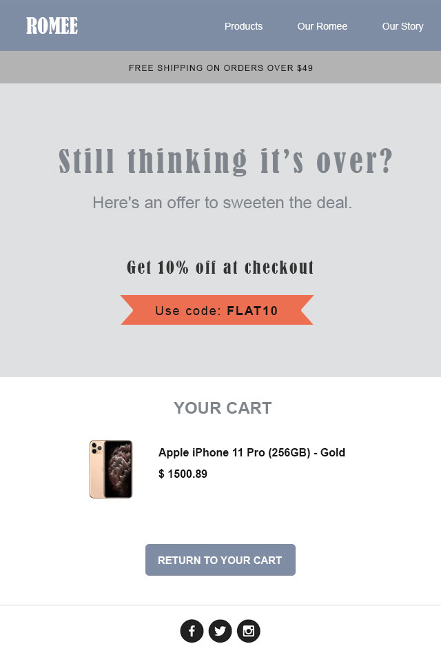
Romee works out an interesting cart recovery email with just the right amount of copy. By highlighting an offer to “sweeten the deal”, the brand uses minimalism in its design to help customers take the one action they need them to take: return to their cart and finish their purchase.
14. Peak Design
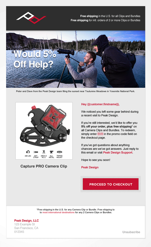
Peak Design uses a simple, customer-service focused approach in their cart recovery email. Instead of sounding too salesy, their email has a human touch by sounding as if a person is talking to the customer “Hey, we noticed you left your cart full of stuff. Do you have any questions?”. They also remind customers about their free and fast shipping policy and a life-time warranty on all their products as a way to ease them out of their doubts about their products.
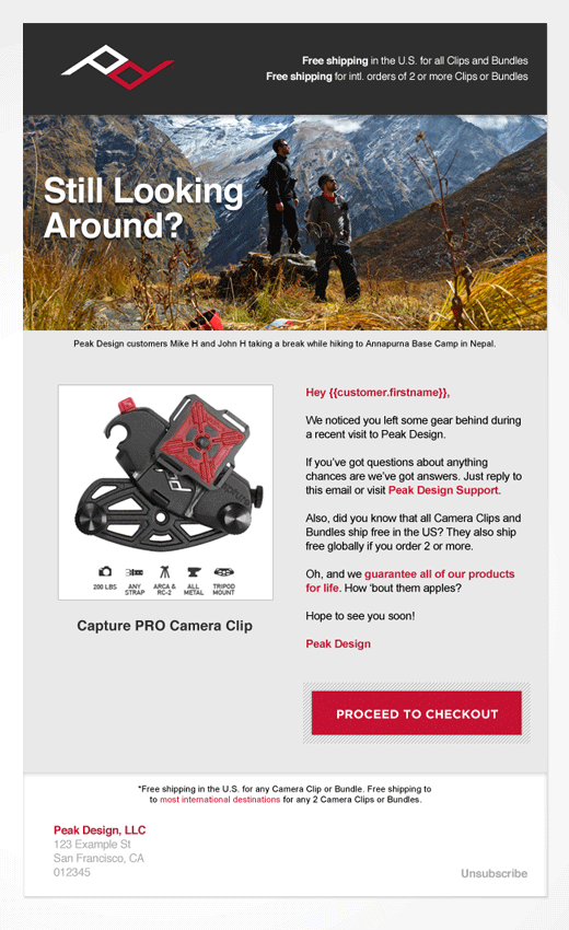
However, in their second email, they offer a small incentive through a discount. This is sent 30 hours later after the first email to see if a small discount can encourage potential customers to complete their purchase.
15. Crutchfield
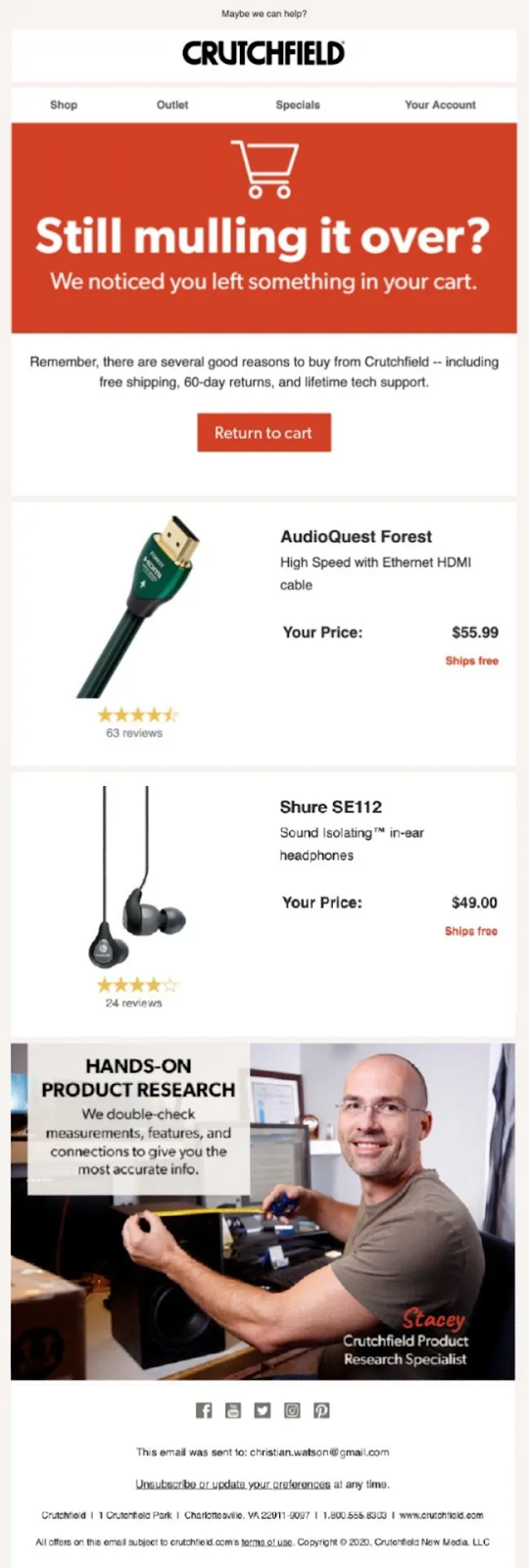
Crutchfield’s cart recovery email highlights all the reasons customers should buy from the brand: the promise of free shipping, hassle-free returns and seamless customer support. It further attempts to build trust by assuring reluctant shoppers of the hands-on product research they carry out on each product to deliver accurate information.
16. Costco.com
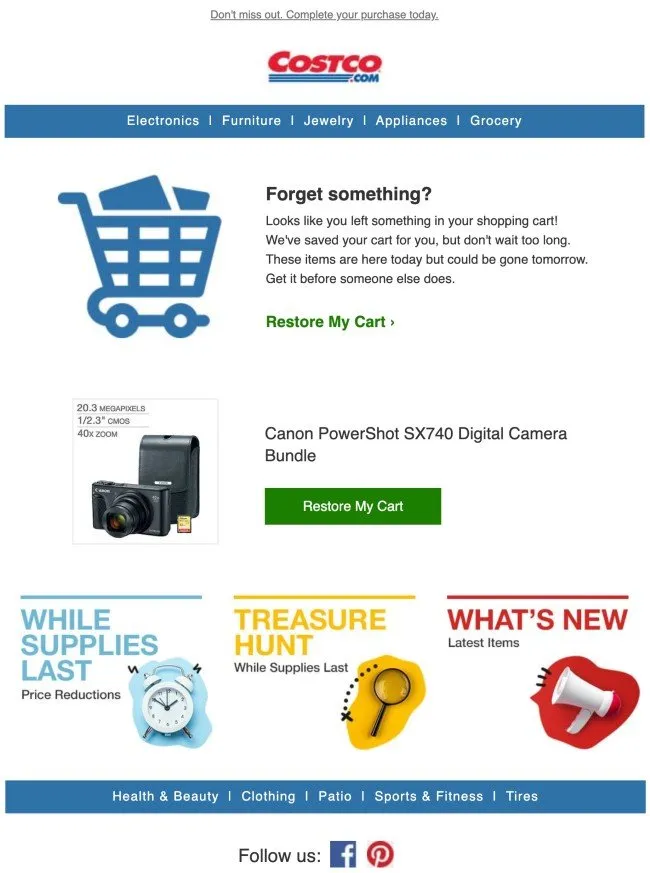
Costco’s cart recovery email plays on the urgency factor by reminding the shopper that their cart items might be gone tomorrow if they do not act fast. The email also features a section displaying ongoing deals and exciting offers, thereby trying to get the customer to explore more products.
17. Peloton
Peloton’s abandoned cart email has all the right elements required to nudge another visit from the buyer. A non-cliche catchy headline “Time to bring it home”, highlighted discounted price (compared next to the original price), section talking about how the customer can save money using Peloton (thereby showing the customer the value they’ll get by becoming a subscriber) and an option to book a test class at the showroom.
A neat email design coupled with just the right amount of no-nonsense copy makes this a notable example of all cart recovery emails.

18. Office Depot
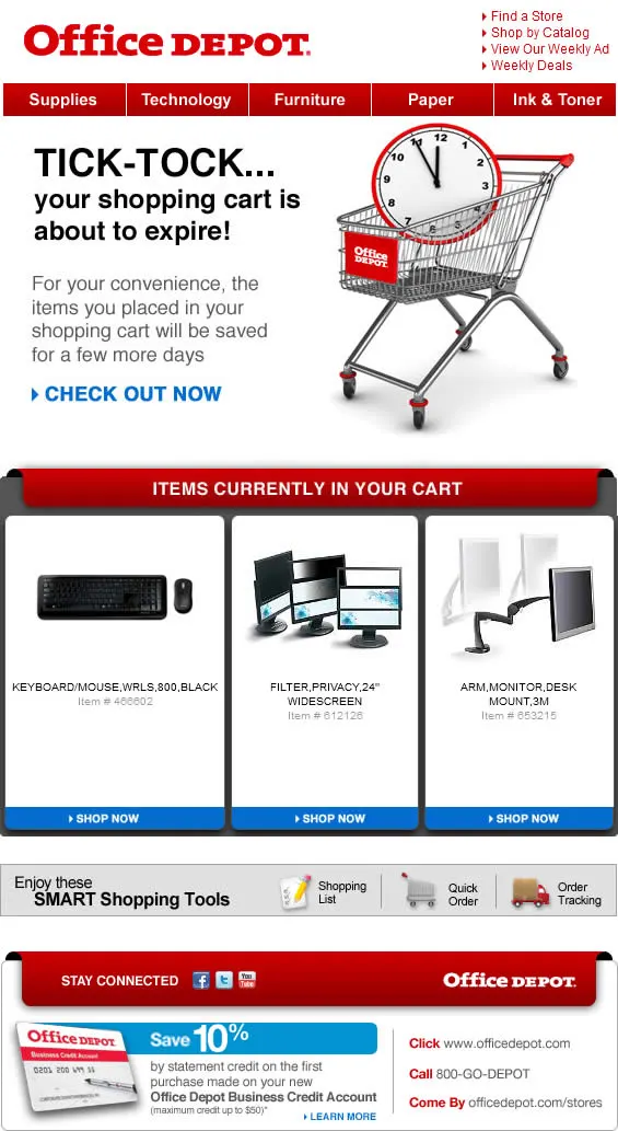
Office Depot’s cart recovery email is all about building urgency in the shopper’s mind by placing a time limit on their cart. This urgency is reflected in their email copy when they say that “the cart is about to expire”. The brand promises to “save the cart for a few more days” to get the customer to checkout. By displaying the items currently waiting in their cart, Office Depot reminds customers what items they may miss out on later.
Office Depot doesn’t want this to be a one-time purchase so it uses this email to advertise its credit card. Customers also get an optional 10% discount on using the Office depot credit card.
19. Reverb
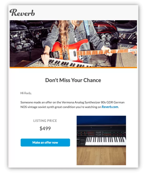
Reverb uses its abandoned cart emails to let their customers know when someone has placed an offer on a product that they’re watching or have added to their cart. Letting the customer know that they are not the only party interested is a brilliant way of playing on the scarcity factor and create a sense of urgency for the product.
20. Waves
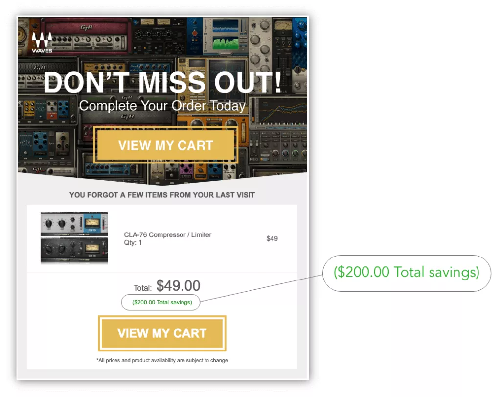
Discounts are one of the commonly given incentives by brands but how you frame them in your marketing message makes a big deal. Waves uses their abandoned cart emails to highlight their sales and discounts in such a way that their customers feel that they are getting a much better deal than what they originally saw when they added the product to their cart.
In their email, see how they focus on the $200+ savings customers will receive if they purchase immediately. They successfully highlight the original price, compare it to the discount price and point out exactly how much the person will end up saving on their purchase. Such gimmicks have the potential to motivate customers to finish their purchase.
Don’t let cart abandoners get away!
![]()
 Writing good cart recovery emails that stand out in the inbox is no easy task.
Consumers get bombarded with promotional messages every day, making it harder than ever to get them to open your cart recovery emails.
There is a lot of potential revenue to win back and we hope these examples inspire you to get creative with your cart recovery emails the next time you send out an email campaign. Create powerful cart recovery emails to compel your customers to come back and complete their purchase. And don’t be afraid to experiment with what works out for your brand.
Want to learn more about setting up a cart recovery workflow on emails?

