Struggling to get your first email right? Here are welcome email template examples for food and beverage brands.
Despite the common belief, email marketing is only continuing to grow bigger and better by the day. It is also a great marketing strategy since it is that one medium that is accessible to all age groups.
Welcome emails are the first personalized communication initiated with your consumers. This is a crucial leg of your email marketing journey since this is going to shape how the consumer perceives your brand.
Welcome emails have an open rate of 91.43% and generate over 320% more revenue on average per email than any other promotional email.
But in times when competition for consumer attention is increasing, sending the age-old welcome email confirming a subscription is no longer enough. You need to be strategic and crafty.
Here are some examples of welcome emails from food and beverage brands to inspire yours
Food and beverage welcome email examples/ templates to inspire yours
1. The Qi
The Qi is a holistic wellness brand that uses eastern healing wisdom to empower you to feel more joy, beauty, and inner calm with whole flower tea rituals.
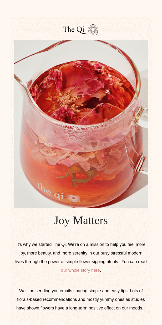
The opening line in this welcome email is concise and summarizes what the brand stands for. This is an excellent way to introduce your brand to your consumers without coming off as too sales-y.
When users initially subscribe to your email list, they may have very little idea about the true essence of your brand. So, the best welcome emails always start off by giving a brief introduction to the brand. It’s also interesting to see how they link to their story and set expectations for the upcoming emails.
What do we like?
- Use of images relevant to the brand
- Catchy opening line
- Letting their brand story take center stage
- Set expectations for the upcoming emails
2. Tre’dish
Tre’dish is a unique brand that is revolutionizing the home-to-home food sharing economy. It is a platform built for home chefs around the world to create successful businesses. They do so by sharing their recipes, cooking, culture, and influences.
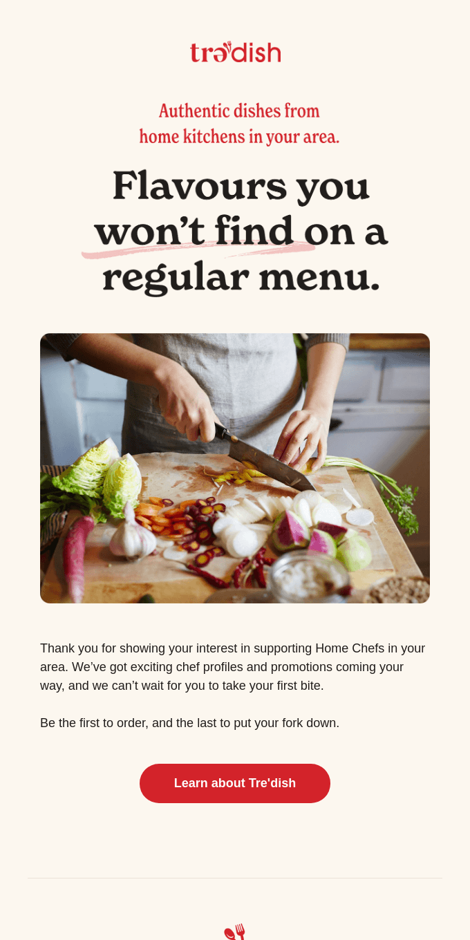
Gratitude goes a long way when it comes to brand-consumer relationships. It helps build a bond and grooms customer loyalty, which is crucial to improving your retention rates. Tre’dish understands this completely and incorporates it in their welcome email template for new customers. They’ve also intentionally ended their email with a big and clear Call To Action (CTA) which prompts user engagement.
What do we like?
- Use of beautiful typography
- Sets clear expectations
- Well-written and persuasive copy
- Use of clear and bright CTA
3. Gooey
Gooey is a 100% plant-based hazelnut cocoa spread brand. They claim that their product is made without all the extra junk.
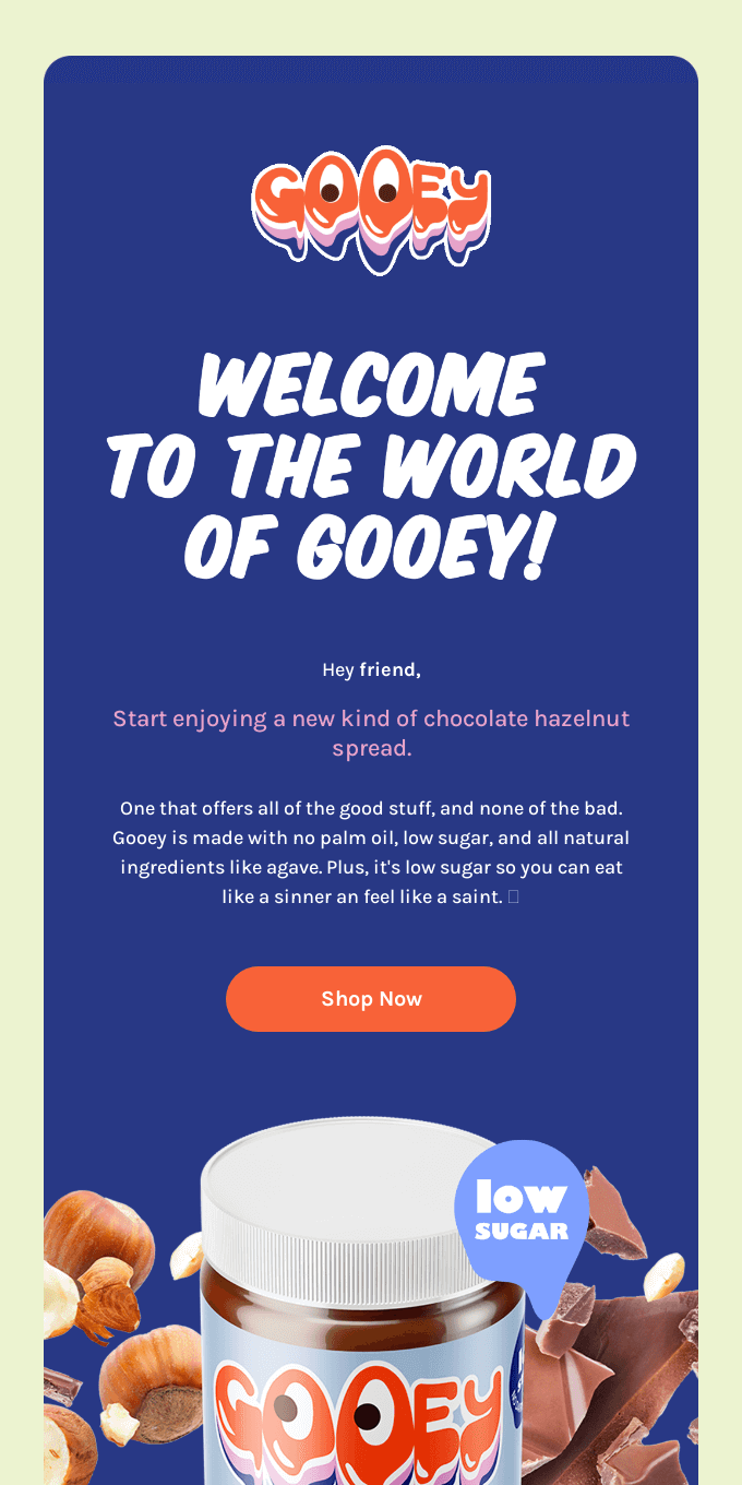
Gooey has tried to build a friendly relationship with the new subscriber by addressing them as a ‘friend’. They’ve strategically mentioned their Unique Seling Proposition (USP) and then go on to guide the consumer to make an actual purchase.
What do we like?
- Addressing customers as a ‘friend’ helps build a bond
- Letting their USP take center stage
- Showcasing the product in the best light with ‘low sugar’ highlighted
- Use of bright and clear CTA to persuade the consumer to make an actual purchase
4. tbh
tbh is a hazelnut cocoa spread brand that claims to be “made with radically astounding stuff”. The brand also takes its responsibility towards building a sustainable tomorrow seriously and plants 20 times the fibers they use for every order.
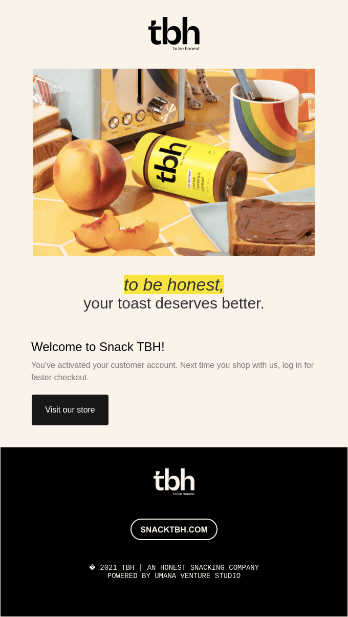
More often than not, simplicity goes a long way in Shopify welcome emails. In tbh’s welcome email design, they’ve kept it simple and to the point. The spotlight is on the product shot and the brand tagline and they’ve strategically ended the mail with a CTA that redirects to their store.
What do we like?
- Minimal welcome email design
- CTA to prompt exploring the product catalog
5. Future Noodles
Future Noodles is a “nutritionally complete instant noodles” brand that aims to make the planet healthier one noodle at a time. The company also works to fight hunger and tackle food wastage by distributing food to vulnerable people.
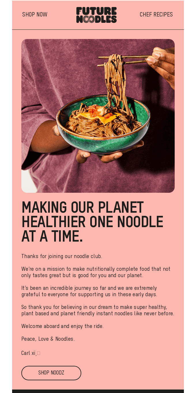
An interesting element in their new customer welcome email template is the use of a navigation bar at the top. It has two clear redirects – Shop Now and Chef Recipes. The email content is also carefully crafted by letting the brand story take the spotlight. The language and tone used, make the subscribers feel like they are part of something meaningful.
What do we like?
- Faux navigation bar design integration
- Letting the brand USP take the center-stage
- Clear CTAs to guide the subscriber toward an action
6. Jeni’s
Jeni’s is an ice cream brand that is “devoted to making better ice creams and bringing people together”.

Storytelling is a powerful marketing tactic to win consumer love and loyalty. Jeni’s uses this to their full advantage by using their entire welcome email design to talk about their story and origin. It helps strike a connection. Apart from stories on how they make products, they also link to their social pages to establish more connections everywhere.
What do we like?
- Use of powerful and persuasive storytelling
- Redirects at the top of the email content – Order Online, Where to Buy, Scoop Shops
- Display of vivid product shots around the welcome email copy
- Use of colorful CTAs at the bottom of the email
7. Starbucks
Starbucks is a global chain of coffeehouses and roastery reserves. As of November 2021, the company functions in over 80 countries with close to 33,833 stores.
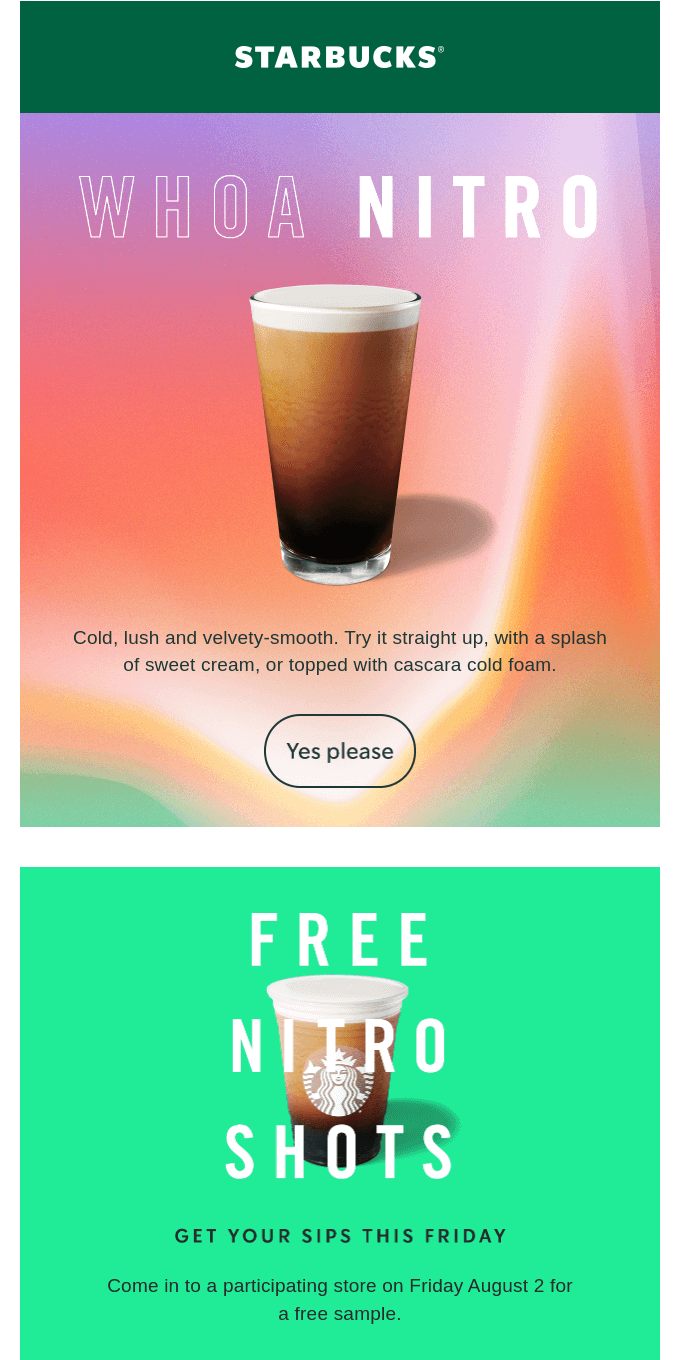
They have used their welcome email template to introduce their new products. And nobody can resist freebies. By strategically giving out free drinks to their new users, they are trying to seamlessly increase their customer base. The use of bold and big letters to display this offer makes it hard to miss!
What do we like?
- This email template looks like a company page offering a more personalized experience to customers
- Free drinks are a great way to ensure better conversion rates
8. The Glenlivet
Founded in 1824, The Glenlivet is a single malt Scotch whisky brand. It is believed to be the oldest legal distillery in the parish of Glenlivet.

The Glenlivet welcomes its consumers based on their interest in whiskies and how they prefer to take it. This is a rather interesting way to prompt engagement from new subscribers of whom we know very little. So, personalized recommendations can be quite tricky. Instead, this is a great approach.
What do we like?
- The design of this email template is intuitive and straightforward
- CTA to explore their entire product catalog right at the top
- Redirecting customers to product pages based on the consumer’s choice and preference
- Redirects to all their social media handles
9. Wine Enthusiast

Paid shipping is one of the prime reasons shoppers do not complete their online checkout processes. By briefly mentioning the free shipping offer right at the beginning of their welcome email design, The Glenlivet manages to grab the new subscriber’s attention from the get-go. The email also contains an elaborate section displaying various product categories, thus prompting the user to explore them.
What do we like?
- Free shipping offer is included in their welcome email template for new customers along with a bright CTA to Start Shopping
- Set expectations for the membership the consumer signed up for
- A brief paragraph about the brand and its story
- Redirects to specific product categories with images giving it a more visual appeal
- Redirects to all their social media handles
10. Trade
Trade is a coffee brand that is “redefining what it means to brew great coffee”. The company aims to support local communities near and far by connecting coffee drinkers to better coffee.

This welcome email template covers almost all the important elements to creating the perfect first impression. The email starts by prompting the new user to explore their product catalog. It then goes on to talk about the brand and its story which helps build a sense of connection with the consumer. In the end, the brand also displays its featured products guiding the new subscriber to make an actual purchase.
What do we like?
- Well-written email that focuses on the story of the brand
- Clear CTAs in every section of the welcome email
- Promoting best-sellers of the brand to help the user make a faster purchase decision
- Mentioning social media handles to help customers stay updated with company activities
11. Blue Bottle Coffee
Blue Bottle Coffee is a major coffee roaster and retailer brand. The company focuses on single-origin beans and is considered a major player in third-wave coffee.
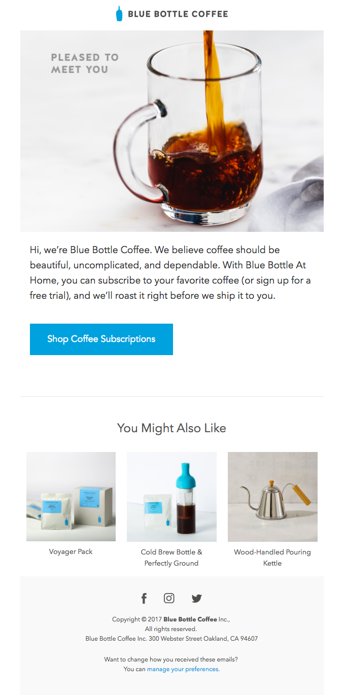
Suggesting products to your new subscribers is a great initiative to improve your sales. Blue Bottle Coffee has a dedicated section to display its recommended products in its welcome email template.
What do we like?
- Clean and simple welcome email design template
- Use of images relevant to the brand
- Bright CTA to explore the brand product catalog
- Product recommendations to boost conversions
- Redirects to all their social media handles
12. Faves Sweets
Faves is a healthy and sustainable candy business. This brand turns “imperfect fruits and vegetables into climate candy”.
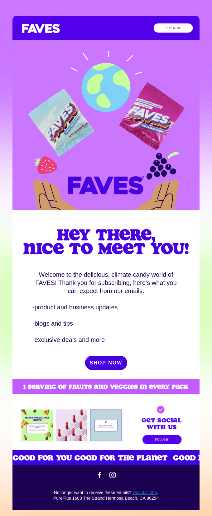
This welcome email makes a new subscriber feel truly welcomed and belonged. It also informs the customer about what benefits they can expect from being part of this mailing list. It also mentions its USP in bright and bold color – 1 serving of fruits and veggies in every packet.
What do we like?
- Sets clear expectations
- Bright and clear CTA to prompt the user to explore and shop
- USP displayed in a bright color
- A tiny glimpse of their Instagram feed
- Links to all their social media handles
13. BetterBrand
BetterBrand is a food-tech startup that strives to revolutionize the refined carb industry. The company claims that they are on a mission “to help create a world free of unnecessary barriers and limitations”.

BetterBrand uses a unique way to show subscriber perks. It helps people feel the value of having subscribed – reinforces it, in fact. The use of a strategically placed CTA to prompt the user to make a purchase by creating a sense of FOMO around the offer is also a masterstroke!
What do we like?
- Clear list of subscriber perks and benefits
- CTA to explore a time-sensitive promotion
14. Impossible Foods
Impossible Foods develops plant-based substitutes for meat products. Its goal is to deliver the same taste and feel as that of meat without the health and environmental setbacks.

Impossible Foods has tried to build a friendly relationship with the customer by personally addressing this email to the person. Their welcome email template also contains dedicated sections for different products offered by the brand with mouth-watering pictures and necessary CTAs to guide the user toward finding the nearest store available.
What do we like?
- Addressing customers by their name can help build a strong connection with the brand
- Display of different products offered with pictures and bright CTAs
- Links to all their social media handles
15. Immi
Immi is a “surprisingly healthy instant ramen” brand that works toward reinventing delicious Asian American foods with added nutrition and love.

Humans are better inclined to process numerical representations faster than its verbal counterpart. Immi uses big, bright, and bold letters to display the numbers behind the brand’s science. This instantly catches the reader’s attention and helps deliver the intended message easily.
What do we like?
- Addressing customers by their name can help build a strong connection with the brand
- Emphasis on the brand story to connect with the consumer
- Use of numbers to talk about the brand impact
- Bright CTA to make a purchase
Conclusion
Welcome emails need to be authentic to what you do and what you offer. It should be used to reinforce what customers can expect from the upcoming communication.
However, for your emails to get opened and action to be taken, you need to get a few basic elements right and tap into the right consumer psychology.
We’re sure the above-listed welcome email examples will help you find the right strategy for your business to drive more sales.
Not sure how to plan out a welcome email strategy for your brand? Explore our email flows here.

