Are you a beauty and cosmetics brand struggling to build a rapport with customers? Here are some welcome email examples and templates you can use.
Globally, the online beauty and cosmetic industry is rapidly growing and by the looks of it, will keep on expanding its horizons. In the past, cosmetics and beauty products were primarily sold in brick-and-mortar stores and offline sales made up the larger bulk of the total revenue.
Today this is shifting rapidly, with online stores projecting to make up 48% of the sales by next year. And moreover, the growth of the online beauty industry in the US alone was 5.6% in 2020.
With such expanding possibilities for ecommerce beauty brands, the primary focus should be in instantly creating meaningful and strong connections with the new and growing customer base. Time and again it’s proven that impressions matter and a cleverly crafted welcome email will definitely impact the impression you are going to make.
Welcome emails can make or break the perception of your brand among customers so always go for exceptional welcome email templates rather than settling for just a good welcome email. You might need to take a look at some of these “exceptional” Shopify welcome email examples that are used by popular beauty brands today. Time to observe and learn.
We have for you a list of the best welcome email examples from the beauty and cosmetic industry.
Best welcome email examples from beauty and cosmetic brands and why we like them
1. Charlotte Tilbury
Charlotte Tilbury, though they don’t ask for the customer’s name during sign-up, still manages to be personal and warm with their welcome email. This tone is achieved by using a friendly first-person narrative in the welcome email.
Their subject line “Welcome backstage darling!” shows how emails can be made to feel more personal even without using the customer’s name. They use their welcome email to convey what customers can expect from them as a brand, which is a great way of encouraging engagement and building excitement.
The introductory part reads “Thank you for signing up to receive my emails!” Customers have to agree this is sweet. Definitely a great way to connect with your buyers even before they start buying.

2. ColourPop
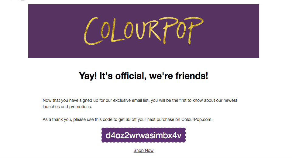
ColourPop also uses a very personal welcome email strategy, which starts with the line “Yay! It’s official, we’re friends!” Cute taglines/subject lines never fail to impress, and impressing in your first contact via email is always a great way to start.
ColourPop incentivizes their welcome email for new customers by offering a good enough deal that can motivate audiences to make their very critical first purchase. This will ensure that you are on the right path in building a solid customer relationship.
3. MAC Cosmetics
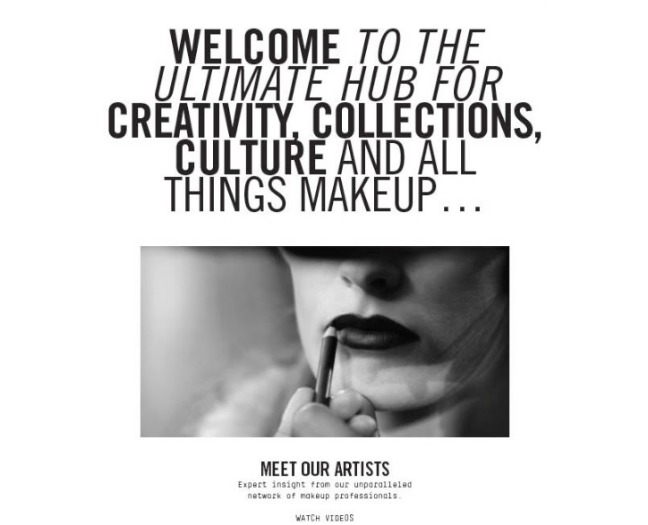
MAC Cosmetics uses their emails to help customers with useful videos on makeup application. They provide a visually loud welcome email with a clever CTA saying “Meet our Artists’ ‘, offering customers “Expert insights’ ‘ from their professionals, with a button to their videos.
Promoting products in their welcome email is a great tactic and MAC does it right by doing so in a subtle way while offering visual media assistance in using their products.
4. Sephora
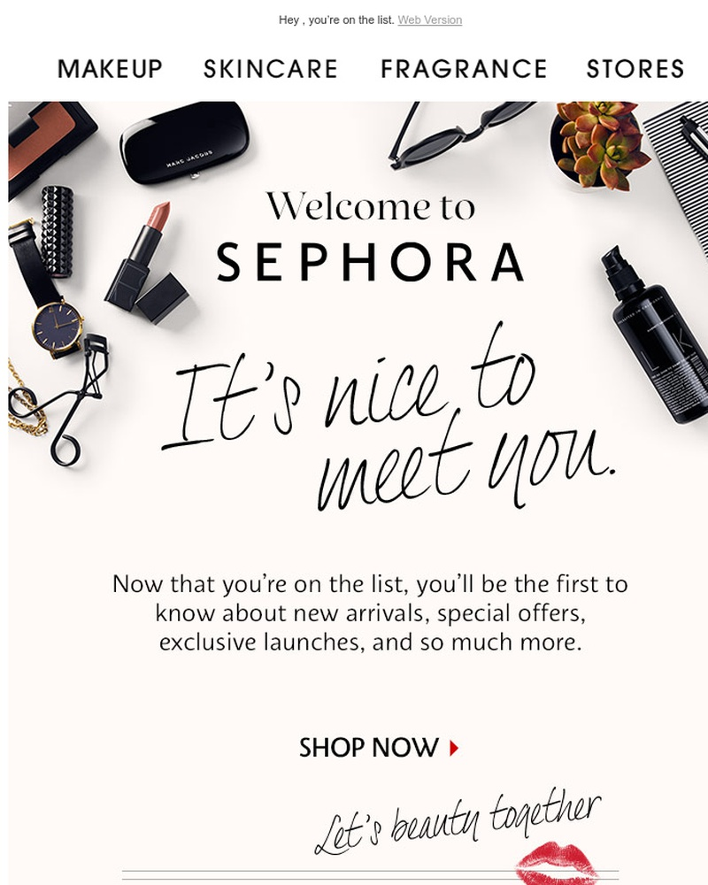
Sephora’s strategy plays at the psychology of community building and this gets employed on two levels in the brand. The brand welcomes you to its fold and then instantly connects to you by saying that you will be provided with exclusive product related updates and more.
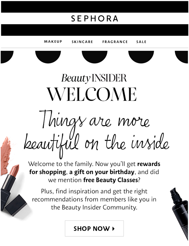
But the true exclusiveness is seen in Sephora Insider program’s welcome email. They make this clear right away by saying “Things are more beautiful on the inside.”
The email lays out the benefits of the insider program, and all this keeping in mind that the reader should be made to feel a part of Sephora’s elite group. They also include clever product recommendations in their email so that any possibility of sales from new customers can be instantly bagged.
5. Clarins
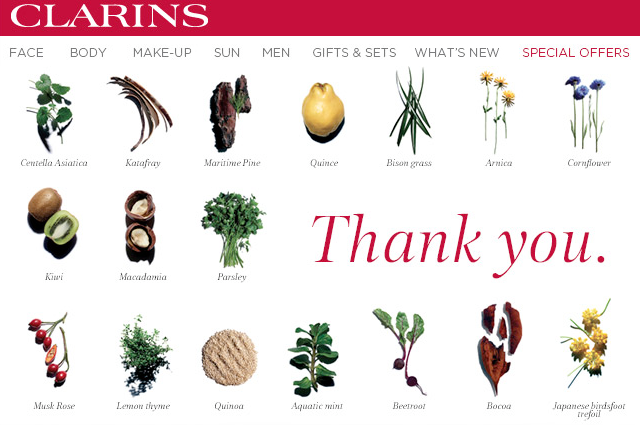
Clarins start their welcome email with “We’re delighted to have you with us.” Their Welcome email with the glaring Thank You, is an example for how visually emails should be in order to aesthetically remain pleasing.
A good navigation bar, high quality images and simple minimalist wording will allow for viewers to easily move across your mails and ultimately move on to the checkout stage. Sometimes building good customer relationships requires you to provide a hassle-free and manageable experience in all stages of the business relationship, even the “welcome” part.
6. Liz Earle
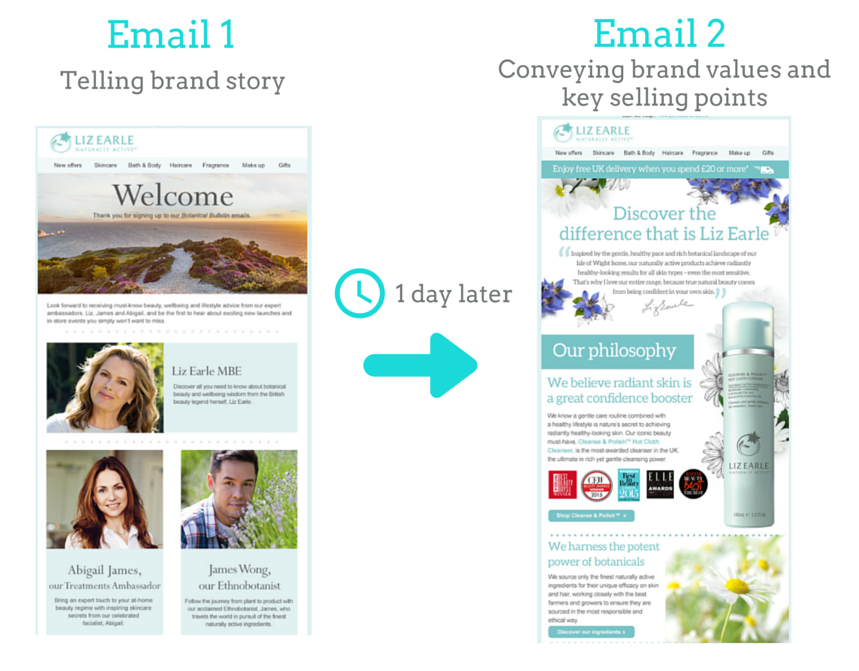
Having a serialized welcome email strategy is a great way to introduce your brand to your customer. Liz Earle, a popular cosmetics brand, uses a first welcome email to tell the brand story and a second one to convey the value they provide. Serialization is effective only if you can tread on a fine balance between effective interaction and outright annoyance.
Like Liz Earle, try to invite audiences to learn more about the brand via multiple emails. When customers learn about a brand, it’s natural that they will get more involved with it, eventually resulting in more products getting bought from you.
7. Clinique
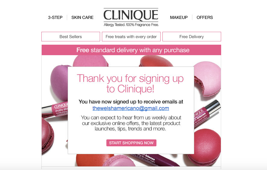
Clinique lays out all their key selling points right from the start without becoming artificial or overwhelmingly showy. No long paragraphs or twisty roads, they present their best aspects plainly just like that.
The expectations one can have from the brand is provided right in front of the viewer, like “free treats” and “free treats” with every order. This will lay out what exactly the brand is going for, providing customers with a frank insight of what they are signing up for. This is also an example of how effective a hook such simple and direct emails can be.
8. Kiehl’s
Kiehl’s has adopted such visuals for their welcome email in that the overall aesthetics looks like an invitation letter, a very inviting one at that. They show their “first buy” offers on the top and the wording is friendly and appealing enough.
They make customers feel like they have been let in on an elite circle around the brand, with exclusive updates about new products, special offers and more. Use this feeling to create a long-lasting connection with your new buyers.
9. Tarte
Everyone loves a treat and marketers have to know this. Owing to this, Tarte’s key strategy when it comes to crafting the best welcome email is incentivization. This has always worked, and if incentives are placed on the center stage right from the onset, then the impact of it can be multiplied.
They provide a redeemable code below their attractive CTA, and the whole email tends to scream how beneficial signing up to Tarte is going to be for new customers. Providing benefits right from the beginning tends to generate that desired appeal in your first impression with the customer.

10. Dollar Shave Club
Dollar Shave Club’s welcome email that comes after a first purchase shows how inclusivity can be used to get favorable outcomes out of customer psychology. Their “Welcome to the club” email along with the intro saying “You are now a member of an elite club of geniuses. You’ll fit right in.” shows how brands can create this sense of an exclusive society in which they are now a part of.
More of this is seen in the way they set up what they call “Club Rules” and also in the overall theme of the mail. DSC also attaches a referral program into their email. This can be a little risky when it comes to welcome emails but with the right approach and the right incentives referrals can work wonders. This way your “welcome emails” can create a loyal brand community from the beginning itself.

11. Olay
Olay’s has a four-stage onboarding strategy for their welcome emails. Serialization is the best way your brand can tell a story with your newsletters. They have clean and clear aesthetics with a unique level of personalization unlike any other brands.
The first email informs about the reward programs, their AI technology, and list of best sellers.
The next three emails inform customers about the point system, customer reviews with social proof and more highlights of their product collections. This way the brand eases the customers into the overall nature of the brand and its reward programs, without becoming boring and overwhelming in its presentation.

12. The Body Shop
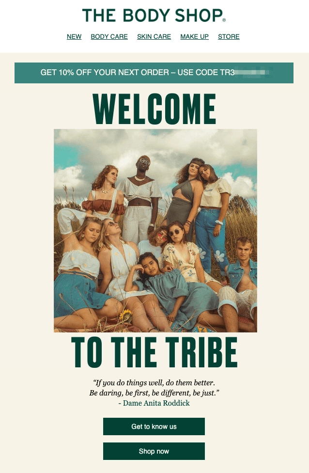
So far, we have seen how welcome offers and discounts have been an effective tactic in nudging customers to make their first purchase. This is not just incentivization, it can be the reason for new customers to try out products from particular brands. The Body Shop welcomes you to the “Tribe” in a grand gesture, with stunning visuals. The CTA down below reads “Get to Know Us” and “Shop Now”.
The sense of community is built by the clever presentation of the brand story, and “the tribe” is further provided with a reason to join the brands on social media. This is done not by traditional “Join us on Socials” request, but by a powerful call; “Let’s Unite!”. Strong right? The Body Shop is another example of how brands can start at building a brand community even from the start of your customer relationship via welcome emails.
13. Supergoop
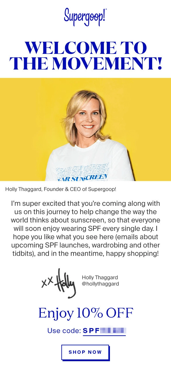
The face of Supergoop’s welcome email is its founder. Not many brands start this way, but this proves that there are other alternatives to humor for making emails interesting. The title reads “Welcome to the Movement” and the email consists of a small intro from Holly Thaggard, the brands founder and CEO.
The brand is trying to change the way people think of sunscreens and they state this in their message. What this achieves is that now, the brand establishes itself as something more than a mere skin care company in the minds of customers. Moreover, this automated mail feels more personal than many of the handcrafted mails some ecommerce brands send out.
14. L’Occitane
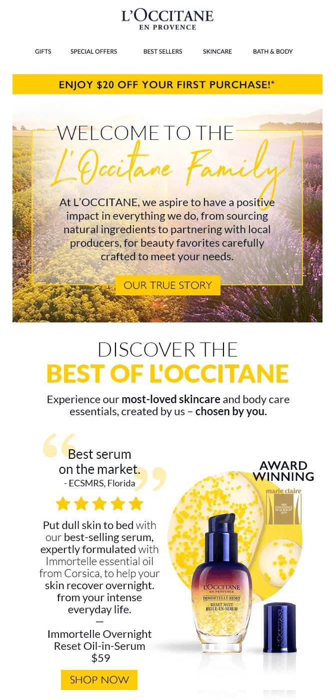
Most welcome emails we have seen here provide offers and benefits in their emails. L’Occitane shows how you can invite customers to more engaging actions beyond just offering discounts. The mail opens to a warm welcome, and the value the brand provides and their aspirations is presented in the body of the mail. The button “Our True Story” takes you to a page where more about the company’s values and commitments are provided for customers who are interested.
L’Occitane’s welcome email’s main highlights are the product recommendations they showcase along with glowing customer testimonials. Social proof along with recommendations in welcome emails are a great way to form a good impression and assert your brand’s validity as a reliable one.
15. Beauty Bay
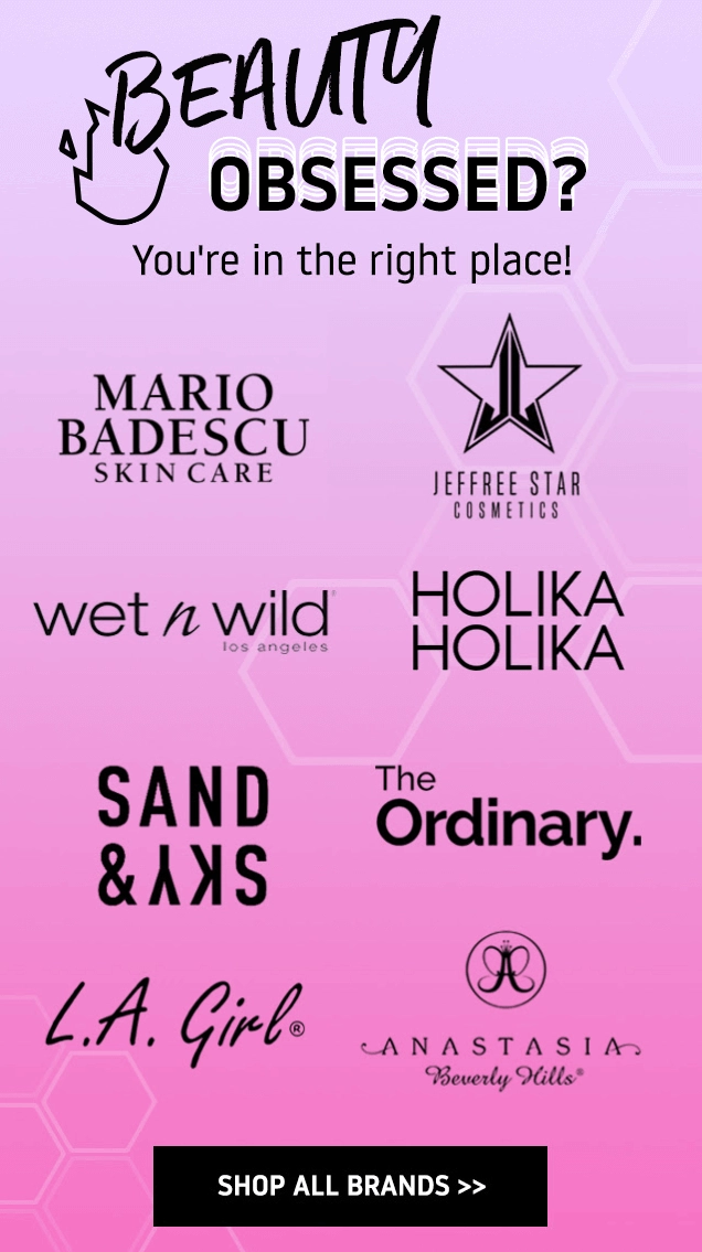
Beauty Bay’s approach to welcome emails a little more on the unconventional side, in a good way. They don’t directly promote their products or offers in their welcome email. Their email opens with a theme appropriate GIF that hints at the products and collection they house. Their subject line which reads “Beauty Obsessed?”, is presented in even more bold and attractive colors, with the brand voice that’s aware of who the target audience here is.
They provide a glimpse of the brands their store carries and almost as if in a reassuring manner it says “You are in the right place!” Beauty Bay then gradually showcases the value and services they provide and offers ways to stay engaged with the company.
Beauty Bay’s product category section in the welcome email and the overall tone shows confidence and reliability and these two things combined to provide a strong welcome impression in their audiences/readers.
Why have just one welcome email?
Having seen how the professionals are doing it, it’s time that you start making the best out of your welcome email designs. And if you have been paying attention, you would know that just one welcome email doesn’t cut it, if you are to make a lasting impact that positively affects your customer relationship. Use more than one welcome email to gradually introduce your brand to your customers, in a natural and smooth way.
RetainIQ can help you with creating that superb first impression and convey your brand story to customers. RetainIQ provides you with high performing Welcome flows, that you can select from a list of prebuilt flows. You can select templates for each email in the flow, customize them according to your brands theme, and easily go live and move towards cleverer marketing.
Ready to explore a powerful ecommerce welcome email flow? Book a demo today.

