Looking for welcome email templates for health and wellness brands? This is for you.
The growth of health and wellness online has been tremendous with it being responsible for 5.3% of the global economic output, according to Global Wellness Institute.
With the rise of e-commerce, it has become easier than ever for people to access supplements, organize their diets and track their fitness. And as a result, there are now more health and wellness brands than ever before. In fact, the global wellness industry is now worth a few trillion dollars.
This has led to an increase in competition. And that’s why it is important for brands to establish a relationship with their consumers from the very start. That’s where welcome emails come in.
Welcome emails are those that are sent after a subscriber signs up for your email list. They are great for setting expectations, getting people excited about your brand, and starting a relationship between you and your subscribers. And these relationships pay off big time.
Surveys have found that welcome emails enjoy a 50% open rate which may lead to a higher click-through rate compared to other promotional messages. These emails are an essential part of a well-designed email automation strategy and can be used to drive engagement, brand loyalty, and ultimately sales.
With that in mind, let’s take a look at 10 welcome email examples for health and wellness brands.
Welcome email examples for health and wellness brands
Let’s look at some of the best health and wellness welcome email examples to help you get started–
1. Bite Toothpaste Bits
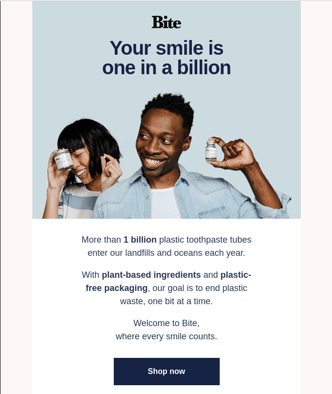
Bite’s welcome email design is quite like their website, clean and appealing. They gently nudge you to subscribe to their newsletter offering an incentive of winning a four-month supply of their products. Apart from incentivising their customers, they also promise to remain spam-free.
Coming to their email, they open with a refreshing headline that is soon followed up by an important statistic that leads to their brand values. This narrative makes it very compelling to purchase from them as it opts for the route of empathy.
Coupled with a clear call-to-action (CTA), a clear visual flow of elements, a link to their socials and a direct message from the founder, Bite’s new customer welcome email template is a great example for marketers to draw inspiration from.
2. Smile Direct Club
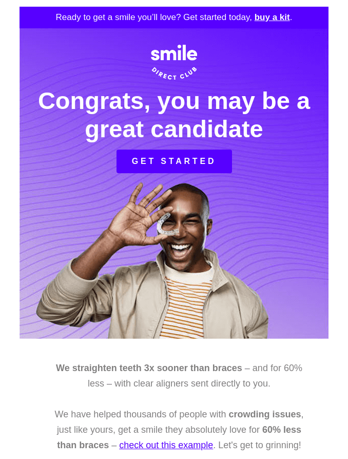
This is a brand that creates end-to-end solutions for people’s smiles and their welcome email shows just that. Their consistent colour palette and their clear value proposition make them stand out in comparison to their competing brands.
They have a clear visual segmentation in their email that makes it easily scannable and easy to read. Not only do they share clear price points and why you should choose them over others, but they also share links to important pages on their website at the end of the email to provide further assistance to their subscribers.
They also have social media buttons at the bottom of the email so that email subscribers can join their growing community online and stay connected to get all updates related to the brand.
A thing that your brand can avoid that Smile does is providing multiple hyperlinks within their email copy. It might get distracting and busy and sometimes might even come across as being an overly pushy marketing mail.
3. Hims
Hims is a brand that provides affordable and accessible FDA approved wellness products for men. With the help of their team of advisors, they have created a brand that provides top-notch products for men around closeted conversations.
They do a great job with their welcome email templates for new customers by using all necessary elements. They opt for a simple and clean email design that showcases their products and shows the benefits of using them followed by a ‘shop now’ button which is direct and effective.
What truly works is the soothing colour palette and short, precise copy that does not overwhelm the subscribers and their use of a single CTA adds to the clarity of the email flow.
They end the email with social media buttons where subscribers can follow the #hellohims conversation.

4. Care of
With a promise of sharing the latest updates, exclusive offers and more, Care/ of does a great job of luring in email subscribers. With soothing colours, a distinct CTA button that stands in contrast to the rest of the imagery, a convincing value proposition and a coupon code that assures 2 weeks of custom packs for free, the brand makes for a compelling welcome email design to mimic.
For health and wellness brands that provide custom products to their customers, this example is a great one to observe. Starting from the headline of the email, this brand clearly illustrates their customised packs based on a quiz that subscribers can take on their website or app. This, in turn, leads to more traffic on platforms where the purchase will happen.

5. The Nue Co
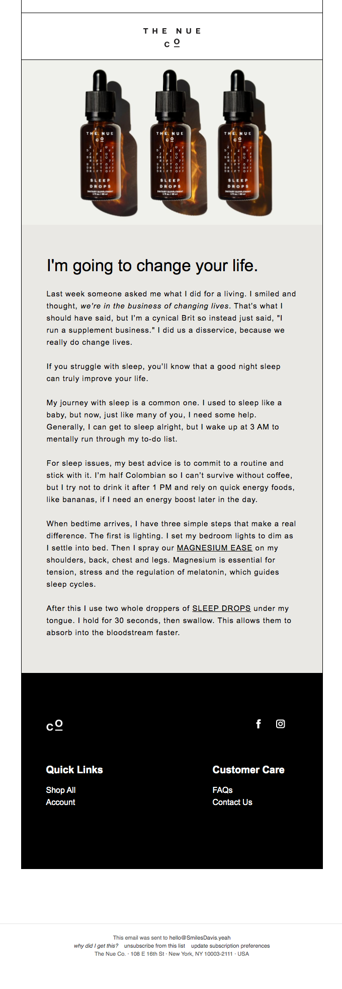
This health supplement brand opts for an interesting route for email promotions. Captivating clients on their website with a 15% discount on their products and early access to new arrivals, The Nue Co gets their email subscribers.
Once you receive their email, you will see that Jules Miller (the founder) makes a rather bold claim— “I’m going to change your life”. She follows this up with a personal story that uses hyperlinks to 2 relevant products.
What works about this format of the welcome email is the fact that it is a narration of a personal story directly from the founder. This instantly makes the subscriber feel like a part of the community. Her personable style of writing and relatable issues that she fixes with her products compels the customer to buy from the brand.
Another interesting aspect of the email is that it does not end with a pushy marketing pitch but just a few helpful links and their social media handles to increase their online community.
6. Gossamer
Gossamer is a brand for people who enjoy smoking weed. They share articles and stories surrounding the topic of cannabis, their product recommendations and more in the email newsletters.
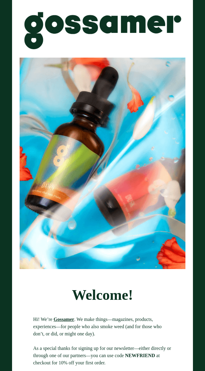
They opt for a friendly yet respectful tone in their emails that helps them build rapport with their growing online community instantly. They also offer a 10% coupon code called ‘NEWFRIEND’ which further adds to their friendly allure.
So what helps them win the email marketing game? They start their email with an image of their top-selling product, Dawn. They move ahead and welcome their subscribers by sharing exactly what they can expect in the upcoming newsletters with hyperlinks sprinkled across the email copy. They go on to share links to the ‘shop’ page and their ‘stories’ page and their Instagram and Twitter buttons to give subscribers an opportunity to connect with them on a platform convenient to them.
7. Aurora
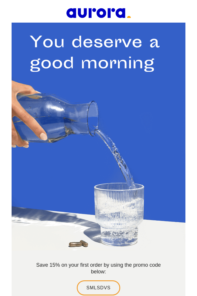
Using a complementary colour scheme in their branding which extends to their emails, Aurora Mornings smartly uses opposing colours to make the right elements pop, i.e., their CTAs.
This vitamin and supplements brand knows the importance of using positive messaging and uses it right from the get-go. Their helpful tone coupled with their 15% discount promo code urges subscribers to turn to loyal patrons.
What marketer’s can mimic from Aurora’s welcome email design is the visual flow and minimal design they use. It conveys the message very effectively without appearing like a promotional email.
Another important factor that helps them win the email marketing game is their use of strong action words like ‘boost’ and ‘support’. Their use of emotive words (instead of the traditional transactional words) sets them apart from other brands.
8. Persona
Persona Nutrition is a personalized vitamins brand that caters to over 1.2 million people for recommendations. Apart from already being a company that provides stellar products to their customers, they also incorporate email marketing as a part of their strategy to boost sales.
When it comes to health and wellness brands, this is one of the best welcome emails to emulate. This is because they tick all the boxes of a successful email. Here’s how-
They start off strong with a huge discount to new subscribers– a 50% discount on their first month). The placement of the offer paired with the bold CTA button makes it unmissable even to new viewers.
The empathetic and friendly tone is paired with a strong value proposition that makes Persona Nutrition a compelling brand to purchase from. They do this very well by dedicating an entire section of their welcome email to sharing their ultimate goal and the values that drive their company. This prompts an immediate feeling of connection with the brand since you now know their ‘why’.
You can also take a cue from them and ape their email flow– a soothing, uncluttered design with clear segmentation and important prominently placed CTA and social media buttons.
9. Aisle
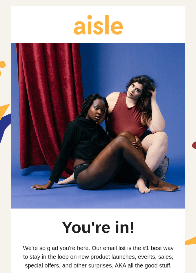
Does your brand want to bring out the feeling of being inclusive? Take a cue from Period Aisle! They aim to bring comfort to a menstruator’s life with the help of their best-in-class products that harness the latest technology.
They use a consistently nurturing and inclusive tone across all platforms including their marketing emails. With statements like ‘You’re in’ and ‘You can sit with us’, Aisle works towards creating a community that encompasses all menstruators.
What makes Aisle’s welcome email appealing is the branding consistency subscribers will notice across their website and emails. They do this by using small visual elements along the margins of their email that are visible on their website.
What encourages people to remain subscribed to the emails is that their copy clearly mentions that it is the number one place to stay abreast of their new products, sales, events, and more.
Aisle also creates a sense of urgency that pushes people to shop from them by highlighting the copy that states they will be offering free shipping ‘only for this week’.
They also ensure higher click through rates (CTR) by having a singular, distinct ‘Shop Now’ CTA in their welcome email. Along with this, they focus on widening their online community by placing buttons at the end of their emails that link to their social media accounts and email.
10. Vital Proteins
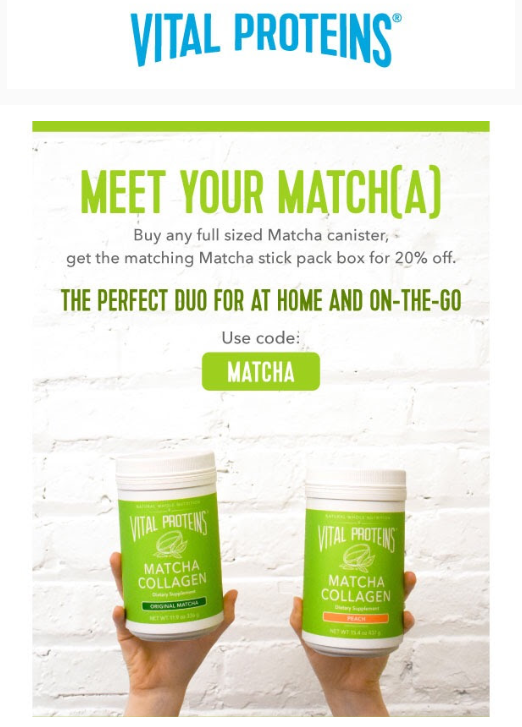
Their email bursts of lively and refreshing colours that remind you of summers by the poolside. They build on this fun colour palette with some light wordplay in their email copy.
What follows next is a whopping 20% discount on the purchase of their full-sized canister. If the copy and the offer aren’t enticing enough, the smart placement of their products right after will compel subscribers to give it a try.
Not only do they provide a great offer, they even follow it up with how the product can be used by sharing recipes. This button takes the viewer to their website where they can explore more products where they also share their top picks.
What works about this welcome email is that it does its job without appearing overbearing and even provides new subscribers with helpful resources like recipes.
Is your brand ready to send out welcome emails?
The purpose of a welcome email is to establish a connection with customers from day one — optimizing for long-term loyalty in the process.
A great welcome email is short and sweet, not long and rambling. It has a hook that grabs your audience’s attention, quickly communicates the benefits of using your product, isn’t too salesy, and encourages subscribers to engage further with your brand.
If you want them to not only read your first email, but all of them that follow, then your welcome email needs to make a good impression. You may even consider doing multiple welcome emails, depending on the subscriber’s place in the buyer’s journey.
Find a way to make your welcome emails entertaining, educational or valuable to those who receive them so that it doesn’t get lost in the mix.
If you want to ace the welcome email race, set up your welcome email flow today.

