Learn how to use the best ecommerce feedback email templates and examples to win hearts.
Nearly 80% of reviews come from emails sent after purchase. After a product is delivered, most e-commerce stores send automated emails to collect product reviews. However, just a small percentage of them ask for feedback.
According to a study, approximately 42% of companies don’t survey or gather feedback from their consumers because they believe feedback isn’t as valuable as reviews.
In this article, we’ll discuss why gathering feedback is important, as well as some of the best templates to use so you can make it a part of your customer win-back email strategy.
How is customer feedback different from product reviews?
It’s a common misconception that feedback and review are the same things. However, in reality, the terms are not interchangeable. Let’s draw comparisons between the two and see how feedback differs from a review.
Consumer feedback is primarily about the buyer’s overall shopping experience with the brand, whereas product reviews are about whether or not the customer likes the product they bought.
For instance, when a customer purchases a product from your website, collecting feedback is about the overall experience with your website. The feedback can be positive or negative.
Feedback considers factors such as website interaction, customer service, shipping time, packaging, and so on.
On the other hand, product reviews are more focused on the item that the customer has purchased and have less to do with how the customer feels about the buying process.
Collecting consumer feedback allows product, customer service, sales, and marketing teams to see where they can improve. The teams can focus on specific areas to boost customer satisfaction and generate repeat business.
There are several methods for gathering feedback, with surveys being the most effective. To collect responses, e-commerce firms might design a set of questions and send them to customers via email. This will also help them gain a deeper understanding of their customers and get in-depth feedback from them.
Learn more about post-purchase email flows here.
15 email templates to ask for customer feedback and what’s good about them
Do you know? Customers that offer feedback make up a small percentage of the total. This is because most businesses collect feedback in the same old format. If you want to collect customer feedback, it’s important to pay attention to certain elements and make the process more engaging.
Here are a few feedback templates that we found exciting. We’ll talk about these templates in brief and why we like them.
1. Brooklinen
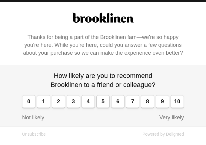
Brooklinen is a leading manufacturer and supplier of bed, bath, and loungewear linens. They are also the home of the internet’s favorite soft and comfortable sheets.
What we like about this template?
- By thanking customers at the beginning, they have made them feel important.
- To keep customers engaged, they’ve asked for feedback directly.
- Customers were asked to rate on a scale of 1 to 10, making the process short and efficient.
2. Ritual
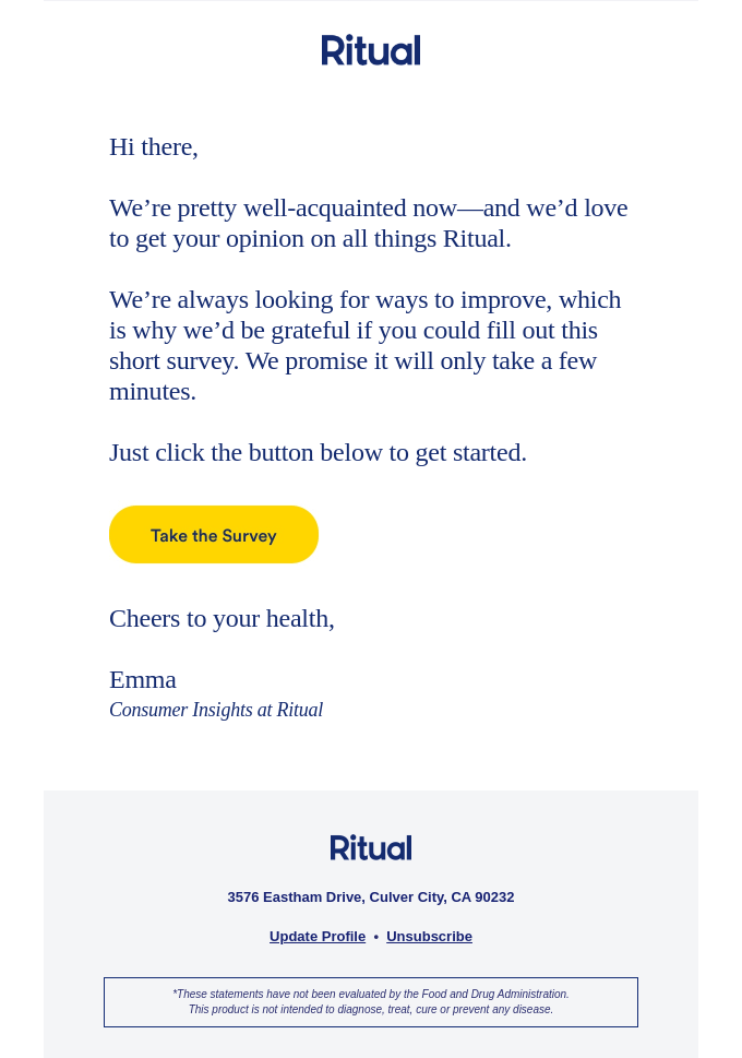
Ritual is an online store that sells women’s multivitamins and nutritional supplements. Their USP is providing the purest, most effective formulations for everyday health while also revealing every component, source, and scientist behind their goods.
What we like about this template?
- This email copy is clear and intriguing.
- By stating that “we are continuously looking for ways to improve,” Ritual has given its customers the impression that their opinion is extremely important to them.
- The CTA button is strategically placed at the end of the message, indicating what customers should do next.
3. MeUndies

MeUndies offer feel good underwear, loungewear, and apparel for both men and women. In addition to the undies they also sell socks, bralettes for everyone.Their value lies in offering comfort and gender inclusive styles.
What we like about this template?
- In the beginning, they have established a strong connection with customers.
- Customers have been assured that leaving feedback is simple.
- The CTA button is enticing because it fits the brand color and email template.
- Customers will feel appreciated and valued if you thank them for their input.
4. Bellroy

Bellroy is an Australian accessories brand that makes bags, folios, wallets, pouches, phone cases, and key covers, among other items. Premium leather and a bulk-free shape are highlights of the brand.
What we like about this template?
- Bellroy’s email template design and copy are quite intriguing.
- Bellroy has experimented with using product photos to help in brand recognition.
- They’re collecting comments after 30 days to better understand the post-purchase experience.
- Customers were requested to rate their experience on a scale of 1-10 to speed up the feedback process.
- The use of a hashtag helps a brand build the trust and community of its potential customers.
5. Anthropologie
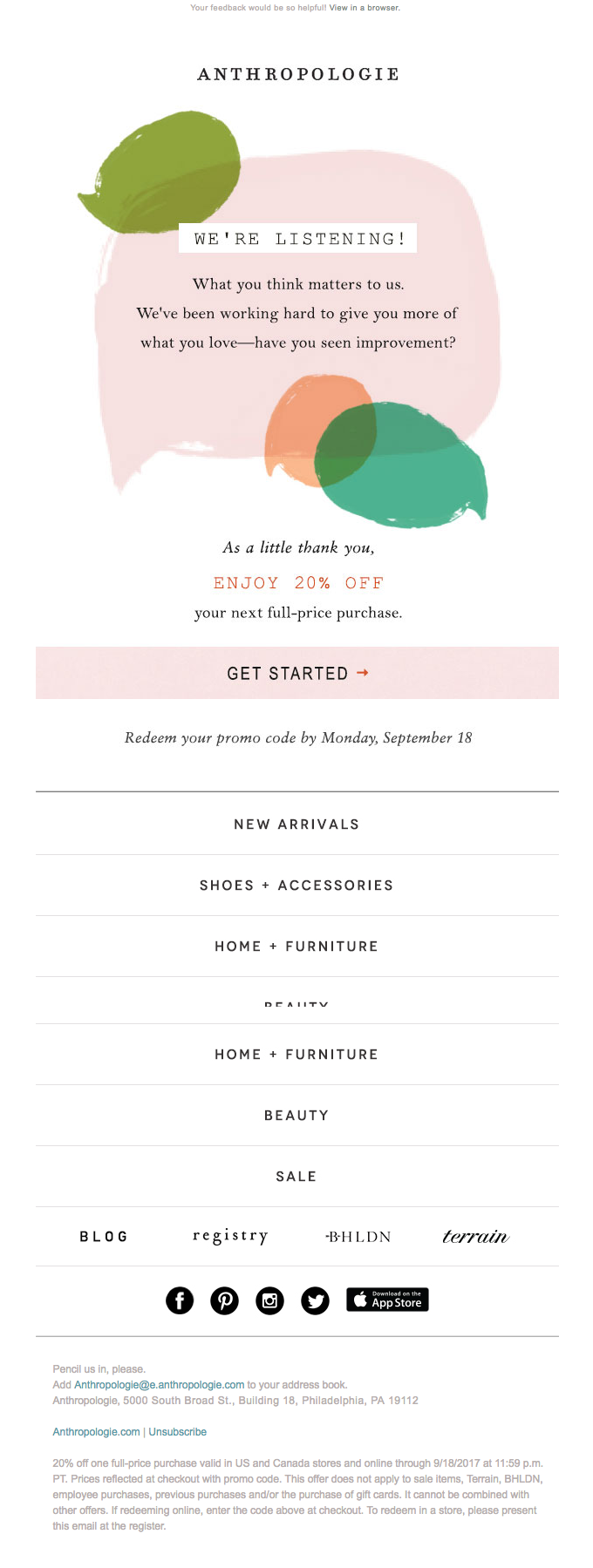
Anthropologie is an American clothing company with around 200 locations in the United States and Canada that sell clothing, jewelry, home furnishings, decor, beauty products, and gifts.
What we like about this template?
- They used the brand colors in the email template to make it easier for customers to recognize it.
- The brand has assured customers that their feedback is important to them by saying, “we’re listening.”
- They tried to incorporate the message with a discount voucher to increase the chances of receiving feedback.
- Customers will not miss the CTA button because it is highlighted.
- They’ve enhanced their chances of sales by listing other products they sell.
6. Nokia
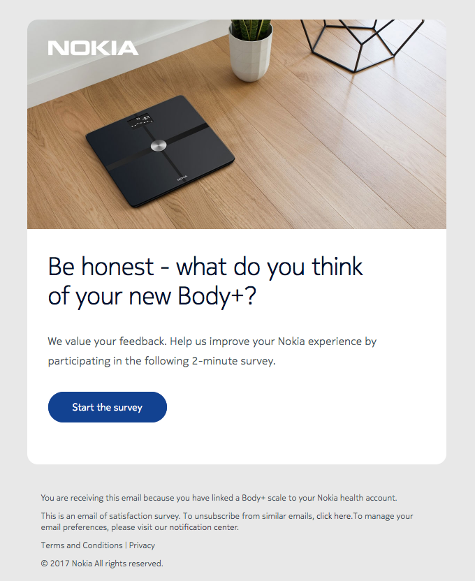
Nokia is a technology leader across mobile, fixed, and cloud networks, enabling a more productive, sustainable, and inclusive world.
What we like about this template?
- The email copy is simple, but the brand has used the correct design and images to make it appealing.
- When a company says “Be Honest,” it implies they welcome both positive and negative feedback.
- By mentioning how much time it will take to give feedback, Nokia has indicated to customers that this is not a time-consuming process.
- They’ve used a contrast color to highlight the CTA button which again increases the chances of getting feedback.
7. Amazon
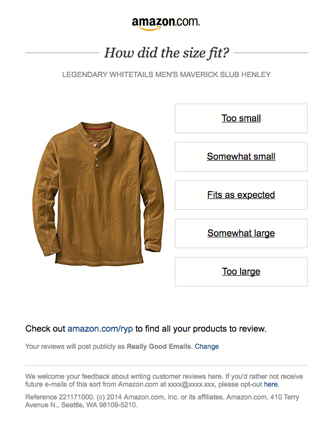
Amazon does not require an introduction. It is a leading technology firm specializing in e-commerce, cloud computing, digital streaming, and artificial intelligence.
What we like about this template?
- They’ve used the product image to help customers recall their recent purchase with the brand. .
- Amazon has reduced the customer’s options by giving the input possibilities and seeking feedback that matters to them the most.
- They’ve included a common link that will allow customers to check their previous orders and offer feedback.
8. Taylor Stitch
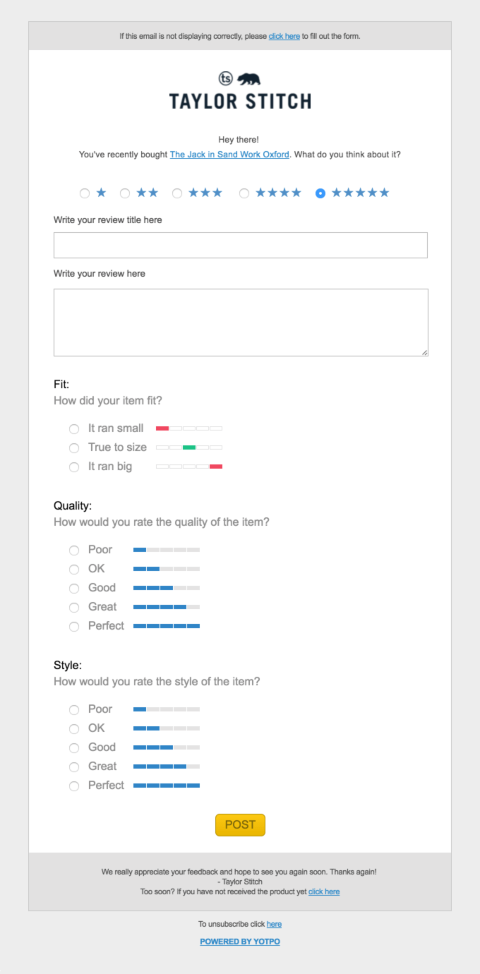
Taylor Stitch is a men’s lifestyle company that crafts responsibly-built staples designed to look and function just as well in the city as they do in the great outdoors.
What we like about this template?
- Mentioning the name of a recent purchase makes it easy for customers to find what the email is regarding.
- They’ve made the best use of the survey method to collect feedback.
- Taylor Stitch has clubbed the usual ask for review questions and other specific questions which customers can answer in detail.
- The CTA button highlighted in the end is click-worthy and ensures customers that their feedback is valued.
9. Tailor Brands
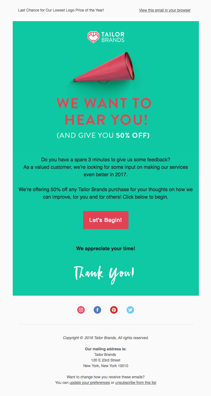
Tailor Brands is the world’s first A powered logo design & branding platform that helps you create a unique brand identity for your business with their customized branding tools.
What we like about this template?
- We can’t take our eyes off this vibrant email template.
- The email template has all the elements of a perfect feedback template — engaging copy, colors, CTA button.
- The brand has clubbed the message with a discount to encourage customers to leave feedback.
- Mentioning the time (3 minutes) helps customers understand whether it is a time-consuming process or not.
- The CTA button stands out from the rest of the message, ensuring that it is not overlooked.
10. Frye
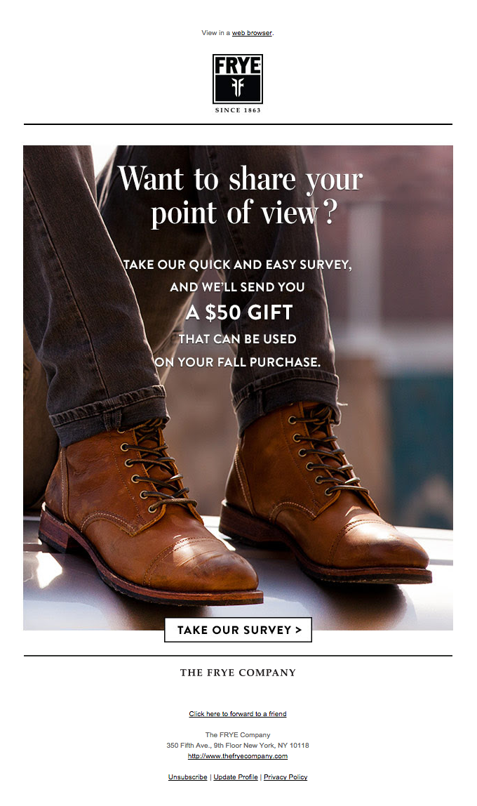
Frye is a popular brand that sells high-quality leather boots, shoes, sneakers, and bags for Men and Women.
What we like about this template?
- We love the way the brand is open about receiving feedback.
- They know that offering discounts against feedback is the best strategy to drive more feedback.
- The brand image is used to make the email more engaging.
- Adding a CTA button to the message helps customers understand what they need to do next.
- Frye has encouraged customers to share the email with their friends to collect more feedback.
11. Warby Parker
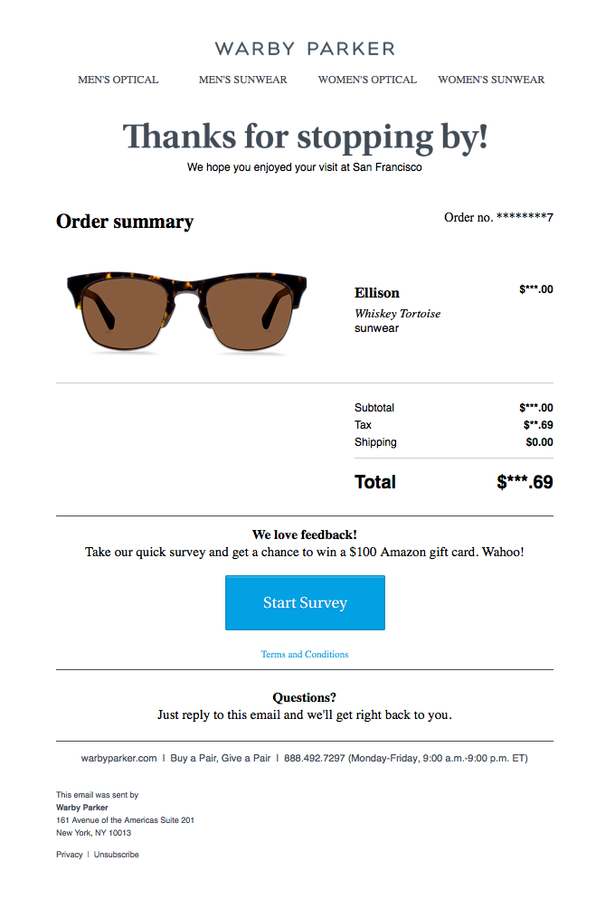
Warby Parker offers high-quality eyeglasses, sunglasses, contacts, and eye exams at an affordable price.
What we like about this template?
- The brand has used clear, concise language in the email template, avoiding fluff.
- They created the email template same to their online store to provide customers with a similar experience.
- The inclusion of a CTA button indicates where buyers should click to complete the survey.
- Customers are more likely to submit feedback or take surveys if discounts or coupons are offered.
12. Thumbtack

Thumbtack is an online directory that allows users to find, review, and employ local service providers for a variety of personal projects such as home remodeling, financial and legal services, and event organizing.
What we like about this template?
- The email message is personalized, indicating that these feedback emails are not sent at random.
- Customers are kept updated by mentioning how long it will take to complete the survey.
- The CTA button is highlighted to direct customers where to leave the survey.
13. Unsplash
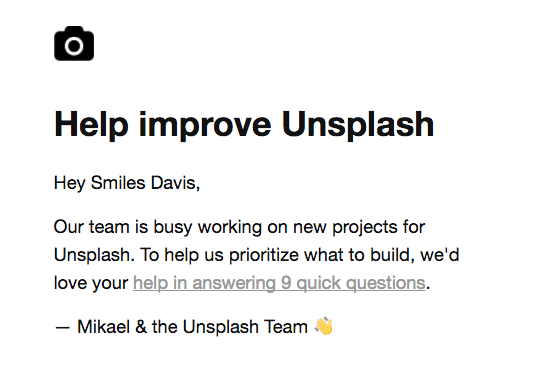
Unsplash is an online website that helps you find beautiful, free images and photos that you can download and use for any project. Better than any royalty-free or stock photos.
What we like about the template?
- The brand has openly mentioned how customer feedback will improve their experience.
- Unsplash wants to prioritize what to build (rather than something generic like “offer a better experience
- Collecting such feedback will help the brand improve customer experience resulting in more sales.
14. Shopify
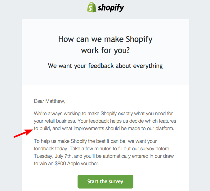
Shopify is the most popular eCommerce platform for all types of businesses. It allows you to sell online and you can easily customize the eCommerce Software to meet your own business needs.
What we like about this template?
- Mentioning the goal of collecting feedback informs customers that the company values their opinions.
- Shopify has included a time factor to reassure buyers that the process will be quick.
- As seen in this template, incentivizing consumers to leave feedback is the best approach to urge them to do so.
15. Ticket Arena

Ticket Arena is a consumer-facing website that sells a wide range of events, including club nights, live music, comedy, theater, and food and drink.
What is it about this template that appeals to us?
- If your firm is more about the tickets/brands you sell, as TicketArena is, being extremely personable is a smart way to go.
- Customers are more likely to take the time to offer feedback when TicketArena expresses how important a review is to them.
- Including a time factor reassures them that this favor will not take up too much of their time.
Conclusion
The feedback email templates listed above are our favorites since they have all the necessary elements to make them appealing and click-worthy.
If you haven’t started collecting consumer feedback yet, now is the time to take inspiration from these templates. Customer feedback is important if you want to provide a unique experience for customers and generate repeat business.
When you collect feedback, you learn about the aspects of the buying process that need to be addressed, which can be tough to locate otherwise. Remember that customers are short on time, so make the feedback procedure as simple as possible when sending emails for feedback.
Supercharge your ecommerce customer feedback emails to win back customers.

