Looking for fashion and apparel welcome email templates? This blog is for you.
Fashion and apparel brands are often too focused on sending out emails about their discounts and deals. But by doing so, they often forget the one email that can help them start a strong relationship with their consumers: ecommerce welcome emails!
Welcome emails are not only a great way to show you appreciate a customer’s decision to sign up for your newsletter or make a purchase, but they also help build relationships with your customers, increase brand awareness and create an overall positive perception of your company.
In this article, we will show you 17 fashion and apparel brands that have nailed their welcome emails, and give you some tips on exactly what makes them such valuable customer-building tools. You may find some great pre build templates in Privy Shopify App.
Remember, these fashion and apparel welcome email templates are only to inspire you!
Welcome email examples for fashion and apparel brands
Let’s look at some of the best fashion and apparel welcome email examples to help you get started:
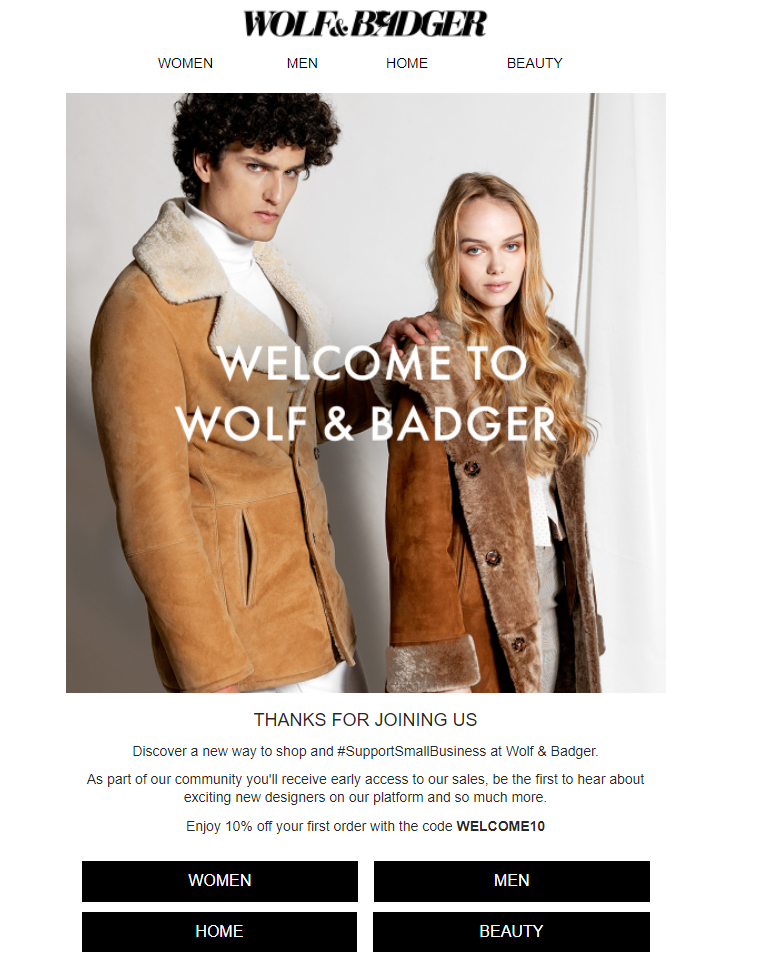
1. Wolf and Badger
One of the most enticing things about buying something new is the elusive element– being able to boast about getting something first and unheard of for yourself. When you welcome your customers to your brand, you should make them feel welcomed by sharing tidbits of exclusive (and hopefully actionable) offers that they can’t access anywhere else.
Wolf & Badger are smart to express this by mentioning that email subscribers will be the first to hear about their sales and will be offering access to events limited to patrons, making it clear that doing business with them grants customers a VIP-like status.
Coupled with their bold tone and overall vibe, subscribers are reminded just why this brand will stand out from others.
Why does this work?
- Clear messaging
- Exclusivity
- Powerful brand visuals
- Incentives provided for signing up and in the future
- Clickable links to shop instantly
2. Finisterre
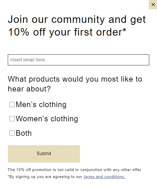
Finisterre is a brand which focuses on sustainability as its standard since 2003 and its welcome email displays just that. Customers are reminded that by shopping with Finisterre they are not only adding one more piece to their wardrobe, but they are also contributing to a better planet.
What’s more, before even signing up for emails, customers get to choose the emails they get along with a 10% discount.
Why does this work?
- Clearly stating the value of sustainability
- Sign up discount
- Brand messaging creates an instant connection that leads to sales
3. Olivela
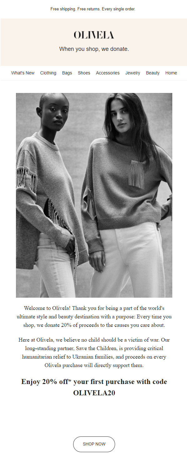
This brand uses its newsletter to welcome potential customers by sharing user-generated content and nudging them to their social media handles.
By getting your email subscribers on social media channels, you can create a win/win scenario. You’re giving new customers places to congregate who will in turn want to follow and visit you across the web at additional sites like Facebook, Twitter and Instagram! Be sure to use their presence on those channels as a jumping-off point for further communications and connection with them, even if it’s instigated by the user.
Why does this work?
- The brand ethos is shared to build a connection
- The welcome email chain includes one from the founder
- Social media links to increase brand awareness
- Incentives provided for new sign-ups
- Highlights best selling products in the first mail
4. Hunter
Emails can range from promotional to informational and more as they are a convenient way to communicate with your audience around the world directly. However, when you want to get across a message, or provide some sort of added value to your subscribers, welcoming with discount codes and follow-ups come in handy.
Hunter leverages this practice by not only incentivising their potential customers with a 15% discount for becoming an email subscriber but also by sending follow up emails to remind them to use the coupon code.
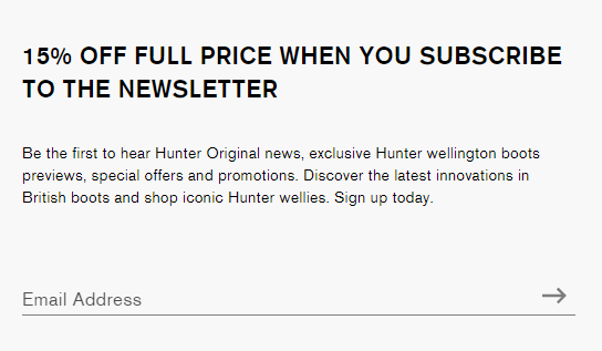
Why does this work?
- Well-defined email flow
- Personalized follow-up
- Strong visuals in welcome email design that display their iconic boots
5. Aritzia
Most brands enjoy very high open rates for their welcome email templates. Aritzia is one of the best welcome email examples since they leverage this situation by sharing strong visuals.
Their new customer welcome email template is entirely image-based with clickable links that compel customers to shop from them.
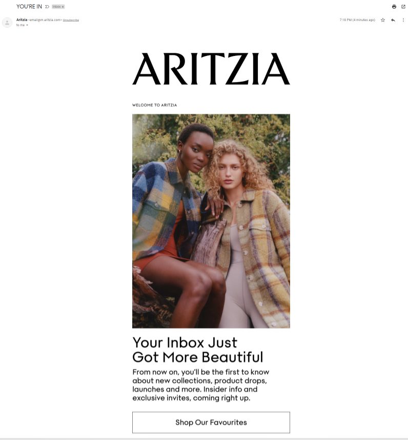
Why does this work?
- A strong subject line that says, “YOU’RE IN” gives the feeling of exclusiveness
- High-quality product images
- Link to all social media accounts
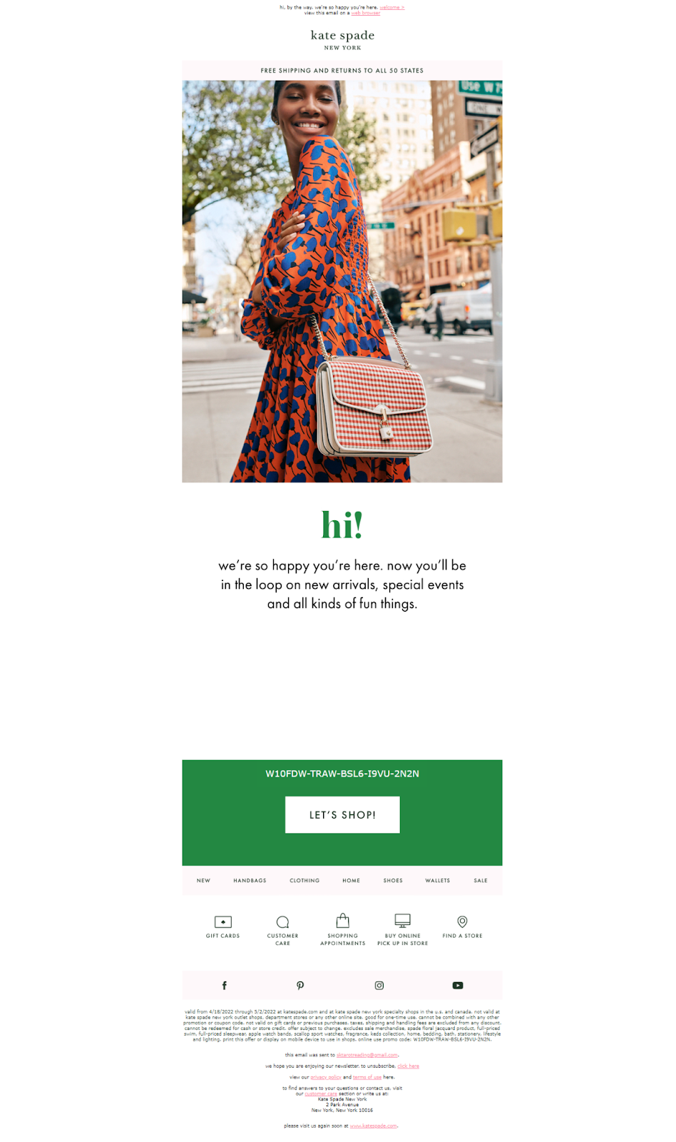
6. Kate Spade
They start out strong with an irresistible subject line- “oooh, a gift! here’s 10% off your next purchase”. Who doesn’t want a discount, right?
They follow this up with a product image, a message of gratitude and the benefits you will get. With this welcome email design, it is hard not to convert subscribers to paying customers.
Another thing that makes their welcome email effective is that they provide a ‘find a store’ option that can lead to in-store sales in conjunction with online sales.
Why does this work?
- They maintain a warm and friendly tone throughout their email
- They offer an incentive to shop
- They share helpful links like customer care, find a store and gift cards for ease of access
7. Tommy Hilfiger
The best part about their welcome email design is how smoothly it flows. They use a simple subject line that says, “Thanks for joining” which is followed by an inviting message and pictures that look like they are straight out of a magazine. They even have a short ‘get to know us’ section that is quickly followed by a personal message from Tommy Hilfiger himself.
Why does this work?
- It uses an intuitive new customer welcome email template
- Personalized message by the brand owner
- Perks listed coherently which flows into another perk– a 20% checkout coupon
8. Whistles
The brand uses an inviting subject line to lure you in– Nice to meet you X | This could be the start of something good. From there, Whistles uses a minimal yet stunning approach to welcome you to their ‘community’. They have placed their ‘Shop New In’ button right after the welcome message that prompts people to browse through their regularly updated catalog.
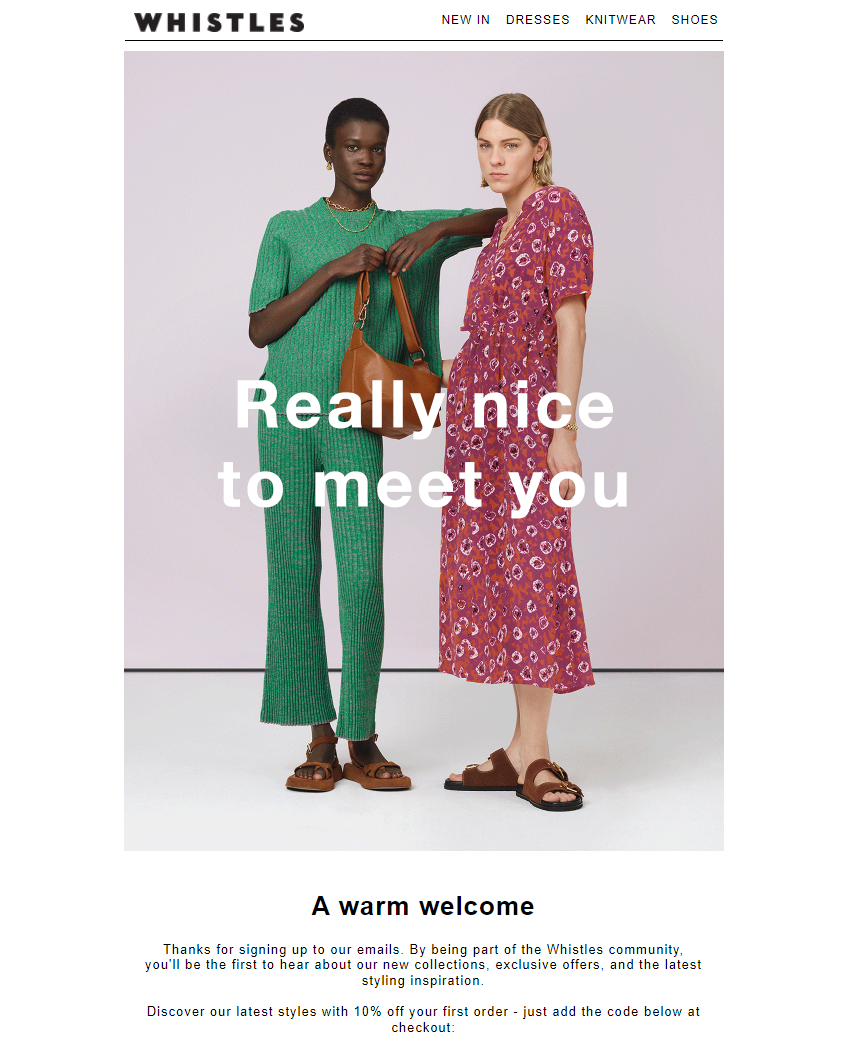
Why does this work?
- They use an advanced visual element, i.e., a gif that showcases their products
- They share ‘4 things to know about Whistles’ which immediately strikes a rapport with the reader
- They include a link to their lookbooks to help their audience style the outfits
9. American Apparel
A rather simple yet effective welcome email template that leads the subscriber to view exactly what they are about. The email is also clickable and leads to their landing page where a visitor can become a customer.
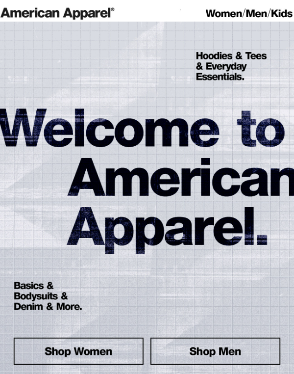
Why does this work?
- Distinct font with minimal text for clearly communicating the CTA
- Simple imagery that is in line with their brand value
- Uncomplicated email design
10. Lululemon
They open with a subject line that draws you in instantly owing to its exclusivity– “Your first lululemon email—welcome!” They have also wisely made the most of their welcome email by making it a landing page in itself. A subscriber can view everything from their shopping link to the app download button and social media handles.
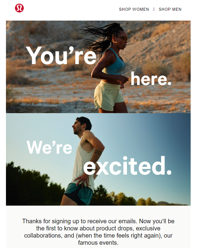
Why does this work?
- Conveys all necessary information a new customer will need
- Provides links to their app download on the App Store and Google Play
- Highlights products using images
11. Mr Porter
This is one of the best welcome email examples because of its personable subject line– A 10% off welcome gift for Ms XYZ. Right from their subject line to their email copy, you know the team at Mr Porter is here to warmly welcome you.
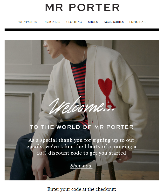
Why does this work?
- Customized approach by addressing the recipient
- A polite language that reels in a subscriber
- 10% discount for signing up
12. Sweaty Betty
They open with ‘You’re in. You’ve got 15% off’ and immediately add a call-to-action so that a subscriber can turn into a paying customer instantly. Apart from this significant sign-up discount, the brand also adds another level of exclusivity wherein you can get exclusive rewards to join their ‘Insider’ program.

Why does this work?
- Images consistent with the brand to nurture the subscribers
- Clear and consistent CTA
- Layered rewards (i.e., more rewards for more engagement)
13. Ralph Lauren
The luxury brand invites its email subscribers with a straightforward yet alluring message– Welcome to the World of Ralph Lauren. From there, you scroll down to see a picture of Ralph Lauren himself which exports you to this exclusive world where he shares his online collection along with a store locator link.

Why does this work?
- Responsive welcome email design
- Easy to navigate design flow
- Integration of social media handles and app links
14. Reebok
If you are looking for welcome email templates, this is one to take note of. Reebok welcomes you to their ‘tribe’ right from the get-go! They use strong brand visuals and break up their email in easy to navigate sections. These include- a welcome image, a 15% discount for signing up and all relevant links that are found on the footer of a website.
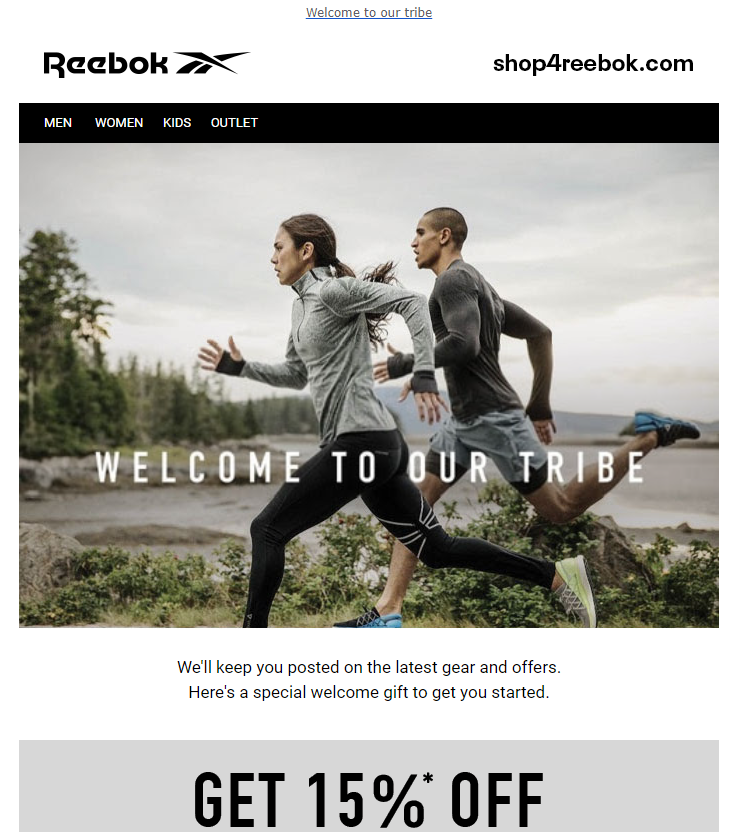
Why does this work?
- Minimal email copy with reliance on CTAs
- Intuitive email sections that flow into each other effortlessly
- Heavy emphasis on sign-up discounts and outlet discount
15. Surf Stitch
They are a good example to follow for welcome emails. They use pleasing colors in the email, address their subscribers as ‘friends’, provide personalized codes instead of standard codes for all, and also share a financing solution with their partner brands. So, even if a subscriber is low on cash at the moment, they can leverage their ‘buy now, pay later’ scheme and get shopping.
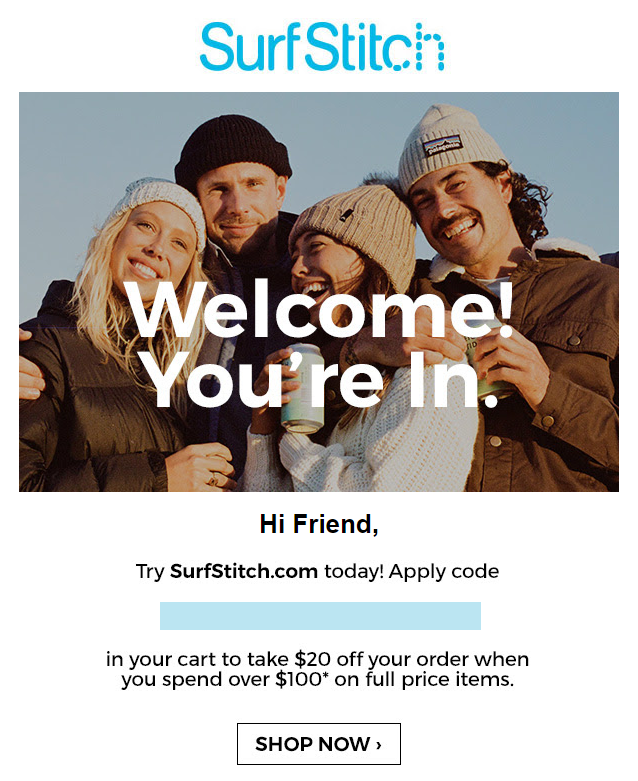
Why does this work?
- Individualized codes for each subscriber
- Financing solution within the introductory mail that creates a feeling of trust
- Integration of social media accounts within the mail
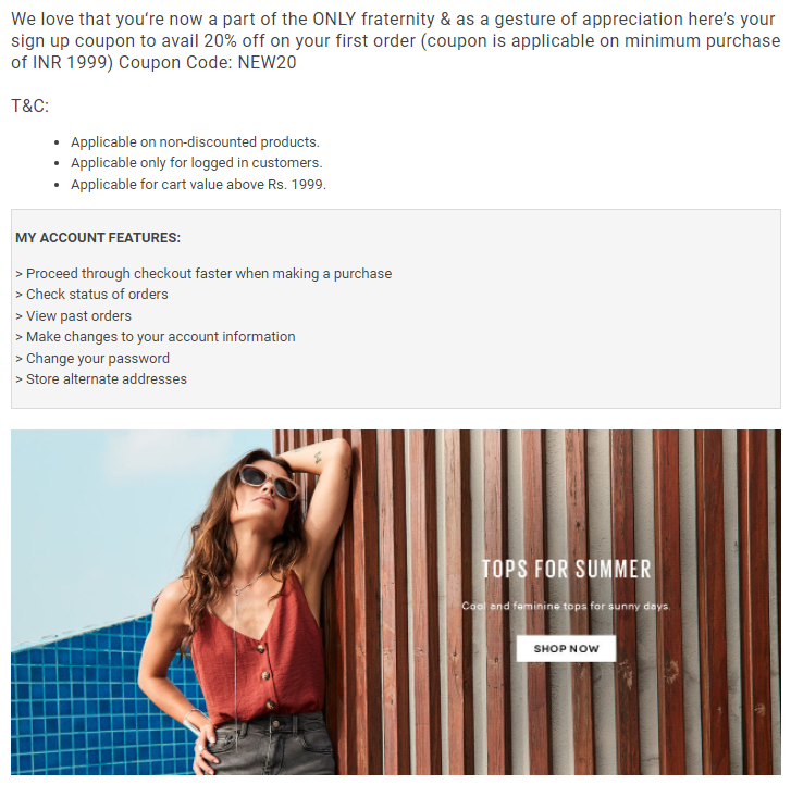
16. Only
This brand uses a no-frills approach while welcoming its new subscribers. They simply share a coupon that helps the buyer get a 20% discount and follow it up with an image and a CTA that leads to their website.
Why does this work?
- Simple welcome email design
- Only one button so that the customer is not overwhelmed
- Significant discount for signing up for their newsletter
17. Adidas
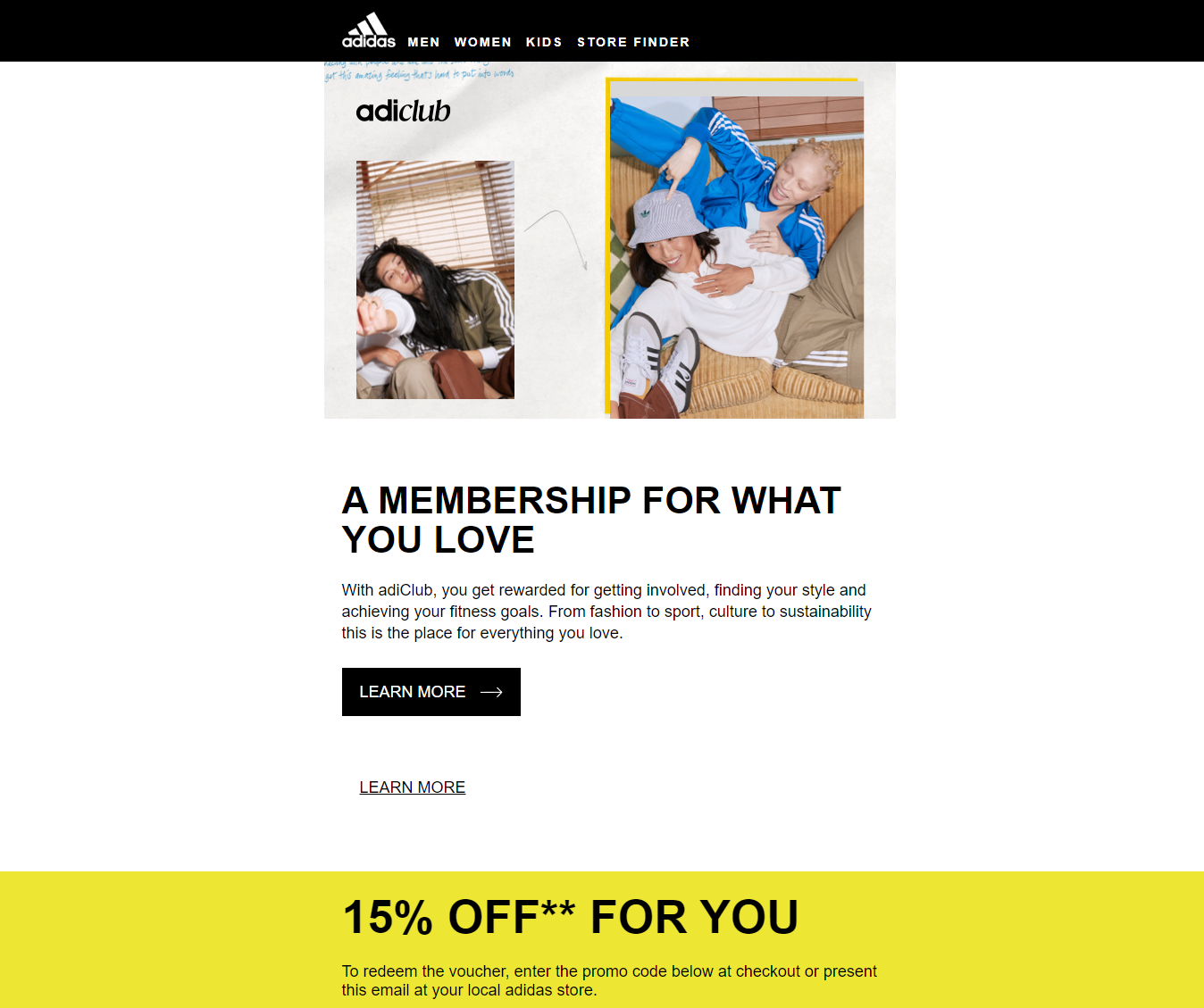
Subscribers can very quickly pick up on the brand’s friendly tone with their subject line– ‘You’re now an adiClub member! ’ They were the only brand to use emoji in this list which adds to their personable approach while welcoming new subscribers to their club.
In their first email, they included every important thing a customer will need to connect with them– a membership reward of 15% off on the bill, other top ‘level 1’ rewards for becoming a member, social media buttons to connect with them on other platforms, and buttons to download their app.
What truly stands out though is that their membership reward is not only limited to their app or website but they also share a barcode in the welcome email. This allows customers to scan the code at their local stores to reap the same benefits as online shoppers.
Why does this work?
- Personalized coupon code for online shopping and barcode for in-store shopping
- Access to membership rewards like discounts and events that exudes a feeling of exclusivity
- Excellent use of white space that keeps the welcome email design clean but powerful
Is your brand ready to use these welcome email templates?
Welcome email are your golden ticket to kick-start your business relationship with new subscribers. If you are not sending a welcome email, you are missing out on a great opportunity to make that first impression, as well as set the tone for future emails you send out.
To make your welcome email campaign a success, it is best to create emails that are not only authentic to your brand but also share how you can add value to your customer’s life. You can do this by optimizing your copy, writing a compelling subject line, providing high-quality visuals and giving the subscriber something meaningful like a coupon code. It is a great way to establish expectations of your relationship right off the bat.
To do this effectively, a single email may not always suffice.
Create a chain of irresistible welcome email flows that drive up your revenue by exploring RetainIQ’s high-performing templates.

