Each day, email subscribers are hit with a whopping number of emails. With every brand competing to gain a customer’s attention, a percentage of your subscriber list is bound to lose interest over time and stop engaging with your email marketing campaigns.
While it may not seem like a huge deal at first, overtime when a big percentage of your subscriber list stops engaging, you run a bigger risk of damaging your sender reputation and hurting your email deliverability rates.
One of the toughest challenges faced by eCommerce brands is retaining their old customers. In a hyper-competitive eCommerce space, brands have to stay at the top of their game and continue providing an unforgettable eCommerce experience.
But why are brands so keen to retain their customers? According to Invespcro, acquiring a new customer costs 5 times as much as it does to keep an existing one. So brands need to look at email marketing as a way to retain their old customer base if they want to keep up their sales while reducing their customer acquisition cost.
Luckily, this is where the “we miss you” email comes in handy. It’s the last attempt to reach those inactive customers and say “Hey, remember us? We want you back. And here’s what we got to offer!”
A We Miss You email is a simple, yet effective email that you can easily send out to your inactive customers. These emails allow you to re-engage with the people who may not have bought from your company in a long time but are still important to you and your business.
To inspire you to create the perfect win-back email campaign, here are some “we miss you” email examples from brands who are winning at this:
‘We miss you’ email templates and what’s we love about them
1. Pottery Barn
Pottery Barn is a home furnishing store chain and e-commerce company.
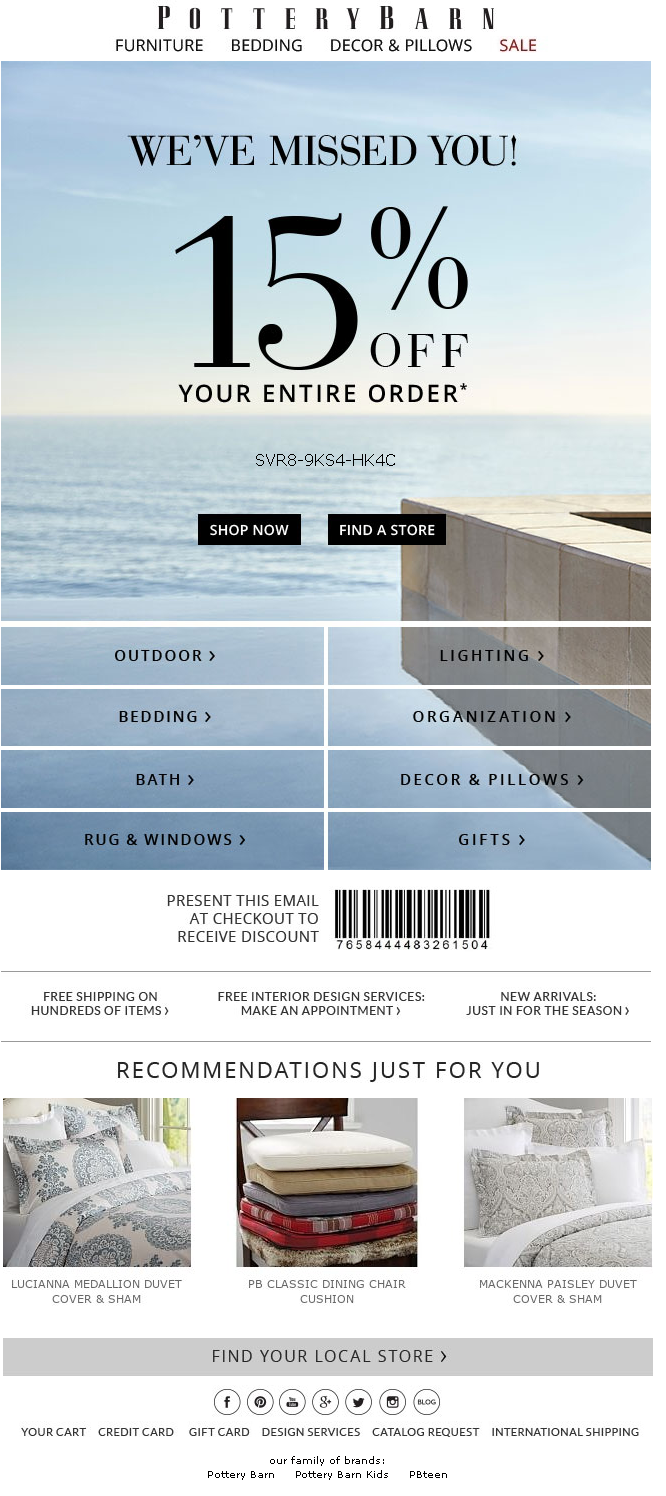
It sends a re-engagement email with the subject line: We’ve Missed You! Here’s 15% OFF EVERYTHING – Even Furniture!
What we like about this email:
- Pottery Barn’s re-engagement leads with a 15% discount incentive on the entire order. This is a great tactic to get the customer to explore products at the online store.
- By laying out all the major product categories in the email itself, the brand makes it easy for the customer to navigate to whatever section interests them.
- It also displays personalized recommendations to increase the reader’s chances of making the purchase.
2. West Elm
West Elm is a modern furniture and home decor store. It sends a re-engagement email with the subject line: 20% Off. Because We Miss You!

What we like about this email:
- West Elm’s re-engagement leads with a 20% discount incentive to incentivize the customer. However, it also induces a sense of urgency by mentioning that the offer is for a ‘limited time period’.
- The brand lays out all the major product categories in the email itself, making it easy for the customer to navigate to whatever section interests them. It also mentions the category-wise discount available on their online store.
- It ends the email with personalized recommendations in its “Picks for you” section to increase the reader’s chances of making the purchase.
3. Sephora
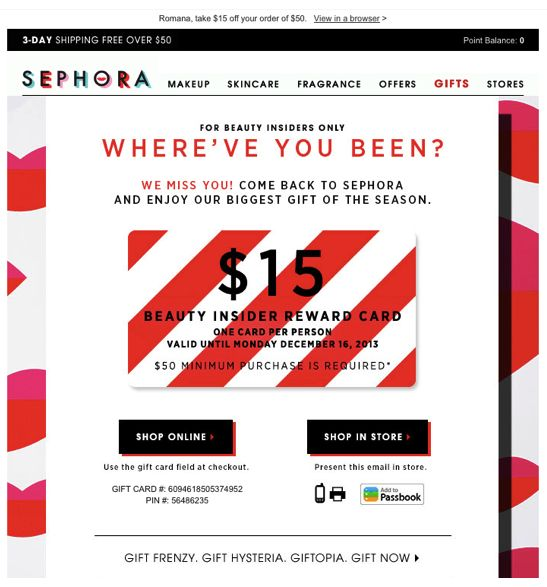
Sephora, a luxury beauty and cosmetics retailer, turns its win-back email into an exclusive offer for its Beauty Insiders.
What we like about this email:
- The email is upfront about its $15 off discount offer on a particular cart value, increasing their odds of winning back their customers.
- It makes it a limited-time offer, prompting their customers to take quick action.
4. Facial Co.
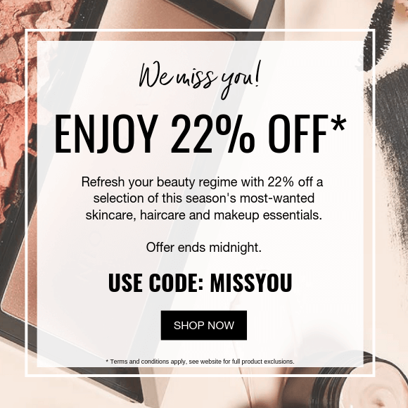
Facial Co is an online skincare and makeup store. Its re-engagement email comes with the subject line: We miss you! Enjoy 22% off.
What we like about this email:
- The email has minimal copy paired with a neat design.
- The highlight of this email is the $22 off discount offer. Discount incentives often work well to get your once active customers back into purchase mode.
- The incentive is a limited-time offer (ends midnight). Making your offer a limited-time thing often persuades customers to make a purchase quickly for the fear of missing out on a great deal.
5. Zazzle
Zazzle is an online marketplace that allows designers and customers to create their own products with independent manufacturers
What we like about this email:
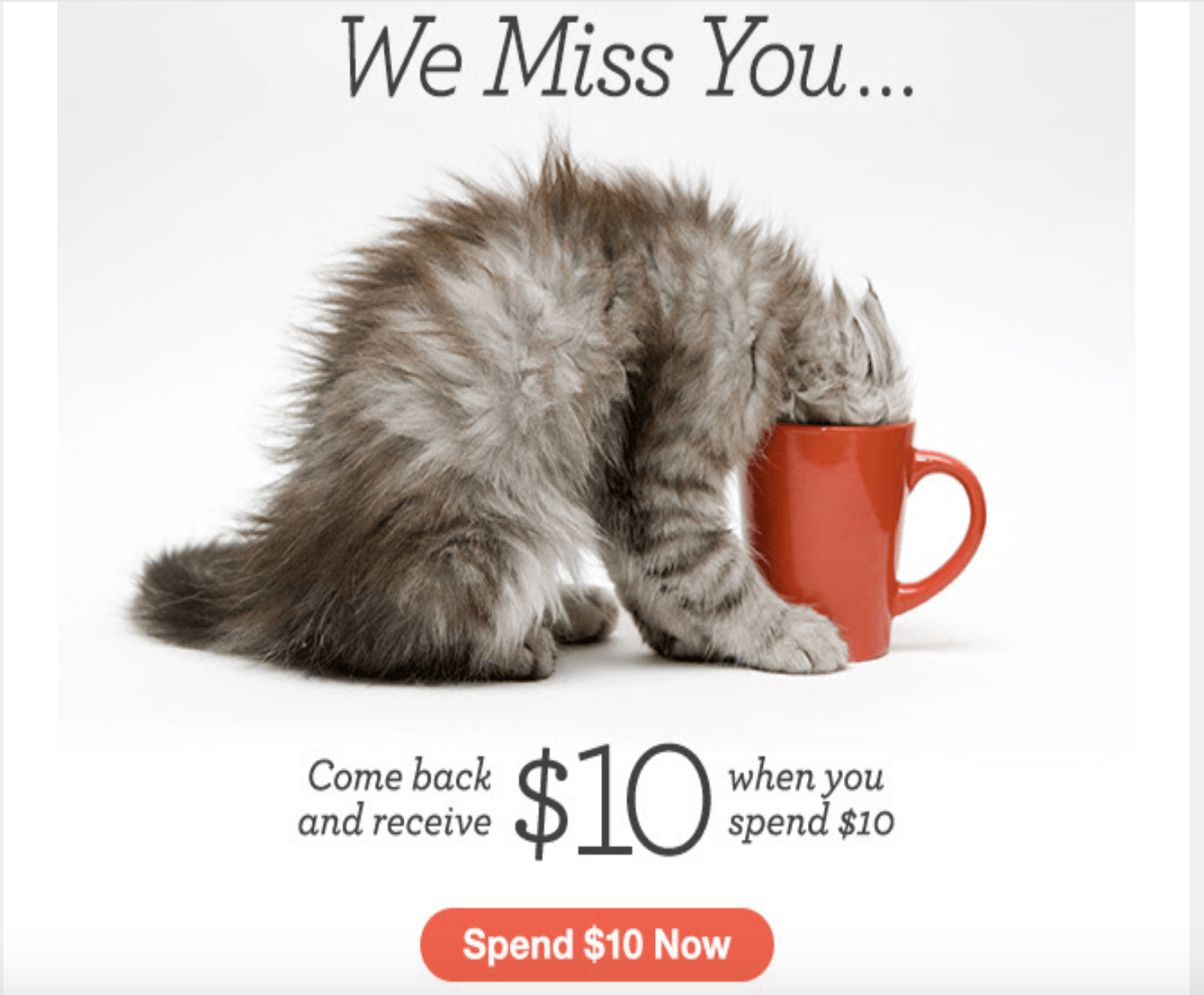
- This discount email by Zazzle is a great way to grab people’s attention at the first glimpse. After all, who’d pass over a discount offer alongside a cute cat pic?
- I like that they left it short and sweet with a clear call to action button that says “Spend $10 Now.”
6. Mark and Graham
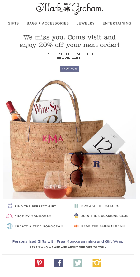
Mark and Graham is an online store that offers gifts and accessories, personalized with your choice. Its re-engagement email shows up with the subject line: 20% off Because We Miss You!
What we like about this email:
- The email has a clear subject line that offers an incentive (20% off) for an inactive subscriber to come back to their store.
- The email includes a photograph of a product hamper to encourage the reader. Images like these are very effective in creating visual stimulations for encouraging interest.
- The brand understands that there is a lot a customer can do at their store: get a gift, browse their catalog, check out the blog or join their club. Therefore, it provides all of these options right at the end to encourage the reader to take one action or the other.
7. Williams-Sonoma
Williams-Sonoma is a consumer retail company that sells high-quality kitchenware and home furnishings. Their re-engagement email pops up with the subject line: WE MISS YOU! Don’t Pass Up This Unique Code Inside + Complimentary Shipping.

What we like about this email:
- Williams-Sonoma has nailed its re-engagement email by using just the right amount of FOMO. By using the phrase “Don’t Pass Up This Unique Code Inside + Complimentary Shipping”, they are clearly stating in their subject line the many benefits that readers can avail from this email.
- Right in their email copy, the brand creates an instant urgency by highlighting a time-sensitive discount offer coupled with the promise of free shipping. That’s enough to get a reader interested.
- By using visually stimulating images of their products, the email manages to remind their readers of all the good things they can consider buying with this offer.
8. Cabela’s
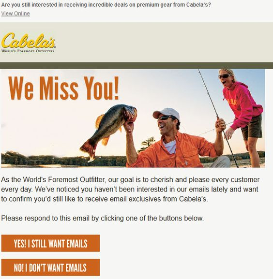
Cabela’s Inc. is an American retailer which specializes in products related to hunting, fishing, boating, camping, shooting, and other outdoor recreation merchandise. Its re-engagement email opens with the subject line “Are you still interested in receiving incredible deals on premium gear?”
What we like about this email:
- Cabela’s uses its re-engagement email to not only reconnect with a customer but also as a way to clean out their email list of subscribers who wish to be removed from their mailing list. And this made very clear in its subject line
- By letting the reader know they’d be missing out on “great deals on premium gear”, it induces a feeling of temptation to continue staying a part of the brand’s mailing list.
9. Charming Charlie
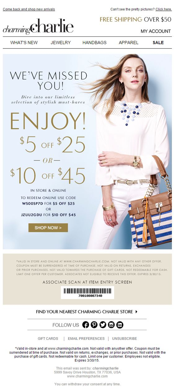
Charming Charlie, a women’s fashion and accessory retailer sends a re-engagement email under the Subject line: Come back and shop new arrivals.
What we like about this email:
- Charming charlie packs a lot of value in one little email. It has everything to lure the reader into engaging with them: a discount offer, a visually attractive image, promise of free shipping, and a clear CTA which stands out and is noticeable.
- To encourage more interaction, it provides social media icons for readers to stay connected with the brand’s offerings via social media. This is an excellent way to reactivate those old subscribers and gain more attention.
10. GAP
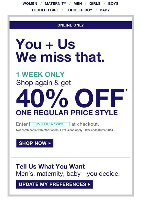
GAP, a clothing and accessory retailer sends a re-engagement email to woo its inactive subscribers and get them to make a purchase.
What we like about this email:
- The email features a considerable discount right from the get-go. This enables the team to skillfully set expectations and ignite a conversation. And it does so by packing all this essential information into a compact size.
- The email mentions a list of benefits subscribers get to remind about the value of the brand.
- It also gives their readers freedom to update their email preferences.
- The email copy finally ends with shopping incentives to leave their readers wanting to explore.
11. La Redoute
La Redoute’s ‘we miss you’ email is another good example of a re-engagement email done right.
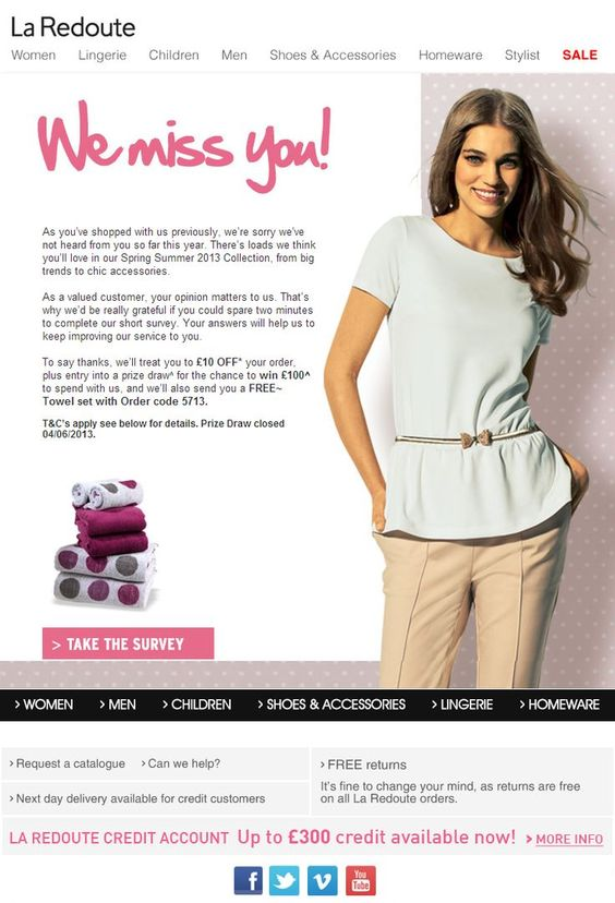
What we like about this email:
- La Redoute packs multiple incentives in this email. They display it as a personal letter to their customer, talk about how much they value their customer and offer multiple sweet deals: a discount offer, an entry into a prize draw and a free product.
- They also provide an option for customers to share their feedback through a survey. Insights from surveys allows brands to look into the reasons that may have prompted the customer to stop engaging with the store.
12. CB2
CB2, a modern furniture & contemporary home decor store sends out a re-engagement email with the subject line: We’ve missed you. Save 15% off your next purchase
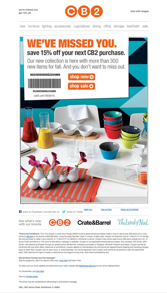
What we like about this email:
- The email works out a sense of urgency with the “Don’t Miss Out” messaging to encourage the recipient to take action.
- The copy takes the reader’s attention to its vast catalog of products and provides two different CTAs: to shop new arrivals and shop sale items.
13. Active Junky
Active Junky is a shopping site for outdoor gear and apparel. Their re-engagement win-back emails are focused on showing the experience the products can deliver.
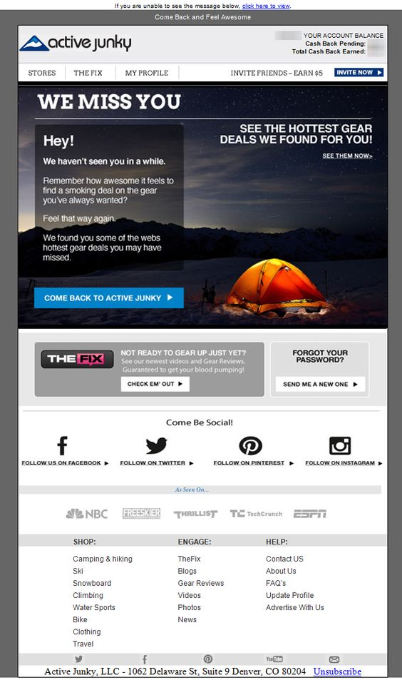
What we like about this email:
- Active Junky’s win-back email employs all the tactics to re-engage their contacts via email and social media. By emphasizing on its social icons, it attempts to connect with its customers from other digital touchpoints.
- The email uses an eye-catching image on the backdrop of its win-back message. This reflects what the brand is all about: nature and adventure
14. Swimsuits For All
Swimsuits For All, an online retailer for women’s swimwear, sends a visually appealing re-engagement email to its subscribers.
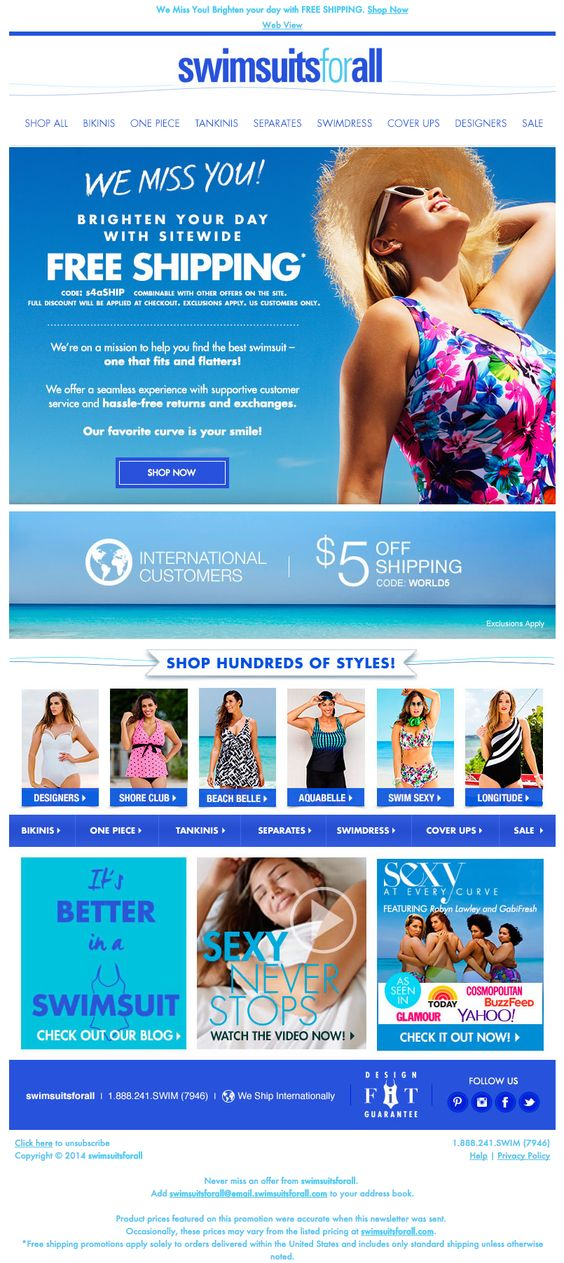
What we like about this email:
- The brand packs a lot of value into its re-engagement email by offering readers a glimpse of everything their store offers.
- The email is a visual treat for readers with the use of vivid imagery and colorful product images that create an idea of a great day at the beach. Hence the use of the color blue.
- The email copy is chill and super friendly, which again reflects what the email wants to make you feel: relaxed and excited enough to get you to shop for your next beach vacation.
- Lastly, the email packs a discount incentive and guarantees like free shipping and hassle free returns to encourage reader who are still on the fence.
15. Liberty
Liberty, a footwear shopping store, sends a professional looking re-engagement email to its inactive subscribers.
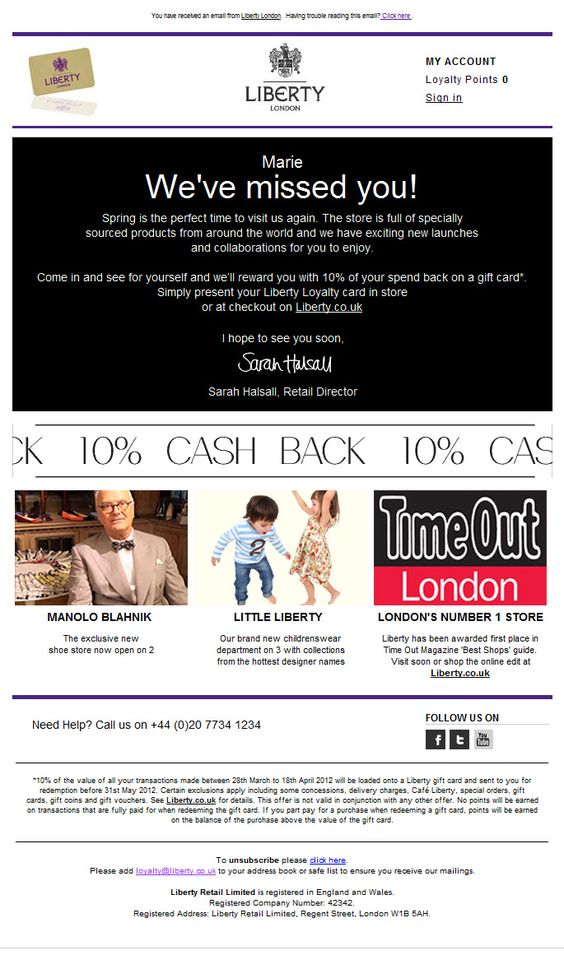
What we like about this email:
- Liberty crafts a personalized message as part of its re-engagement email to make its reader feel like its exclusive to them. This makes the customer feel that the brand values them.
- Unlike other brands that offer a flat discount, Liberty offers a 10% cashback that gets credited to the customer’s Liberty account. This ensures that the cashback is again reused against the next order when another purchase is made within a particular time period.
- The brand clearly lists its helpline number in case of any inconvenience faced by the reader.
Conclusion
Although there are numerous ways to re-engage your inactive customers, sending a “we miss you” email is a simple yet compelling way to break the ice and get yourself back in the customer’s mind.
It doesn’t cost much and if done right, it’ll be the best re-engagement tool to lure your inactive customers back to your online store.
However, if people choose to unsubscribe from your emails, this would be an opportunity to connect with them via different channels. After all, that is what marketing is all about – creating multiple touchpoints.
Want to learn more about win-back emails for customer re-engagement? Read the complete guide here.
Looking for win-back email examples and templates for your re-engagement campaign? Explore all our articles here.
Additional read: 5 underrated tips to make your customer win-back emails more effective.

